Bido Montero
After establishing a solid foothold within the motorcycle service sector, this Dominican Republic firm launched an extensive rebranding project.
Re-branding and Logo Design
Re-branding and Logo Design
components
Branding
Date
June 2021
duration
2 Weeks
tools
PROJECT NAME
Bido Montero
components
Branding
Date
June 2021
duration
2 Weeks
tools
Client
Bido Montero
This company hailing from the Dominican Republic specializes in repairing and maintaining high- and low-cylinder motorcycles.
With over four years of experience in the industry, their Dominican talent and ingenuity have allowed them to establish a business that meets and satisfies the needs of their clients.
They've built an impressive portfolio of important clients, propelling them to become one of the best companies in their sector.



CHALLENGE
Create a cutting-edge brand that perfectly reflects the unique services and products the company offers while also captivating potential customers' attention.
Customer's main idea was to visually represent a high-end motorcycle with the current company's colors and an elegant font that would connect the brand with its main objectives, eliciting a positive response from users.
logo design
Proposal #1
Proposal #2
Proposal #3
Proposal #4
Branding
Logo Selection
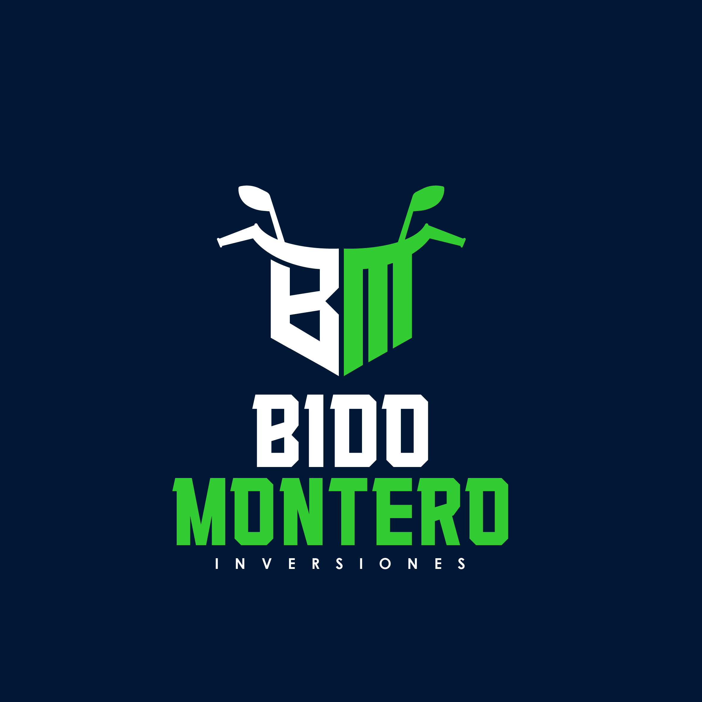
After carefully considering and analyzing all the proposals, the client has chosen the second one! Its flexibility in both print and digital media was the deciding factor.
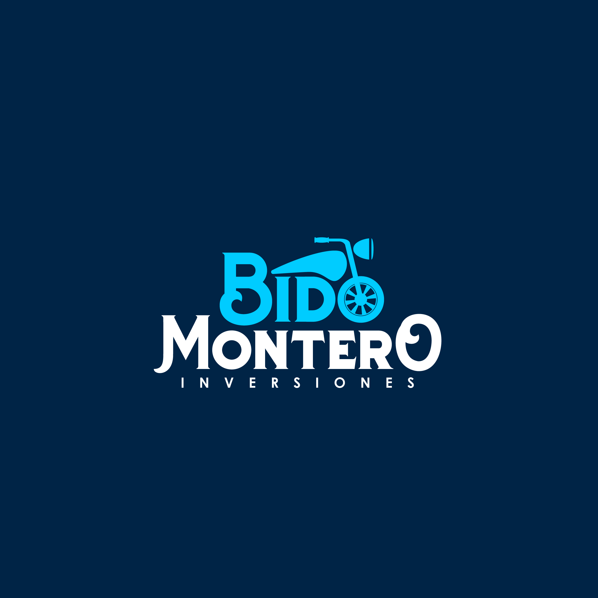
The logo takes its inspiration from the visual representation of a motorcycle. The font intertwines with the design, utilizing the front wheel as part of the company name.
The design features bold waves and pointed accents, evocative of the speed and efficiency of their top-quality products and services.
Typography Selection
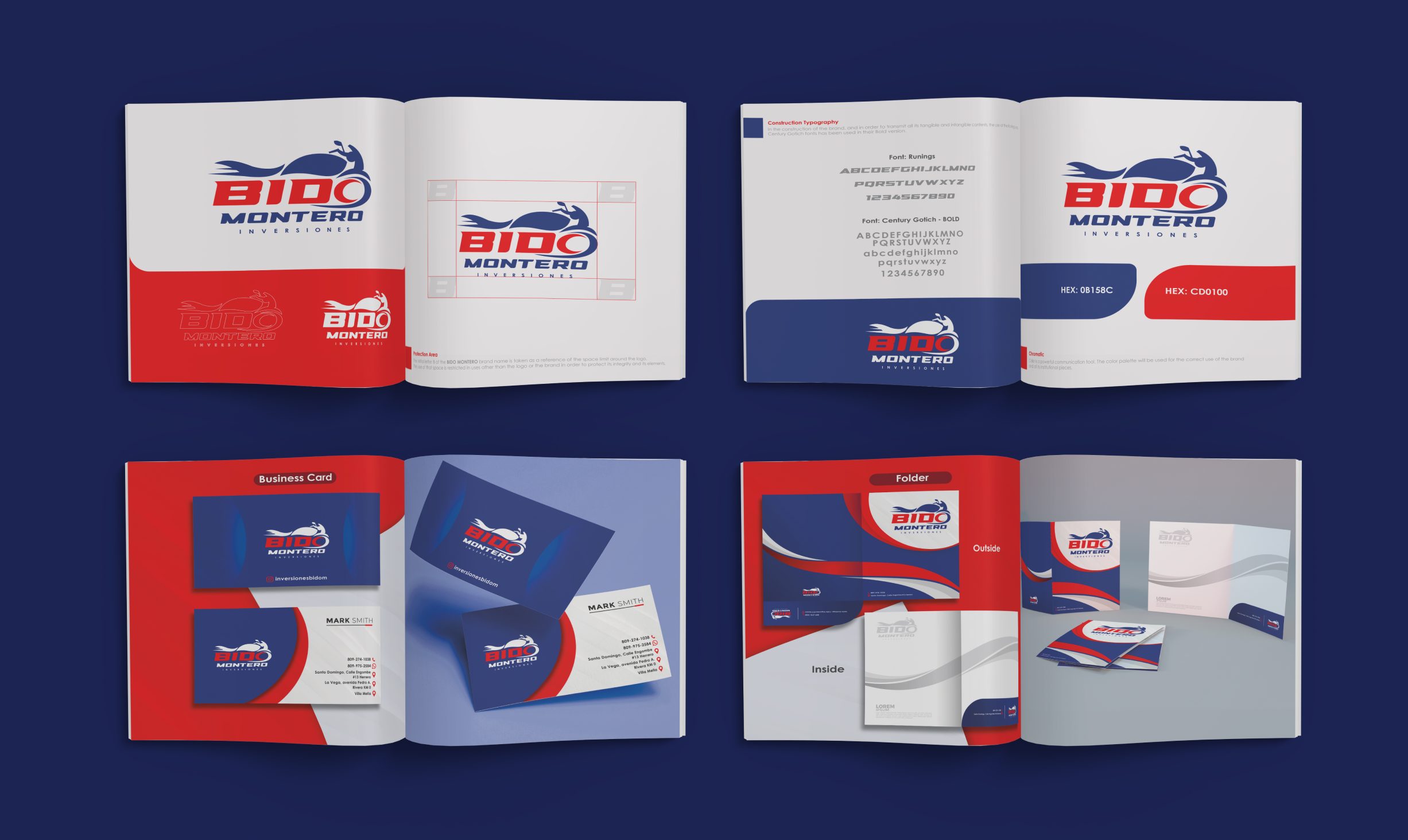
We carefully selected a typography that complemented the brand's design, exuding a tech-savvy vibe that aligned perfectly with the brand's psychology. The font choice added a dynamic edge to the overall aesthetic.
We incorporated Century Gothic as a complementary font to add some pizzazz to our designs. Not only is it easy to use across various mediums like the web and social media, but it also adds a touch of sophistication to our print and digital communication.
Color Selection
The color scheme choice for Bido Montero revolves around an Analogous palette using two bold colors - blue and red. Blue dominates the design, instilling a sense of trust and clarity. Meanwhile, red is used strategically to express the passionate commitment of Bido Montero to its clients. Each product and service is delivered with a vibrant energy conveyed through the accent of red.
RE-BRANDING
corporate stationery
Our goal was to create a captivating digital presentation that would introduce their new corporate image and illustrate all the beautiful things this business offers.
Through this engaging showcase, viewers could explore its various pillars and offerings as they embarked on an exciting journey into a new era.
Corporate Stationery
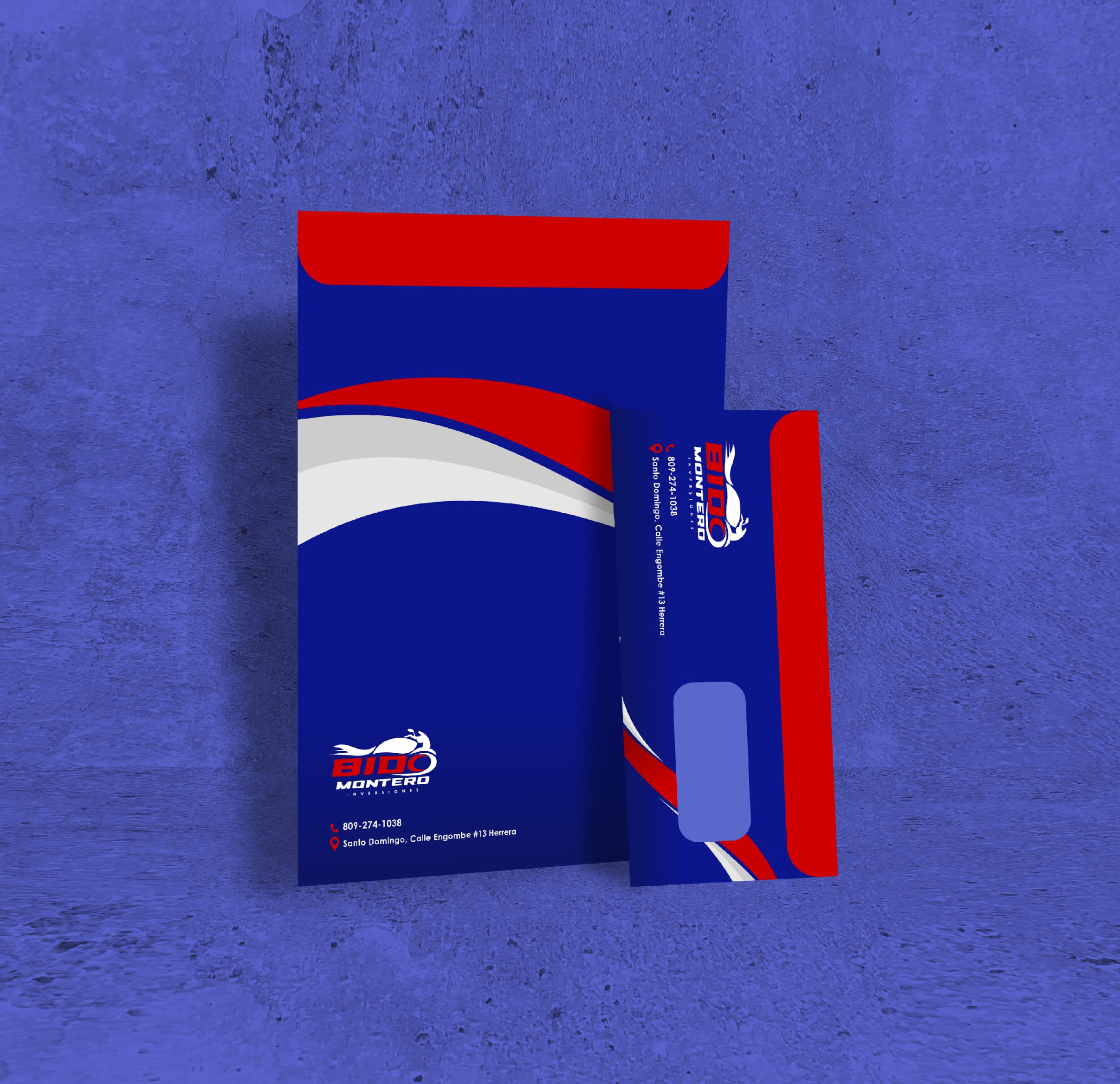
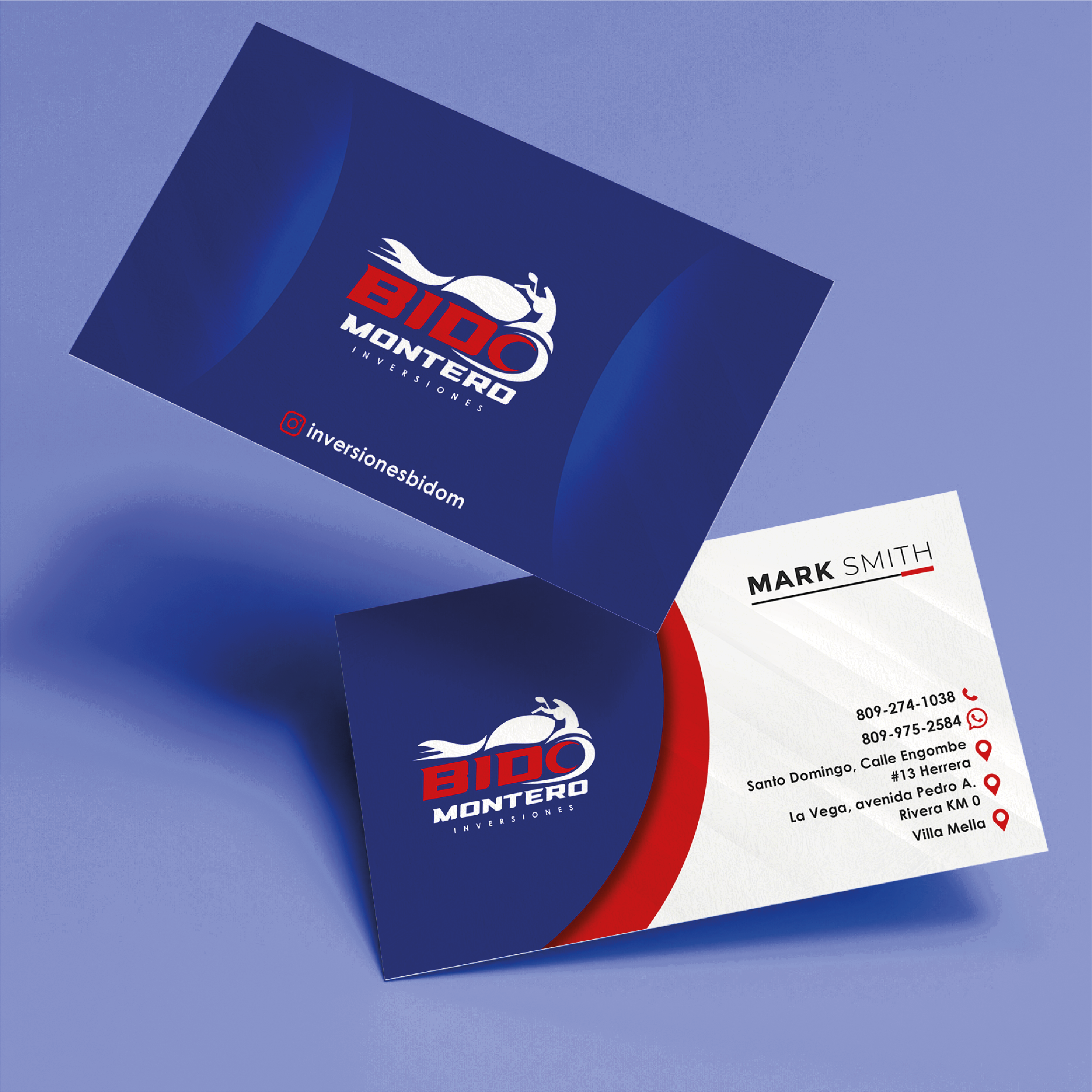
Carrying on with the philosophy of the logo, the stationery design had to exude a sense of fluidity and cleanliness while giving prominence to the primary color over the second one.
By leveraging sleek and dynamic curves and utilizing a bold shade of red, we created a design that exudes professionalism and power, perfectly capturing the essence of our brand.
We have chosen Century Gothic as the primary font to accentuate and maintain the brand's unique identity. This decision was made to enhance the design's readability and overall aesthetics.
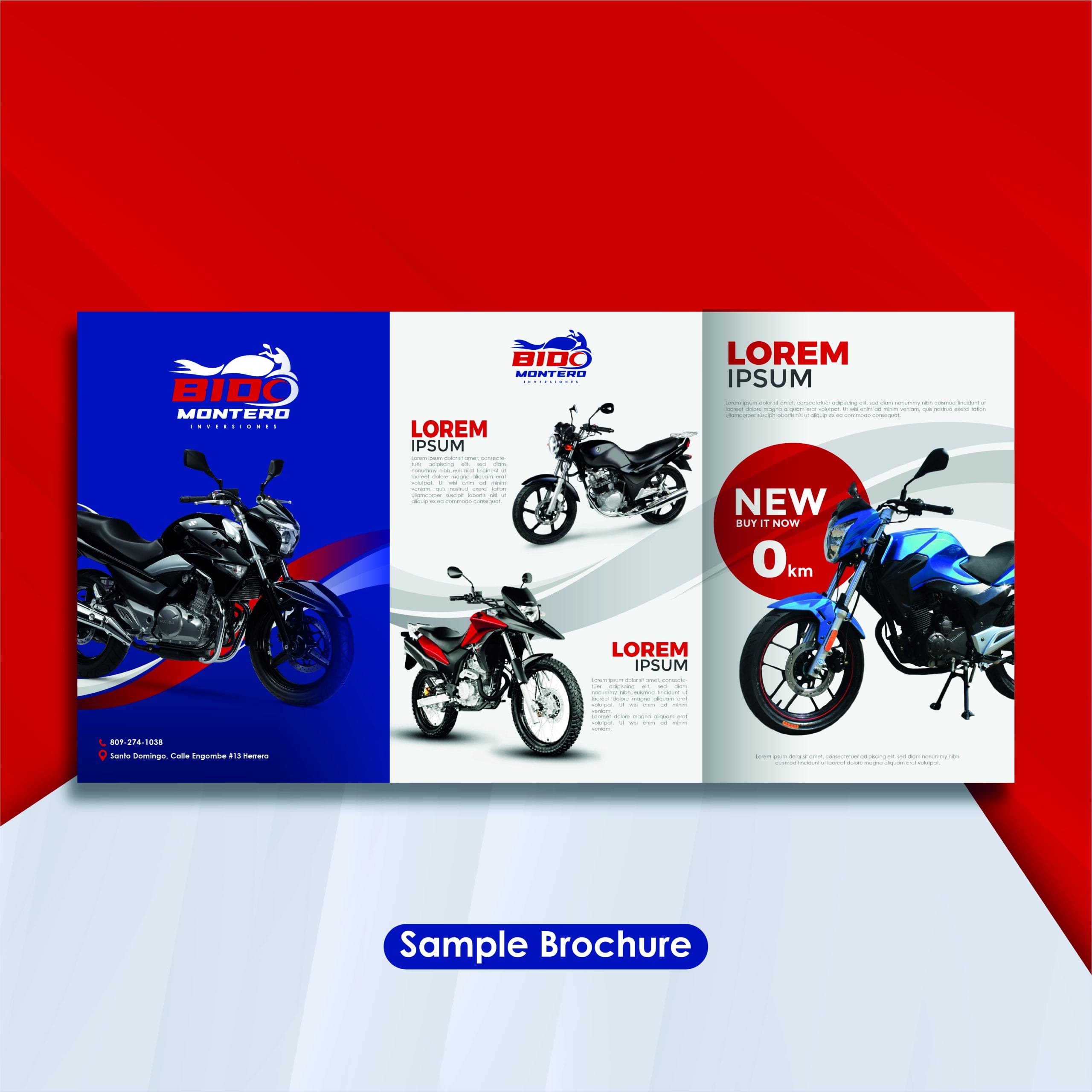
Brochure Design
Maintaining consistent graphic design throughout this project was crucial, which is why a clean and distinctive Brochure was created. It effectively showcases the integral aspects of the brand while staying true to its unique personality.
We crafted a balance of light and shadow, creating an immersive reading experience that captivates without overwhelming. Through distinct sections that stand out from one another, we maintain the core values of a seamlessly integrated brand that never loses its identity.
Conclusion
Each graph had to work together to find the precise point of a perfectly crafted and well-founded brand with a defined concept and strong foundations. It was about creating a cohesive and comprehensive visual representation that embodied the brand's essence. The goal was to make every detail count and ensure that the overall design was more significant than the sum of its parts. After all, a strong brand is not just about a logo or a tagline but an immersive experience that resonates with customers on a deep and meaningful level.
We poured our passion and expertise into a project, striving for the desired results while staying true to our client's ideas. With a professional and coherent approach, we positioned the brand in its rightful place in the market, making it easy for customers to remember and connect. This project ignited our enthusiasm and drew on all our knowledge, resulting in a standout success story.
project
Your team of professionals has done an excellent job with the rebranding of Bido Montero. The new logo and color palette perfectly capture our identity and have significantly enhanced our brand image. The quality of the design in the stationery and brochures is impressive. We are very satisfied with the outcome and grateful for their dedication. We look forward to future collaborations!
Let’s roll up our sleeves and make it happen.
We’ll turn your vision into designs that work and wow.
