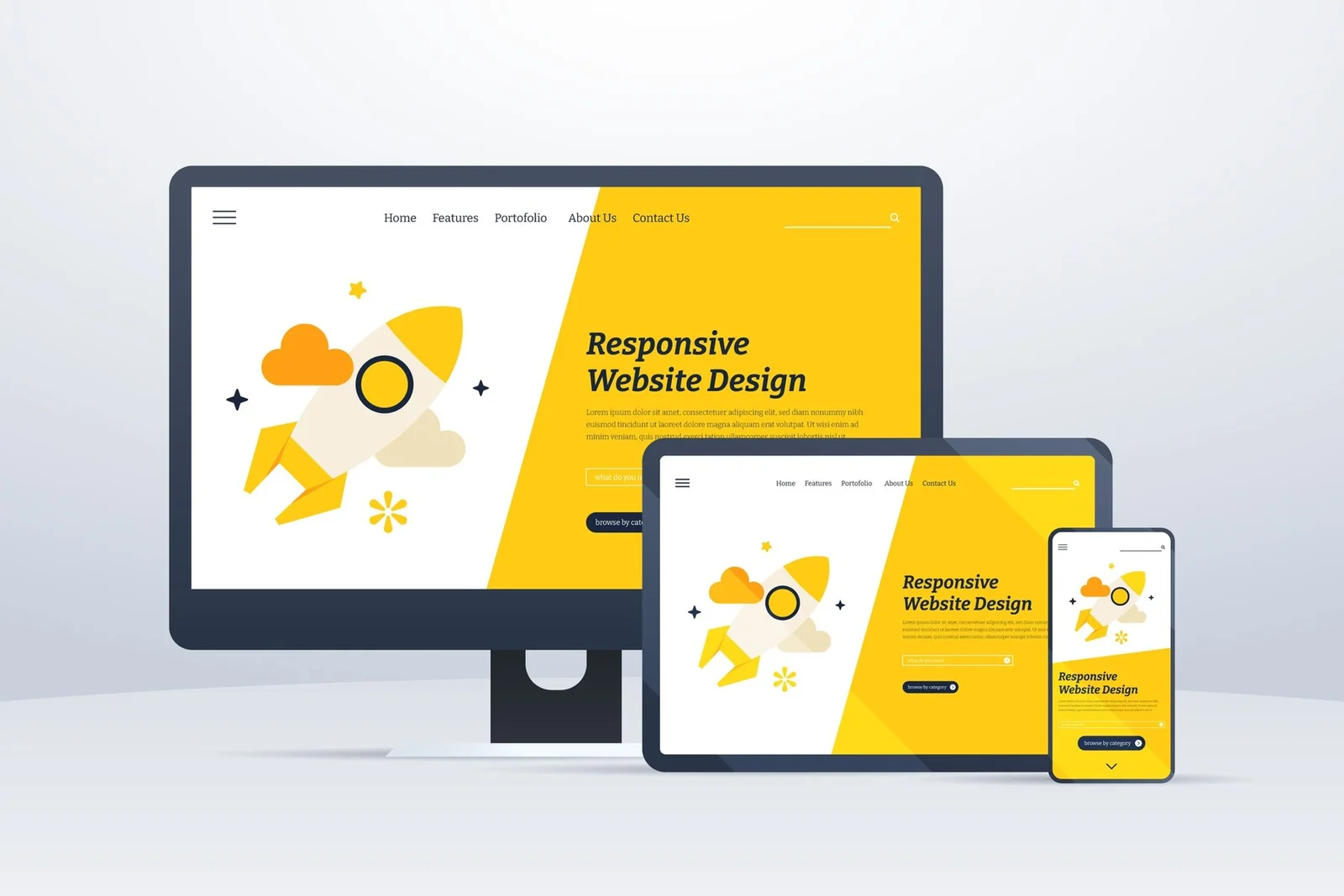
In today’s digital landscape, where smartphones and tablets dominate, having a responsive design for your website is no longer a luxury—it’s a necessity. For business owners, marketers, and startup founders, understanding the importance of responsive design can mean the difference between engaging visitors and losing them to competitors. This article delves into why responsive design is vital and offers strategies to ensure your website performs flawlessly on all devices.
The Importance of Responsive Design
User Experience (UX) Matters
Imagine visiting a website on your smartphone, only to find that the text is too small to read, images are out of place, and navigation is nearly impossible. This frustrating experience is a direct result of non-responsive design. In contrast, responsive design adapts to different screen sizes, ensuring that your site looks and functions well on any device.
Key Benefits:
Enhanced Usability: Easy navigation and readability improve user satisfaction.
Increased Engagement: Visitors are more likely to stay longer and interact with content.
Higher Conversions: A seamless experience can lead to higher conversion rates.
Explore More: Importance of UX Design

SEO Advantages
Google has shifted to a mobile-first indexing strategy, meaning it predominantly uses the mobile version of a website for indexing and ranking. A responsive design ensures that your site is optimized for mobile, which can positively impact your search engine rankings.
SEO Benefits:
Improved Rankings: Mobile-friendly sites are favored by search engines.
Reduced Bounce Rate: Better UX means visitors are less likely to leave quickly.
Faster Load Times: Responsive sites often load faster, further boosting SEO.
Explore More: Mobile-First Indexing
Cost-Effective and Future-Proof
Maintaining separate websites for desktop and mobile can be costly and time-consuming. Responsive design eliminates the need for multiple versions, reducing maintenance efforts and costs. Additionally, as new devices emerge, a responsive design will adapt, making your site future-proof.
Cost Efficiency:
Single Codebase: Easier to manage one responsive site than multiple versions.
Long-Term Savings: Reduced development and maintenance costs over time.
Adaptability: Automatically adjusts to new devices and screen sizes.
Explore More: Benefits of Responsive Design

Strategies for Ensuring Flawless Performance on All Devices
Fluid Grids and Flexible Layouts
A fluid grid is the foundation of responsive design. Instead of fixed-width layouts, fluid grids use relative units like percentages to ensure elements resize proportionally to the screen size.
Implementation Tips:
Use Percentages: Define widths and heights in percentages rather than pixels.
Flexbox or Grid Layout: Utilize CSS Flexbox or Grid for flexible and efficient layouts.
Test Across Devices: Continuously test your design on various devices to ensure consistency.
Explore More: CSS Grid Layout Guide
Responsive Images and Media
Images and media play a crucial role in web design but can pose challenges in responsiveness. Ensure that media elements scale appropriately and maintain quality across different devices.
Best Practices:
Use Scalable Vector Graphics (SVG): SVGs are resolution-independent and scale well.
Set Max-Width: Use CSS to set the max-width of images to 100% to ensure they resize.
Source Set Attribute: Utilize the `srcset` attribute to serve different image sizes based on device capabilities.
Explore More: Responsive Images Guide

Media Queries
Media queries are CSS techniques that allow you to apply styles based on the characteristics of the device, such as screen width, height, and orientation.
How to Use:
Breakpoints: Define breakpoints where the layout adjusts to different screen sizes (e.g., 320px, 768px, 1024px).
Custom Styles: Apply custom styles at each breakpoint to optimize the design for specific devices.
Responsive Typography: Adjust font sizes and line heights to enhance readability on smaller screens.
Explore More: Media Queries Documentation

Touch-Friendly Navigation
Designing for touchscreens requires larger clickable areas and intuitive navigation to enhance the user experience on mobile devices.
Design Tips:
Larger Buttons: Ensure buttons and links are large enough to be easily tapped.
Simplified Menus: Use collapsible menus and off-canvas navigation to save space.
Swipe Gestures: Incorporate swipe gestures for common actions like scrolling through galleries.
Explore More: Touch-Friendly Design Principles

Performance Optimization
Performance is critical for mobile users, who often have slower internet connections. Optimizing your site’s performance ensures quick load times and a smooth experience.
Optimization Techniques:
Minimize HTTP Requests: Reduce the number of elements on the page to decrease load times.
Lazy Loading: Load images and media only when they enter the viewport.
Optimize CSS and JavaScript: Minify and compress CSS and JavaScript files to reduce their size.
Explore More: Web Performance Optimization
Real-Life Examples of Responsive Design
Starbucks
Starbucks’ website is a prime example of responsive design. It seamlessly adapts to different screen sizes, maintaining a consistent user experience across devices. The site features fluid grids, responsive images, and touch-friendly navigation, making it easy for users to browse menus and place orders on any device.
Explore Starbucks’ Responsive Design: Starbucks
Apple
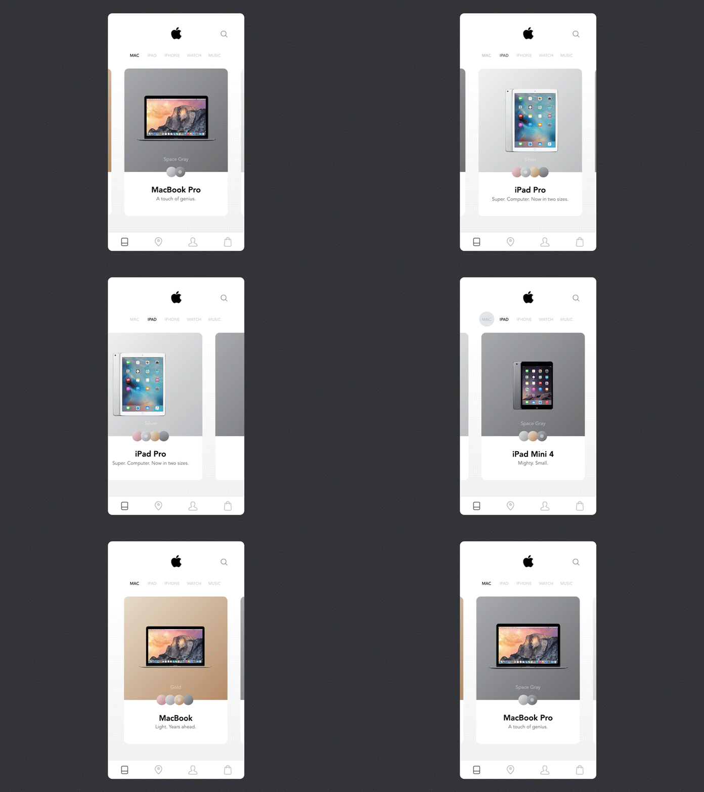
Apple’s website exemplifies responsive design with its clean layout, high-quality visuals, and fluid navigation. The site adjusts flawlessly to various screen sizes, providing an optimal experience whether you’re browsing on a desktop, tablet, or smartphone.
Explore Apple’s Responsive Design: Apple

Tattly
Tattly, a temporary tattoo company, uses responsive design to showcase its products beautifully on all devices. The site employs fluid grids, responsive images, and media queries to ensure that the shopping experience is enjoyable and intuitive, regardless of the device used.
Explore Tattly’s Responsive Design: Tattly

Conclusion
In a mobile-first world, responsive design is crucial for businesses aiming to engage their audience and achieve success online. By enhancing user experience, boosting SEO, and offering cost-effective solutions, responsive design ensures your website performs flawlessly on all devices. Implementing strategies like fluid grids, responsive images, media queries, touch-friendly navigation, and performance optimization can help you create a seamless and engaging experience for your visitors.
Ready to embrace the power of responsive design? Start implementing these strategies today and transform your website into a dynamic, user-friendly platform that captivates audiences and drives conversions.
