In the fast-paced arena of business, a brand’s survival hinges on its ability to evolve. Let’s explore the transformative journeys of several companies in 2024, each reimagining their identity and leaving a lasting impact in their respective industries. These case studies from &above, Eurostar, &Walsh, Wise, Leeum Museum of Art, Camp, Natural History Museum, and Venmo reveal strategies that business leaders can learn from and apply.
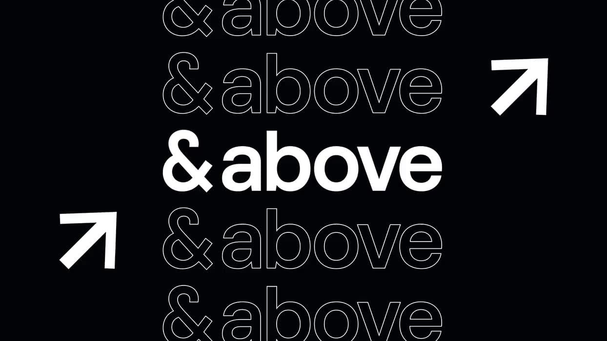
&above: Integrating Art and Technology
London-based creative firm &above merged artistic inspiration with cutting-edge tech aesthetics in its rebrand. Drawing from Japanese Hokusai paintings, the new visual identity employs minimalistic natural elements, embodying creativity and innovation. The ‘&’ symbol, paired with a sleek font, represents seamless service integration. This rebranding demonstrates the power of blending tradition with modernity to exceed client expectations.
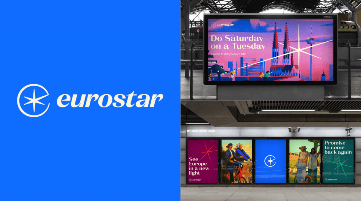
Eurostar: Harmonizing Legacy and Innovation
Eurostar’s rebrand, featuring an animated compass star logo, artfully merges the vintage charm of French Riviera posters with modern design. This strategic use of classic typefaces and evocative wordmarks targets affluent, nostalgic travelers, proving that respecting brand heritage while integrating contemporary elements can captivate and expand a customer base.
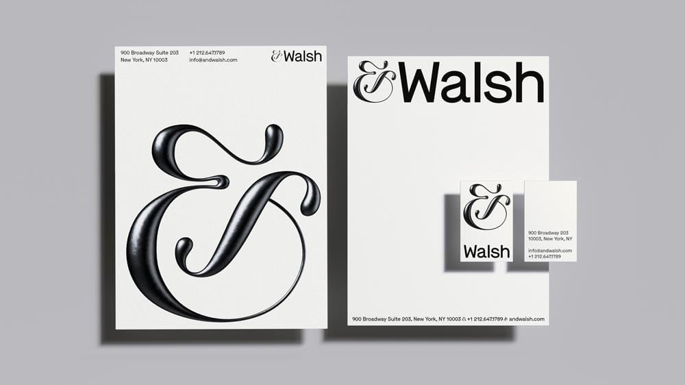
&Walsh: Crafting a Human-Centric Approach
Focusing on inclusivity, &Walsh’s rebrand as a tech company highlights a queerness-inspired aesthetic without overt symbols. The modern yet retro design with unique green and yellow tones illustrates the importance of authentic representation, avoiding superficial trends. This approach emphasizes the need for socially aware branding that resonates deeply with target communities.
Wise: Simplicity Meets Quirkiness
Wise revamped its image with green typography reminiscent of dollar bills, balanced with flat colors and quirky 3D illustrations. This rebrand, executed by a sophisticated brand identity studio, enhances trust and authenticity, reinforcing Wise’s position as a reliable financial service provider across global markets.

Leeum Museum of Art: Bold and Unconventional
The Leeum Museum of Art’s rebrand was bold, featuring a circular, animated logo that defied traditional branding norms. Despite initial controversy, the design’s flexibility and connection to architectural shapes symbolize the museum’s role in uniting people through art. This case underscores the potential of daring, unconventional strategies in creating memorable brand identities.
Camp: Injecting Fun into Family Branding
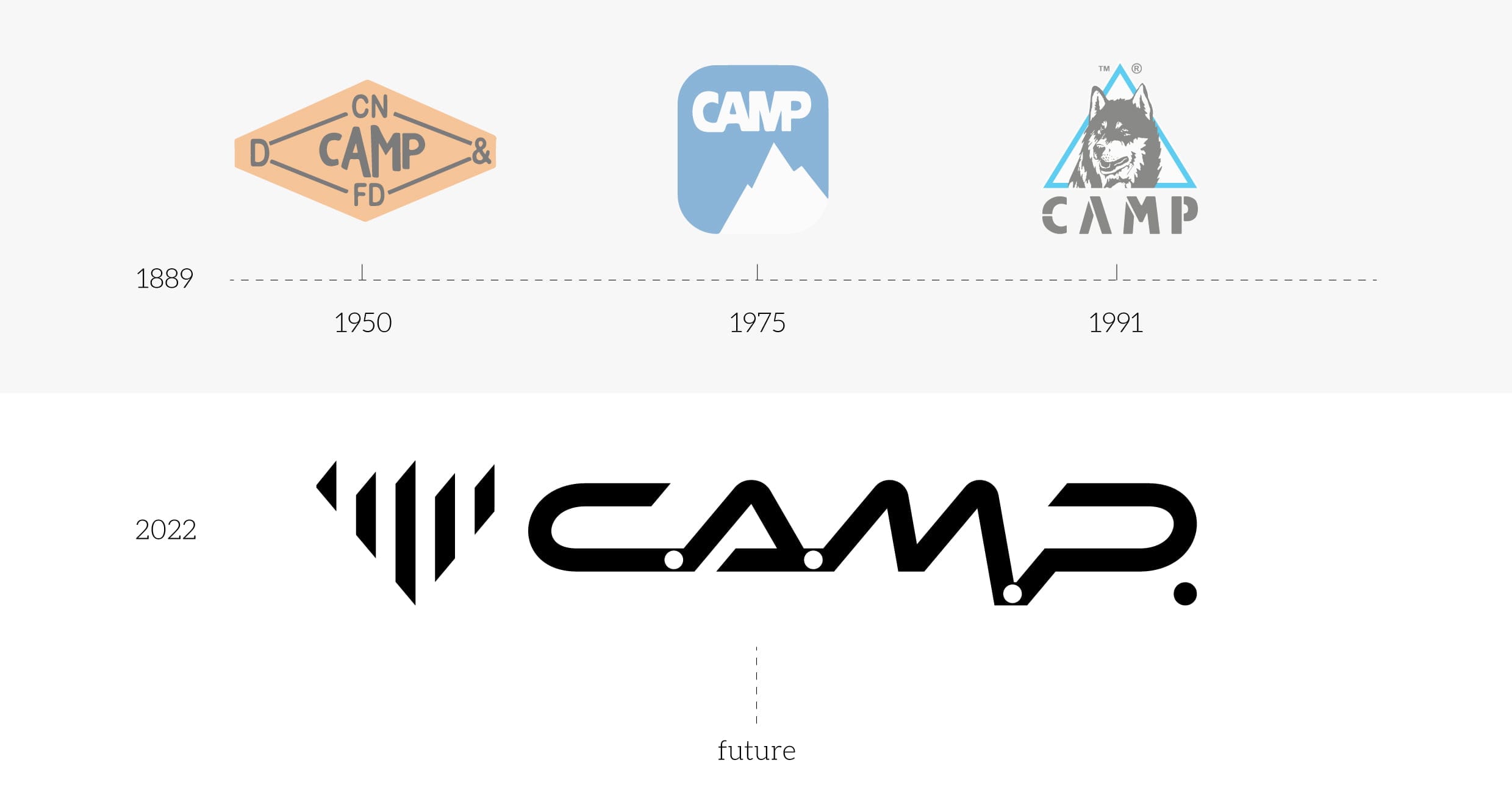
Camp’s rebranding brought vibrant colors and strong typography to the often dull family-focused market. By embracing retro styles attractive to parents, Camp crafted an engaging and playful identity. This demonstrates the effectiveness of rebranding in transforming perceptions and creating a cohesive, multi-generational brand experience.
Natural History Museum: Redefining Museum Imagery
Designed by a prominent london branding agency, the Natural History Museum’s rebrand stripped back traditional imagery to a dynamic, animated identity. By transforming letters into vibrant symbols like fireworks, this bold move sparked widespread recognition and conversation, exemplifying the impact of visually exciting branding strategies.

Venmo: Making Finance Fun
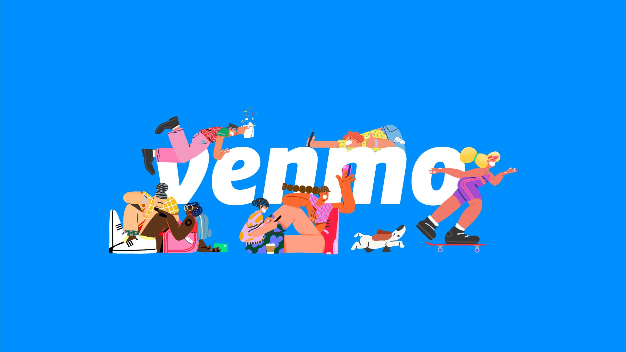
Venmo’s rebrand tackled the often awkward subject of money with a playful approach, employing vibrant colors and scenarios. This shift away from traditional monetary associations aligns with changing consumer attitudes, making financial transactions feel approachable and enjoyable. It reflects the importance of aligning brand identity with evolving cultural narratives.
Key Takeaways for Businesses
Blend Tradition with Modernity: As showcased by Eurostar and &above, merging heritage with contemporary elements can create a powerful brand presence.
Authentic Representation: &Walsh illustrates the importance of genuine, socially aware branding that resonates with target audiences.
Bold Creativity: Like Leeum Museum of Art and Natural History Museum, daring to defy norms can lead to standout brand identities.
Playful Engagement: Camp and Venmo highlight how injecting fun into branding can transform consumer perceptions and foster brand loyalty.

Conclusion
For companies ready to embark on their own rebranding journey, partnering with a corporate identity agency or brand identity development agency can provide the expertise needed to navigate this complex process. Whether through visual identity design agency services or collaborating with a brand design consultation, the future of your brand is ripe with possibility. Embrace the change, craft a story that resonates, and let your brand flourish in today’s dynamic marketplace.
