Everything You Need to Know
About Color Gradients
Color gradients have become increasingly popular in design over the past few years, but where did they come from? What do they mean? And how can you use them effectively in your own designs? In this blog post, we’ll take a look at the history of color gradients, the different types and meanings behind them, and the best practices for using them.

History of Color Gradients
Color gradients have been around since ancient times. The first gradient used in art was probably a type of black-to-white gradient called “shading”, used by ancient Greek sculptors to create a three-dimensional effect. However, it wasn’t until the invention of the computer that color gradients became widely used in design.
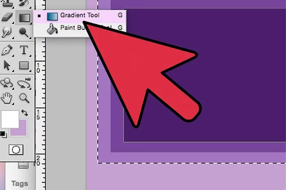
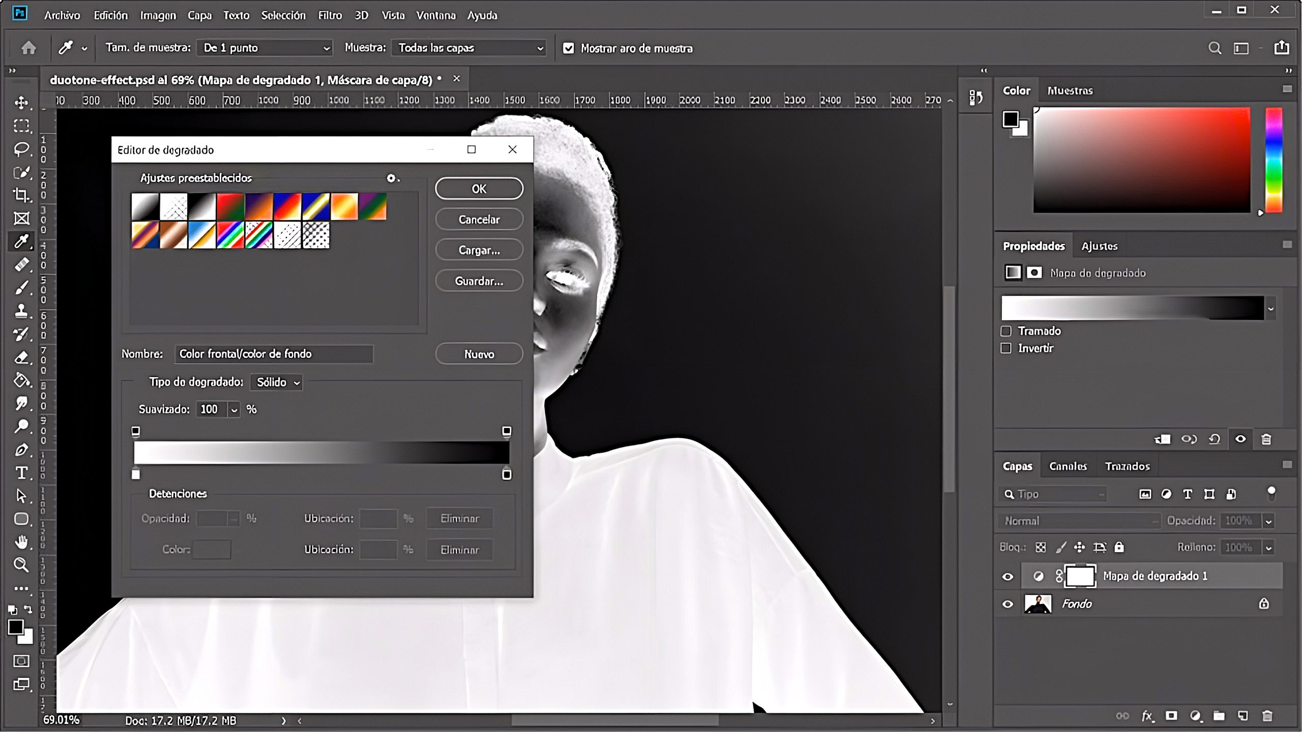
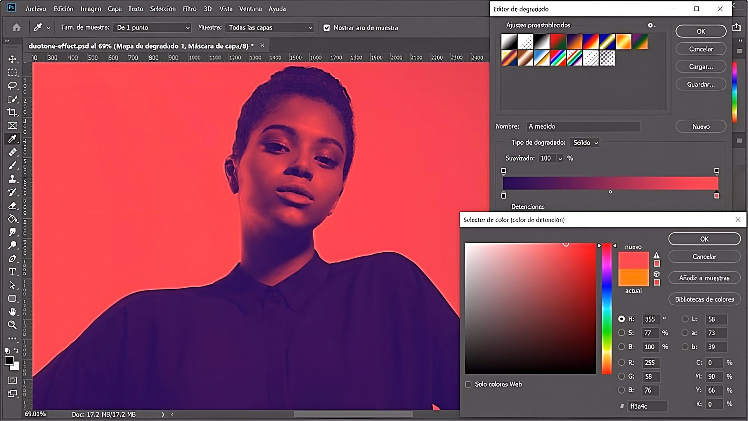
In 1987, Adobe Photoshop introduced a “gradient fill” tool, which allowed designers to create smooth transitions between two or more colors. This feature quickly became popular with graphic designers, who began experimenting with different types of gradients and ways to use them in their designs.
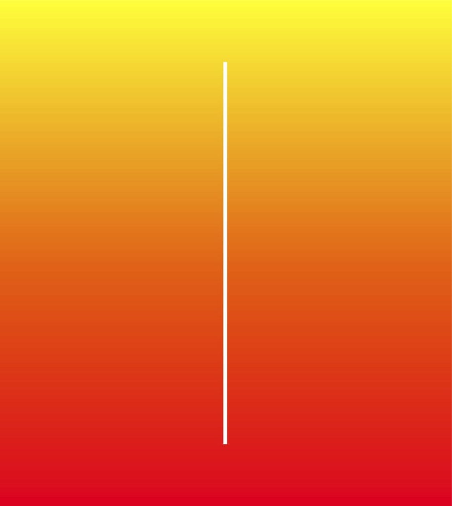
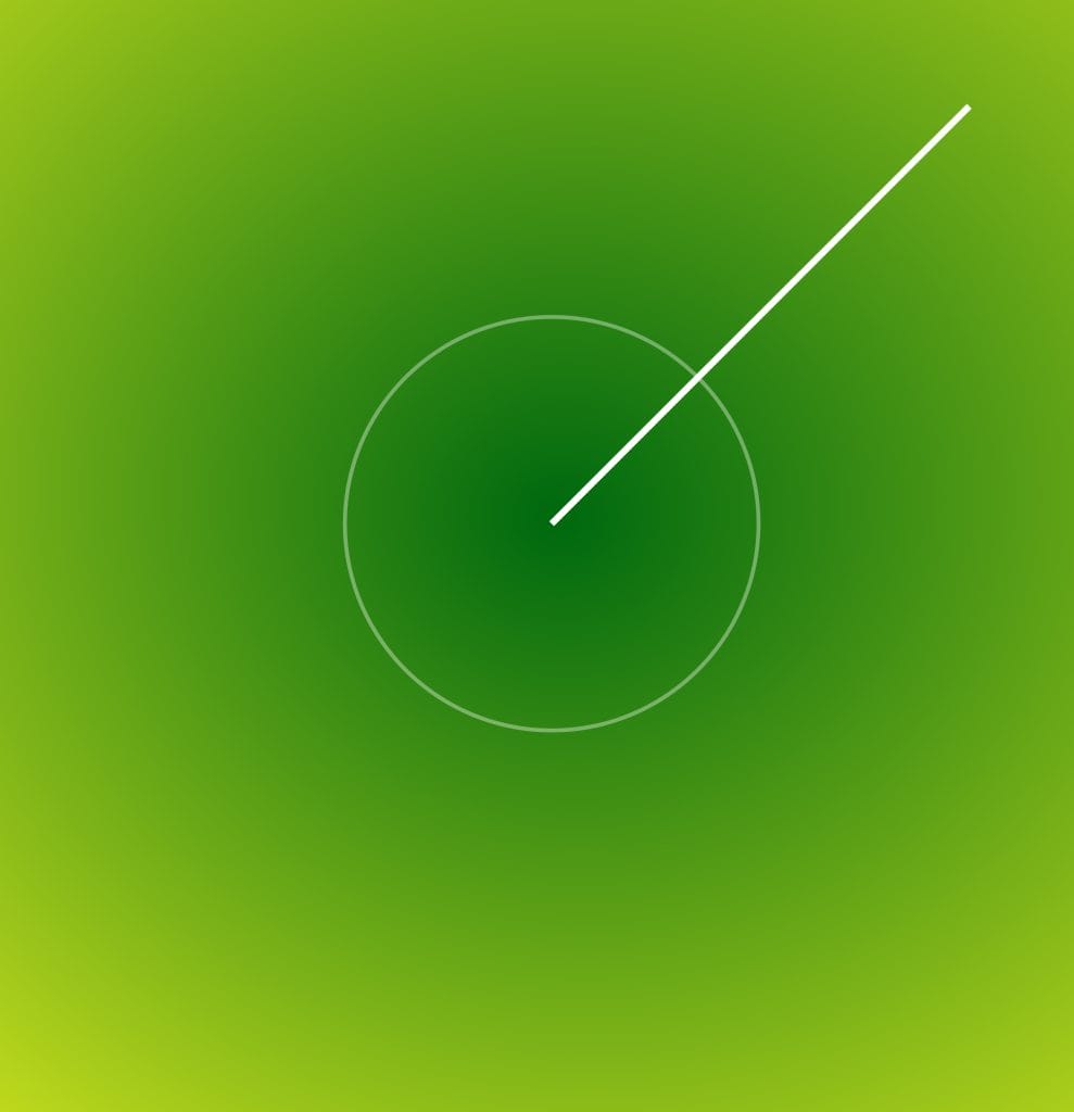
Color gradients are often associated with feelings such as harmony and balance because they create a sense of flow between colors. They can also convey energy, joy, excitement, and optimism. There are many different types of color gradients, including linear (horizontal or vertical), radial (circular), and angled (diagonal). Each class has unique looks and feels, so choosing one that fits your design aesthetic is vital.
Usage & Tendencies
When it comes to using color gradients in design, it is crucial to consider the purpose of your project before selecting colors. Certain shades can evoke different emotions or connotations, so it is essential to consider how your audience will interpret your design before deciding color choices. Additionally, some common trends exist when using color gradients, such as using bright colors for buttons or headers or creating subtle transitions between shades for background images or illustrations.
How to choose & what NOT to do
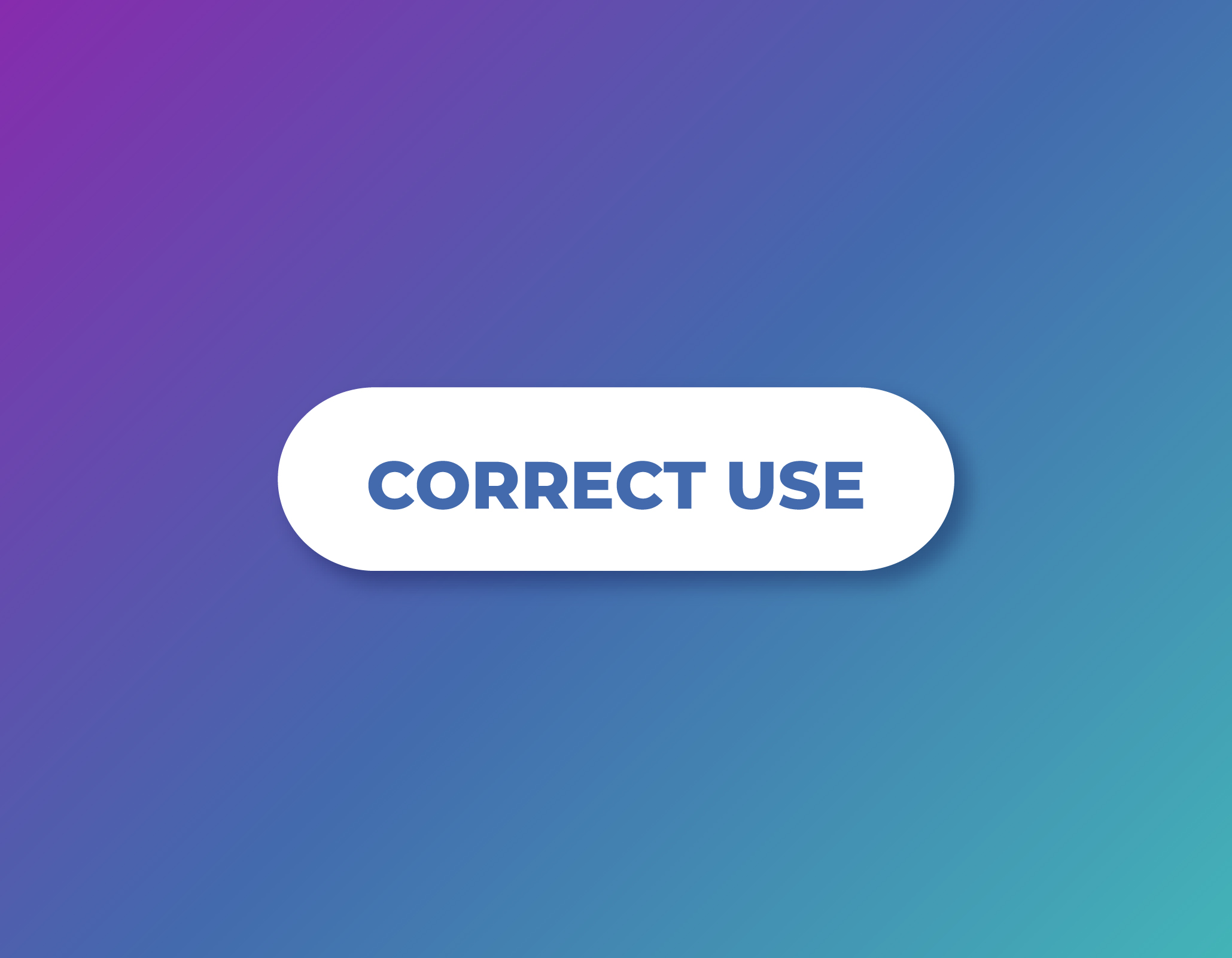
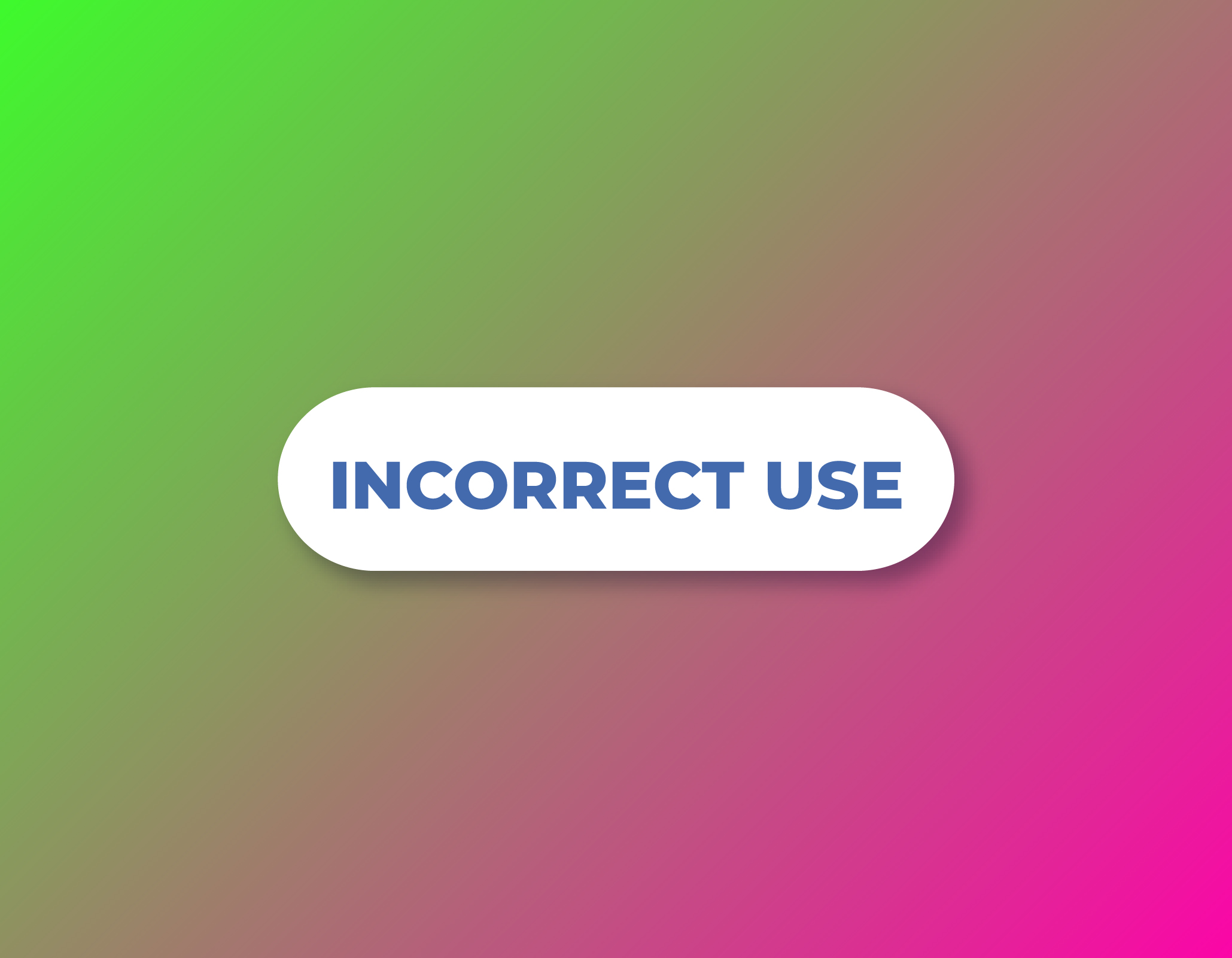
It is important not to get too carried away when choosing colors for your gradient—too many colors can make the transition look cluttered or overwhelming, so try sticking to no more than four shades per gradient if possible. Additionally, try not to mix too many hues together—keeping the palette consistent will give your project a unified look and feel while still allowing you plenty of room for creativity! Another tip is not to mix warm and cool tones together; this can give off an unbalanced vibe and detract from the overall aesthetic of your design.
Conclusion
In conclusion, color gradients offer designers endless possibilities when creating beautiful visuals that evoke emotion and impact viewers on an emotional level. By understanding their history, their different meanings, and usage trends, you will be better equipped when selecting colors for your projects to create stunning designs that stand out from the crowd! With these tips in mind, you will be well on your way toward becoming an expert at creating gorgeous color gradients!