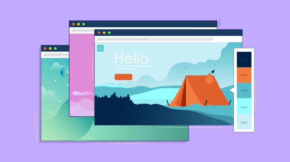
In the vibrant and ever-evolving world of web design, color plays a pivotal role in shaping how users perceive and interact with a brand online. As we step into 2024, fresh and exciting color trends are emerging, offering new ways to captivate and engage audiences. This year, colors are not just about aesthetics; they’re about creating emotional connections and enhancing user experiences. Let’s explore the hottest color trends in web design and how you can incorporate them into your website for a modern, cutting-edge look.
The Power of Color in Web Design
Before diving into the trends, it’s important to understand why color is so crucial in web design. Colors can evoke emotions, convey messages, and even drive decisions. For businesses, choosing the right color palette can mean the difference between capturing attention and blending into the background. A strategic use of color can enhance brand recognition, influence perceptions, and guide users through a website effortlessly. Utilizing tools and insights from a design agency in the US can help you master the art of color in web design.
Trending Colors of 2024
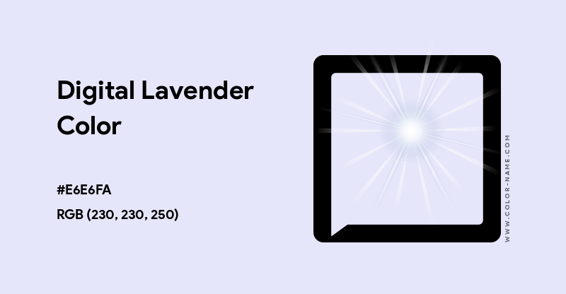
Digital Lavender
Digital Lavender is set to dominate the web design landscape in 2024. This calming hue, reminiscent of tranquility and relaxation, is perfect for brands looking to create a soothing online presence. Its subtlety makes it versatile, pairing well with both bold and neutral colors. Incorporating Digital Lavender into your design can exude a sense of calm and reassurance, ideal for wellness brands.
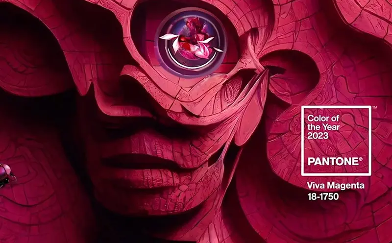
Viva Magenta
Viva Magenta, with its vibrant and bold presence, is all about making a statement. This color is ideal for brands that want to stand out and assert their identity. It’s energetic, lively, and can be used to draw attention to key elements like call-to-action buttons. A website design agency in the USA can provide guidance on balancing this bold shade with other elements to maintain harmony.
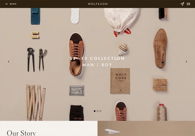
Warm Earth Tones
In 2024, the trend towards sustainability and nature-inspired aesthetics continues with the rise of warm earth tones. Colors like terracotta, sage, and mustard are popular choices for brands aiming to foster a connection with nature. These tones are grounding and can be used to create an inviting and organic feel, perfect for eco-friendly businesses.
Neon Accents
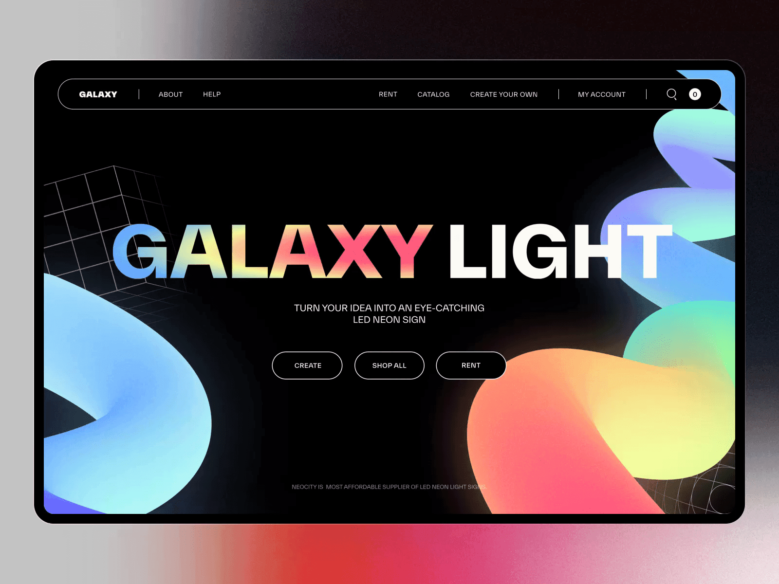
While neon colors might seem retro, they’re making a comeback as striking accents in web design. Neon greens, pinks, and blues add a futuristic flair, particularly when used sparingly against dark backgrounds. This trend is well-suited for tech and innovation-driven brands looking to convey modernity and excitement.
Monochromatic Palettes
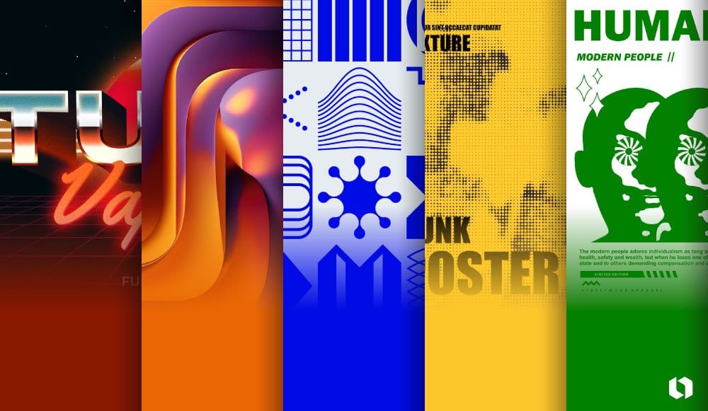
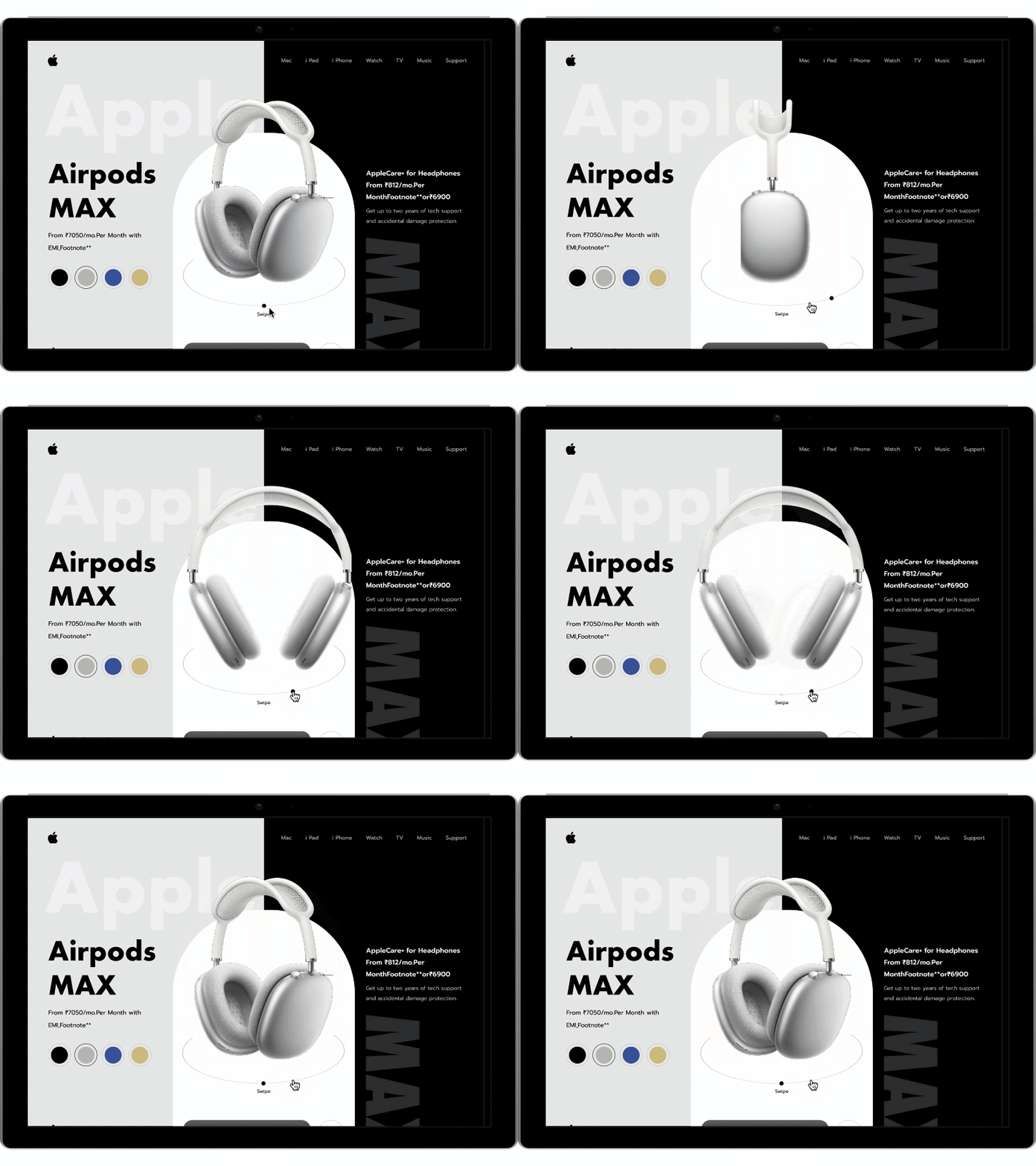
Monochromatic color schemes are gaining traction for their simplicity and elegance. Using varying shades of a single color can create a cohesive and sophisticated look. This approach is particularly effective for minimalist designs, where focus and functionality are paramount.
Incorporating Color Trends into Your Website
Now that we’ve explored the trending colors, the next step is integrating them into your web design effectively. Here are some strategies to ensure your color choices not only look modern but also enhance user experience:
Align with Brand Identity
Ensure your color choices reflect your brand’s personality and values. For instance, if sustainability is a core value, incorporating warm earth tones can reinforce this message. Consulting with a digital marketing and website development expert can align your color strategy with your overall brand identity.
Use Color Psychology
Understand the psychological effects of color on users. For example, blue is often associated with trust and reliability, making it suitable for financial services. By leveraging color psychology, you can influence user perceptions and behaviors, creating a more engaging experience.
Balance and Contrast
Achieve visual harmony by balancing bold and neutral tones. Use contrasting colors to highlight important elements, such as navigation menus or calls to action. This technique ensures key features stand out without overwhelming the user.
Accessibility Considerations
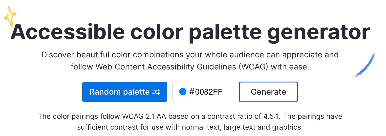
Ensure your color scheme adheres to accessibility standards, providing sufficient contrast for users with visual impairments. Tools like the [Web Content Accessibility Guidelines (WCAG)](https://www.w3.org/WAI/) can help assess the accessibility of your color choices.
Stay Consistent
Maintain consistency across all brand touchpoints, from your website to social media and marketing materials. Consistency reinforces brand recognition and creates a seamless user experience.
Real-World Examples and Inspirations
Spotify: Known for its bold use of neon green, Spotify’s design captures attention and reinforces its dynamic brand image.
Apple: With its sleek, monochromatic palettes, Apple maintains a minimalist yet sophisticated look that speaks to innovation and elegance.
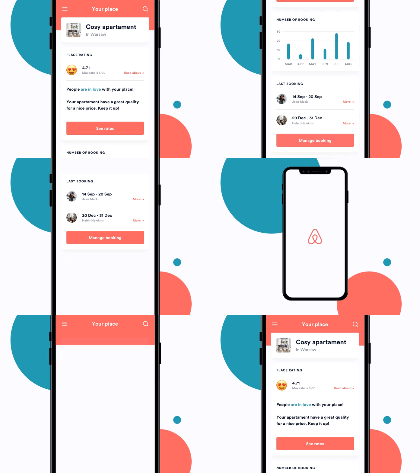
Airbnb: Utilizing warm earth tones, Airbnb creates a welcoming and homely atmosphere that aligns with its brand promise of belonging.
Conclusion
Color is a powerful tool in web design, offering limitless possibilities to express your brand’s identity and connect with your audience. By embracing the color trends of 2024, businesses can revitalize their digital presence and stay ahead in the competitive online landscape. Whether opting for the calming Digital Lavender or the bold Viva Magenta, ensure your color choices enhance your brand story and resonate with your target audience.
As you explore these trends, consider partnering with a web design consultancy to refine your color strategy and ensure your website not only looks modern but also delivers a compelling user experience. Remember, in the world of web design, color is more than just a visual element—it’s a strategic asset that can transform your digital success.
