In the world of design and marketing, the right font can be the unsung hero behind every successful brand. Just as a soft melody can evoke emotion or a bold headline can capture attention, typography has the power to influence perception and communicate your brand’s essence. Whether you’re a designer creating visual harmony, a marketer crafting compelling narratives, or a small business owner establishing brand identity, understanding the psychology of fonts is crucial. In this post, we’ll explore how fonts speak to your audience, shape brand perception, and enhance user experience.
The Silent Communicator
Typography is more than just letters on a page; it’s the silent communicator of your brand’s personality. A font can whisper elegance, shout excitement, or murmur reliability. But how does it do this? The answer lies in psychology. Fonts evoke emotions and memories, subtly influencing how a brand is perceived. For instance, a luxury brand might choose a serif font, symbolizing tradition and heritage, while a tech startup might lean towards a sleek sans-serif, conveying modernity and innovation.
Understanding Typography's Role in Branding
Fonts are like colors, each carrying an emotional palette. With their classic lines and formal structure, Serif fonts often evoke trust and respect. They tell stories of history and prestige. On the other hand, sans-serif fonts—clean and straightforward—speak the language of clarity and modernity. They resonate with audiences seeking simplicity and directness. Then we have script and decorative fonts, which add playfulness or sophistication, capturing attention with their uniqueness.
The Influence of Font Size and Weight
Beyond the typeface, size, and weight play pivotal roles in the psychology of fonts. Larger fonts command authority and grab attention, perfect for headlines and calls to action (CTAs). Meanwhile, smaller fonts can suggest intricacy and detail. Bold fonts convey strength and emphasis, while lighter weights express elegance and subtlety. It’s a delicate balance, where each choice echoes the brand’s voice.
Cultural Nuances in Typography
Cultural context also shapes how fonts are perceived. A font that resonates with one demographic might not have the same impact on another. For example, a traditional script might appeal to an audience valuing heritage, whereas a minimalist sans-serif might attract those drawn to modern aesthetics. Understanding these cultural nuances ensures your typography speaks to the right audience in their language.
Aligning Fonts with Brand Personality
Choosing the perfect font requires more than aesthetic preference; it’s about aligning typography with your brand’s personality. Here’s how you can make informed decisions:
Defining Your Brand Voice
Your brand voice is the foundation of your typography choices. Is your brand playful or serious? Innovative or traditional? Determining these traits helps narrow down font options. A playful brand may opt for whimsical script fonts, while a serious one might gravitate towards authoritative serifs.
Exploring Font Families
Once you’ve defined your brand voice, explore font families that align with it. Serif fonts offer a range of emotions, from sophisticated to authoritative. Sans-serif fonts provide clarity and modernity. Script fonts add elegance and creativity, while decorative fonts make bold statements. The key is finding a font family that encapsulates your brand’s essence.
Testing for Versatility
Versatility is crucial in typography. Your chosen font should work seamlessly across various mediums, from digital platforms to print materials. Test how it looks in different sizes and weights. Ensure readability on both large banners and small business cards. A versatile font maintains consistency, reinforcing your brand identity.

Enhancing User Experience with Thoughtful Typography
Typography isn’t just about aesthetics; it’s a tool to enhance user experience. A font choice can guide users effortlessly through content or create friction. Here’s how to ensure your typography elevates user experience:
Ensuring Readability
Readability is paramount. Users should effortlessly consume your content without straining their eyes. Choose fonts with clear letterforms and ample spacing. Avoid overly decorative fonts for long paragraphs. Maintaining a balance between style and function ensures your message is delivered effectively.
Creating Visual Hierarchy
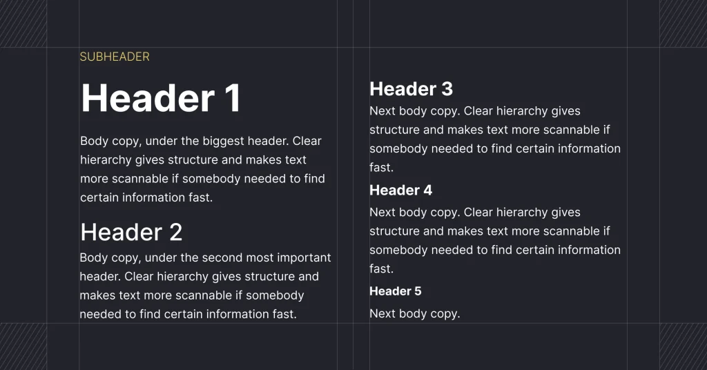
Typography can establish a visual hierarchy, guiding users through your content. Use different font weights and sizes to differentiate headings, subheadings, and body text. This hierarchy helps users scan information and understand its importance. A well-structured hierarchy enhances navigation and comprehension.
Balancing Consistency and Variety
Consistency in typography creates a cohesive brand experience, while variety adds interest. Use a consistent font family throughout your materials, but introduce subtle variations to highlight key points. For instance, use bold for emphasis or italics for quotes. This balance keeps your content engaging without overwhelming readers.

Real-World Examples of Effective Typography in Branding
Let’s explore some real-world examples where typography has played a pivotal role in shaping brand identity:
Coca-Cola Timeless Elegance
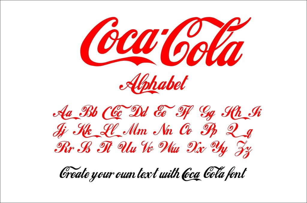
Coca-Cola’s script font is iconic, embodying the brand’s heritage and timelessness. The flowing curves and classic style evoke nostalgia, creating an emotional connection with consumers. This font choice reinforces Coca-Cola’s position as a global beverage leader.
Apple Modern Simplicity
Apple’s sleek sans-serif fonts reflect its commitment to modernity and innovation. The clean lines and minimalistic approach align with Apple’s brand ethos, creating a sense of sophistication and cutting-edge technology. This typography choice resonates with tech-savvy audiences worldwide.
Disney Playful Imagination
Disney’s whimsical script font captures the enchantment and wonder of its brand. The playful curves and decorative elements evoke a sense of magic, appealing to audiences of all ages. This font choice reinforces Disney’s position as a leader in family entertainment.

Conclusion
Finding Your Brand's Visual Voice
Typography is not just about letters; it’s about finding your brand’s visual voice. The right font can whisper your brand’s personality, evoke emotions, and create lasting memories. By understanding the psychology of fonts, you can choose typography that aligns with your brand’s identity and enhances user experience.
Remember, your font choices should reinforce your brand voice, ensuring a consistent and authentic representation across all mediums. Consider factors like emotional associations, cultural nuances, and user experience. Test your typography choices for versatility and readability. And look to real-world examples for inspiration.
By harnessing the power of fonts, you can create a brand identity that resonates with your audience and leaves a lasting impression. Explore the endless possibilities of typography and watch your brand’s visual voice come to life.

