In the ever-evolving landscape of digital marketing, mobile optimization has emerged as an indispensable component of a successful online presence. For business owners, marketers, and startup founders, understanding the necessity of mobile optimization and implementing best practices is crucial for staying competitive. This blog post will stress the importance of mobile optimization and offer actionable tips for creating a seamless mobile user experience.
Why Mobile Optimization Matters
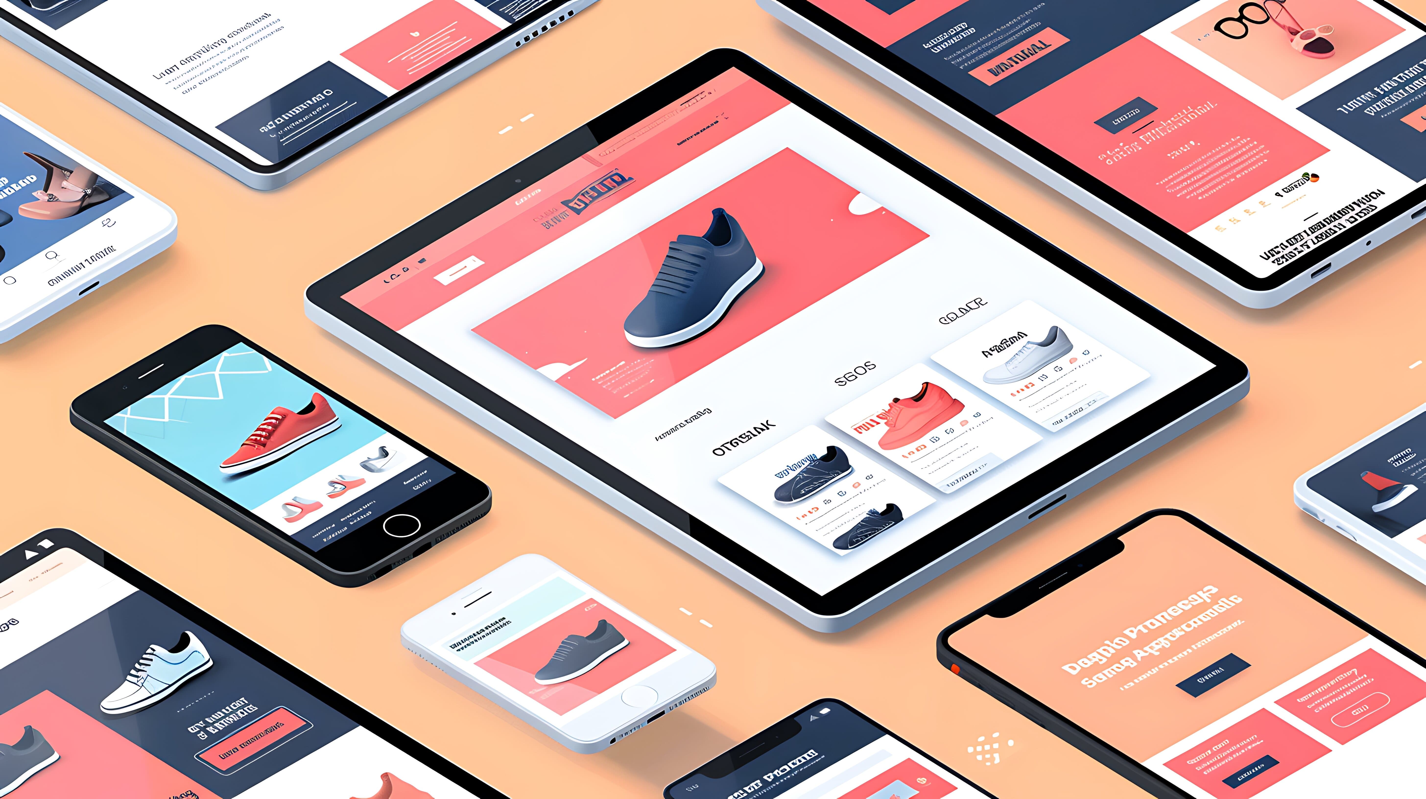
Mobile optimization refers to designing and developing your website to ensure it performs well on mobile devices such as smartphones and tablets. With the growing number of mobile users, neglecting mobile optimization can have severe consequences for your business.
Increased Mobile Traffic: Mobile devices account for over half of global web traffic. If your website isn’t optimized for mobile, you risk losing a significant portion of potential visitors.
Better User Experience: A mobile-optimized website offers a better user experience, leading to higher engagement and lower bounce rates. Users are more likely to stay on your site and convert if they have a positive experience.
Improved SEO Rankings: Google prioritizes mobile-friendly websites in its search results. A mobile-optimized site is more likely to rank higher, attracting more organic traffic.
Competitive Advantage: In a competitive market, a mobile-optimized website can set you apart from competitors who have yet to embrace mobile optimization fully.
Essential Elements of Mobile Optimization
To create a seamless mobile user experience, focus on the following key elements:
Responsive Design
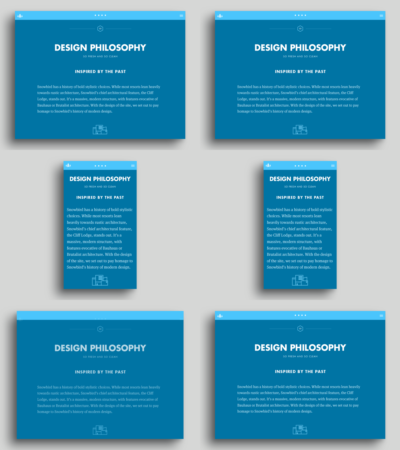
Responsive design ensures your website adapts to different screen sizes and orientations. This approach provides a consistent user experience across all devices.
Flexible Layouts: Use flexible grids and layouts that adjust to the screen size. Avoid fixed-width designs that can lead to horizontal scrolling on mobile devices.
Fluid Images: Ensure images scale appropriately based on the screen size. Use CSS media queries to apply different styles for different devices.
For examples of responsive design, check out agency website design portfolios.
Fast Loading Speeds
Mobile users expect fast-loading websites. Slow loading times can frustrate users and lead to high bounce rates, negatively impacting your SEO rankings.
Optimize Images: Compress images to reduce file sizes without sacrificing quality. Tools like TinyPNG and ImageOptim can help.
Minimize HTTP Requests: Reduce the number of elements on your page, such as scripts, images, and stylesheets. Combine files where possible.
Leverage Browser Caching: Enable browser caching to store static files on users’ devices, reducing load times for returning visitors.
Discover best service website design companies that excel in optimizing site speed.

Simplified Navigation
Mobile users need to find information quickly and easily. Simplify your navigation to enhance the user experience.
Clear Menu Structure: Use a clear and concise menu with easy-to-tap buttons. Consider using a hamburger menu to save space.
Search Functionality: Provide a search bar at the top of the page to help users find what they’re looking for quickly.
Sticky Navigation: Use sticky navigation that remains visible as users scroll, making it easier to access important links.
Explore cool creative websites that prioritize effective navigation.
Touch-Friendly Design
Mobile users interact with websites using touch gestures. Design your site to accommodate touch interactions.
Large Tap Targets: Ensure buttons and links are large enough for users to tap easily. Avoid small clickable areas that can frustrate users.
Spacing: Provide adequate spacing between clickable elements to prevent accidental taps.
Gestures: Incorporate touch gestures like swiping and pinching to enhance the user experience.
Check out unique website design examples that embrace touch-friendly design.
Readability
Ensure your content is easily readable on mobile devices. Small text and cluttered layouts can deter users from engaging with your site.
Font Size: Use a legible font size that doesn’t require users to zoom in. Aim for at least 16px for body text.
Line Height: Provide adequate line height to improve readability. A line height of 1.5 times the font size is a good starting point.
Contrast: Ensure sufficient contrast between text and background to enhance readability, especially in different lighting conditions.
For inspiration, explore best corporate web design portfolios that prioritize readability.

Tips for Effective Mobile Optimization
Implementing mobile optimization involves several best practices. Here are some tips to help you get started:
Test on Multiple Devices
Testing your website on various devices and screen sizes ensures a consistent user experience.
Emulators: Use emulators and simulators to test your site on different devices and browsers.
Real Devices: Test on real devices to get a true sense of how your site performs. Borrow devices from colleagues or use device labs.
Explore graphic design company website examples that undergo rigorous testing.
Optimize Forms for Mobile
Forms are essential for lead generation, but they can be challenging to complete on mobile devices. Simplify your forms to improve the user experience.
ewer Fields: Reduce the number of form fields to minimize user effort. Only ask for essential information.
Auto-Complete: Enable auto-complete and auto-correct features to speed up form completion.
Responsive Layouts: Ensure your forms are responsive and fit well on smaller screens.
Check out best business websites design that excel in mobile form optimization.
Use Mobile-Friendly Pop-Ups
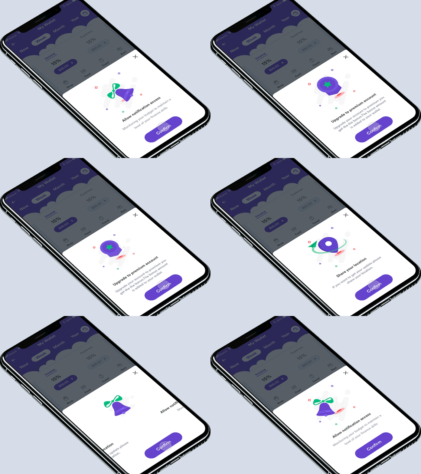
Pop-ups can be effective for capturing leads, but they can also be intrusive on mobile devices. Use mobile-friendly pop-ups to avoid frustrating users.
Exit-Intent Pop-Ups: Use exit-intent pop-ups that appear when users are about to leave the site, rather than interrupting their experience.
Time-Delayed Pop-Ups: Display pop-ups after a certain amount of time or when users scroll down the page.
Easily Dismissible: Ensure pop-ups are easy to close with a clear and accessible close button.
Explore agency web design examples that use mobile-friendly pop-ups effectively.

Leverage Accelerated Mobile Pages (AMP)
AMP is an open-source framework that enables fast-loading mobile web pages. Implementing AMP can significantly improve your mobile site’s performance.
Simplified HTML: Use AMP HTML, a simplified version of HTML, to create fast-loading pages.
Caching: AMP pages are cached by Google, reducing load times for users.
Enhanced SEO: Google prioritizes AMP pages in search results, potentially improving your rankings.
Check out digital agency web design examples that utilize AMP.
Monitor and Analyze Performance
Regularly monitor and analyze your mobile site’s performance to identify areas for improvement.
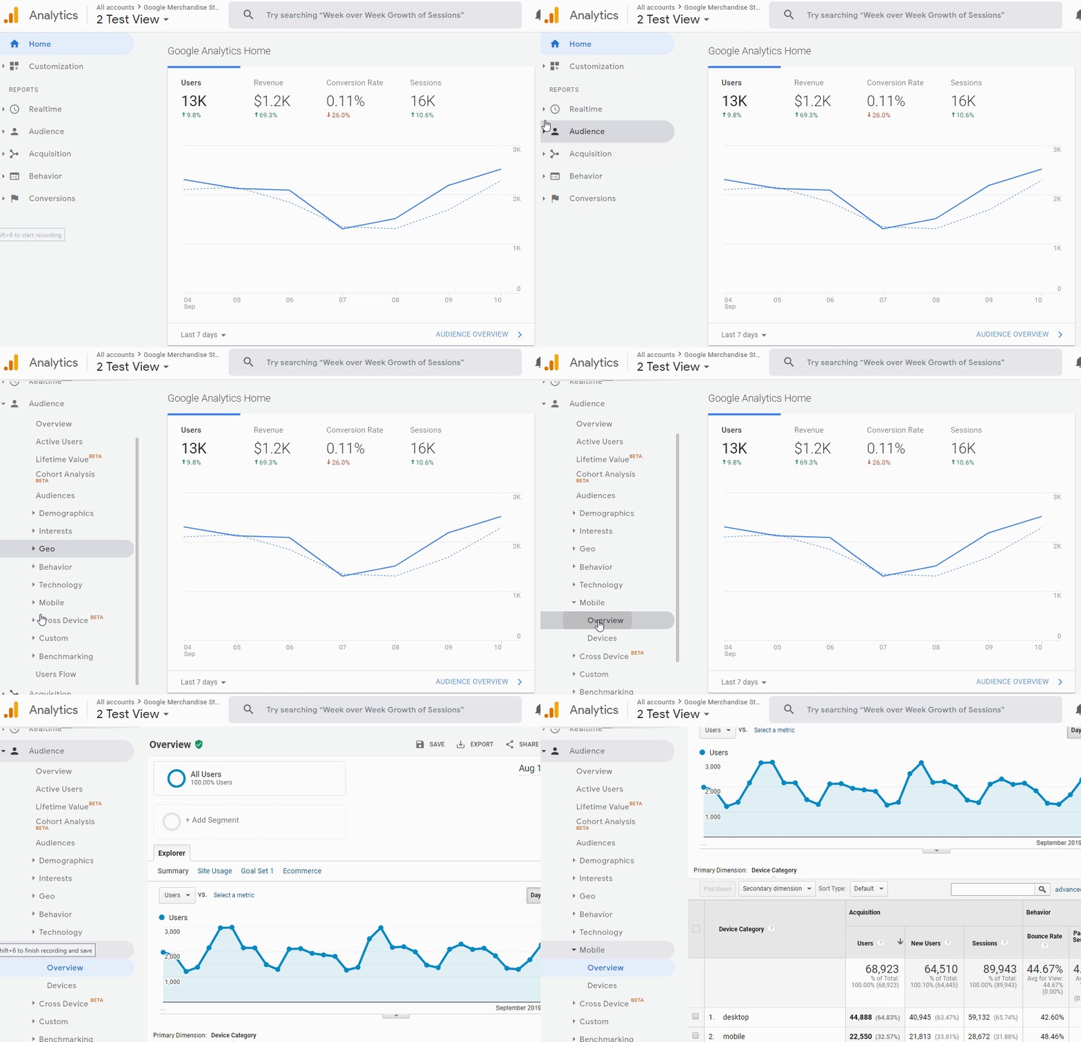
Analytics Tools: Use tools like Google Analytics to track mobile traffic, bounce rates, and user behavior.
Performance Audits: Conduct regular performance audits using tools like Google PageSpeed Insights and Lighthouse.
User Feedback: Gather feedback from mobile users to understand their pain points and improve the experience.
Explore digital agency website examples that prioritize performance monitoring.

Conclusion
Mobile optimization is non-negotiable for modern websites. By implementing responsive design, optimizing loading speeds, simplifying navigation, creating touch-friendly designs, and ensuring readability, you can create a seamless mobile user experience that keeps visitors engaged and drives better results.
Ready to optimize your website for mobile? Partner with a top-tier web design and development agency to create a mobile-optimized site that stands out in today’s competitive market. Explore your options and discover the transformative power of mobile optimization today.

