Typography is a design element that speaks louder than words. It’s the unsung hero of branding, working subtly but powerfully to communicate your brand’s identity, values, and message. Whether you’re scrolling through a website, reading an ad, or holding a business card, the choice of font has an impact on how you perceive the brand behind it.
With 2025 around the corner, typography is evolving like never before. From sleek, futuristic letterforms to warm, retro-inspired styles, fonts are playing an even bigger role in shaping how brands connect with their audiences. This guide dives deep into the role of typography in modern branding, provides tips for choosing the perfect fonts, and highlights 10-15 of the most cutting-edge fonts to watch for in 2025.
By the end, you’ll have a clear understanding of how to harness typography’s potential to elevate your brand and communicate effectively in today’s fast-paced digital world.
Why Typography is Crucial for Branding
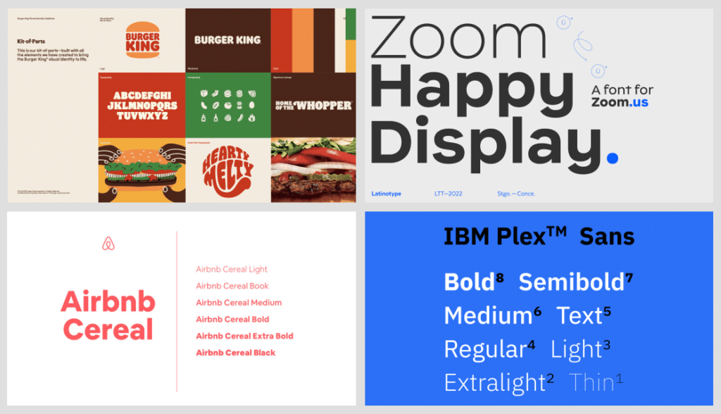
Typography isn’t “just a font.” It’s an essential tool in any designer’s toolkit. While color palettes and logos grab attention, typography carries the message. It creates the foundation for how your brand speaks, both literally and visually.
Key Reasons Typography Matters in 2025
1. First Impressions Are Visual
Most consumers form an impression of a brand within seconds. Your font choice can communicate professionalism, playfulness, sophistication, or innovation—before a single word is read.
2. Consistency Builds Recognition
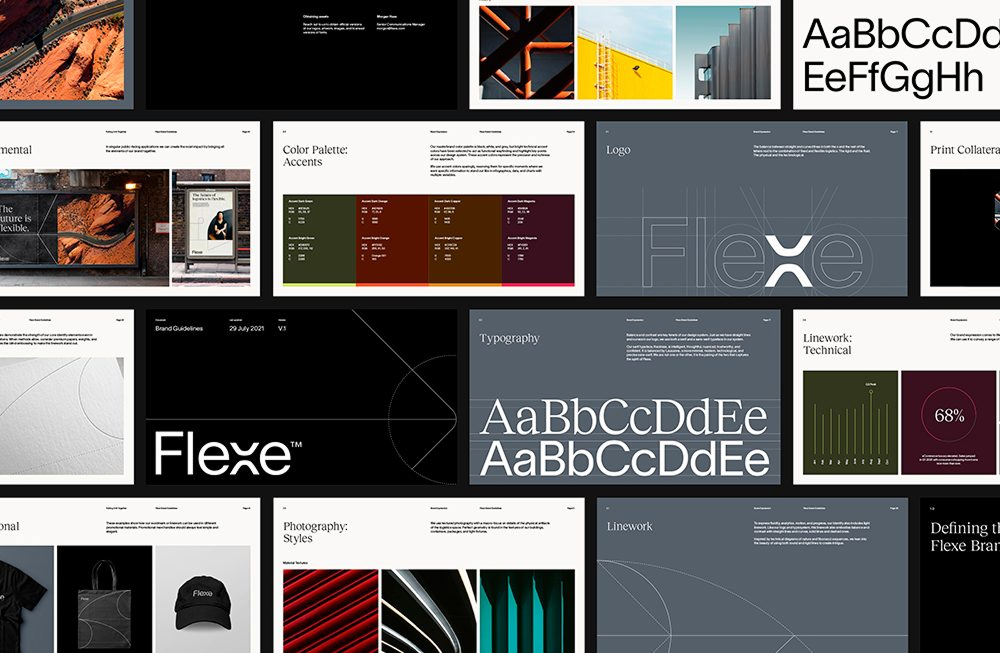
Typography creates consistency across platforms—whether it’s on your website, business cards, social media, or product labels. A cohesive typeface strategy helps consumers remember your brand when they see it again.
3. Emotion and Personality
Fonts evoke emotions. For example, a sleek sans-serif font feels modern and clean, while a script font might feel elegant or nostalgic. For effective branding, your typography should reflect your unique personality and story.
4. Drives Readability and Engagement
Typography affects how easy it is for people to consume your message. Poor font choices result in a frustrating user experience, while intentional choices draw readers in and guide their attention.
5. A Competitive Edge in Crowded Markets
With so many brands vying for attention, standing out isn’t optional—it’s critical. Typography can be the differentiator that makes your brand unforgettable in a sea of sameness.
Tip: If your tone is playful and dynamic, a bold, quirky font will resonate. For a corporate or luxury brand, a clean, elegant typeface might feel more appropriate.
Typography Trends in 2025
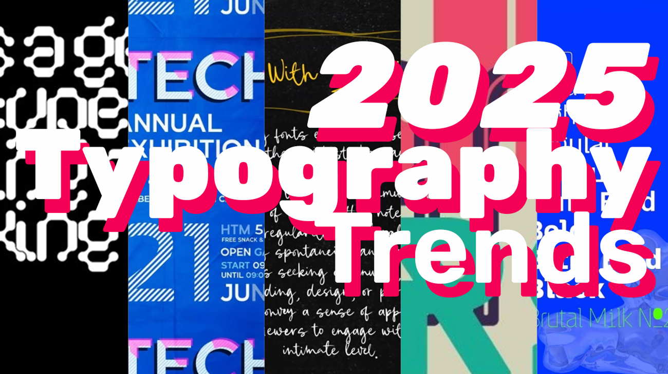
Typography trends are influenced by culture, technology, and shifts in design aesthetics. For 2025, keep your eye on these movements shaping modern branding.
1. Neo-Minimalist Fonts
Simplicity is reigning supreme, but designers are refreshing it with unique twists. Think typefaces that look minimal but have subtle quirks, like asymmetric letter shapes or unconventional spacing.
2. Retro-Modern Hybrids
Fonts inspired by the ’70s and ’80s are making a playful comeback, featuring bold serifs and vintage vibes. But this time, they’re digitized for sleek readability on screens.
3. Maximalist Typography
While some brands are leaning into minimalism, others are going maximalist—using experimental fonts with exaggerated forms, contrast, or layering. Bold typography becomes a leading visual element rather than the background.
4. Variable Fonts
These dynamic fonts are customizable, able to shift in weight, width, or other properties to fit diverse needs. Their adaptability makes them highly versatile for modern, responsive designs.
5. Sustainable Typography
As brands align with eco-conscious values, we’re seeing fonts inspired by nature. Organic typefaces use textures like woodgrain or incorporate imperfect, hand-drawn lines for an earthy feel.
Now that 2025’s trends are clear, it’s time to explore 10-15 of the most modern fonts that encapsulate these movements and are ideal for next-gen branding.
Modern Fonts for Branding in 2025
Here are some of the fonts set to dominate the design world in 2025. Each has unique characteristics that make it perfect for different branding needs.
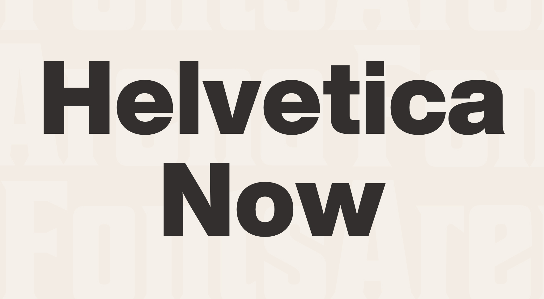
1. Neue Helvetica Now
• Why It’s Trending: Timeless, clean, and versatile—Helvetica has been a staple for decades. The “Now” iteration modernizes it for digital clarity.
• Best For: Corporate, luxury, or tech brands aiming for professionalism.
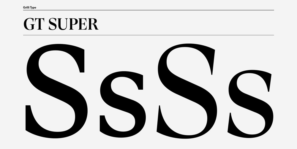
2. GT Super
• Why It’s Trending: A sharp serif font with character, GT Super balances elegance with boldness. It’s perfect for brands looking to make a statement.
• Best For: Fashion, editorial, or high-end e-commerce.
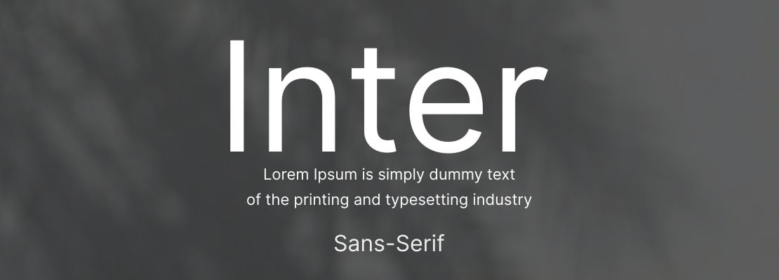
3. Inter
• Why It’s Trending: Designed for the web, Inter is optimized for readability on screens at any size. A stable, no-frills option that fits contemporary aesthetics.
• Best For: Digital-first startups or SaaS platforms.
4. Basier Circle
• Why It’s Trending: Its modern geometric shapes make it feel futuristic yet accessible. Think clean curves with a touch of playfulness.
• Best For: Tech companies or lifestyle brands seeking innovation.

5. CoFo Sans Optimo
• Why It’s Trending: This cut-out sans-serif adds depth, texture, and visual intrigue without overwhelming the viewer.
• Best For: Creative agencies or brands targeting younger audiences.

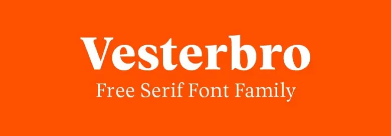
6. Vesterbro
• Why It’s Trending: A serif font with roots in retro design, Vesterbro elevates nostalgia but feels fresh for modern use.
• Best For: Boutique businesses, restaurants, and lifestyle brands.
7. Roboto Flex
• Why It’s Trending: Roboto’s “Flex” version embraces variable font technology, allowing it to be highly adaptable across platforms.
• Best For: Responsive web design and mobile-first brands.

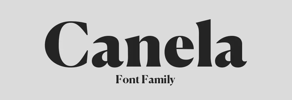
8. Canela
• Why It’s Trending: With its soft curves and transitional serifs, Canela combines elegance with approachability.
• Best For: Luxury brands, beauty products, or artisanal crafts.
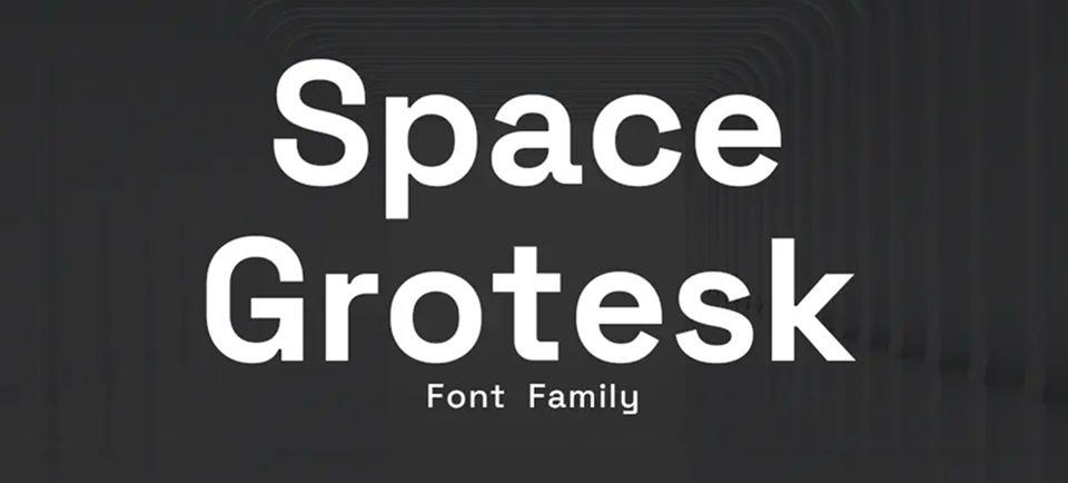
9. Space Grotesk
• Why It’s Trending: Its compact forms and polished appearance embody futuristic minimalism.
• Best For: Tech startups or innovative product launches.
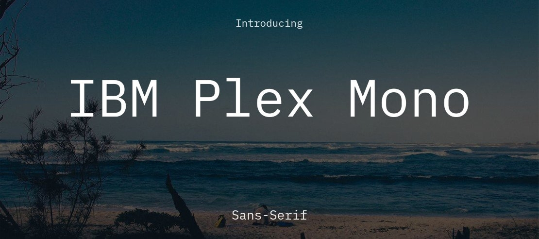
10. Plex Mono
• Why It’s Trending: This monospaced font has technical precision that feels coded for the digital age.
• Best For: Companies in fintech, cybersecurity, or coding tools.
11. Recoleta
• Why It’s Trending: Soft, rounded shapes make this retro serif font feel inviting while standing out from sharper designs.
• Best For: Feminine brands, creative portfolios, or lifestyle stores.

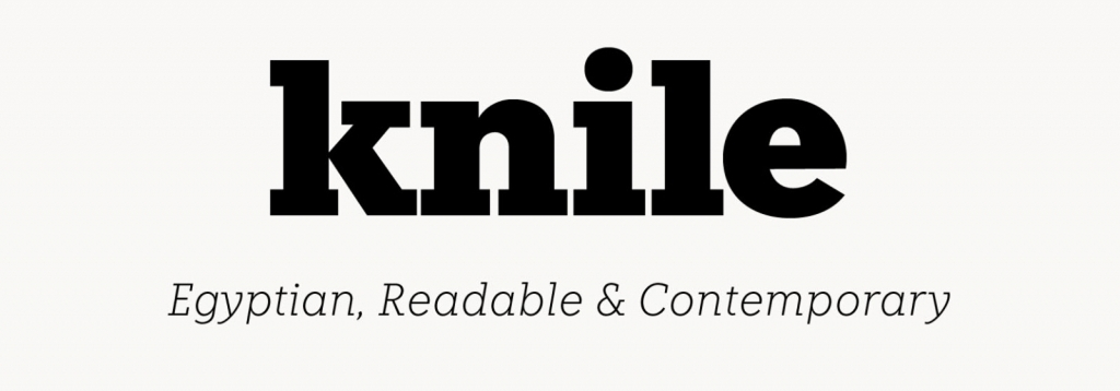
12. Knile
• Why It’s Trending: A sharp yet understated sans-serif that oozes sophistication.
• Best For: High-end brands or formal industries like law or finance.
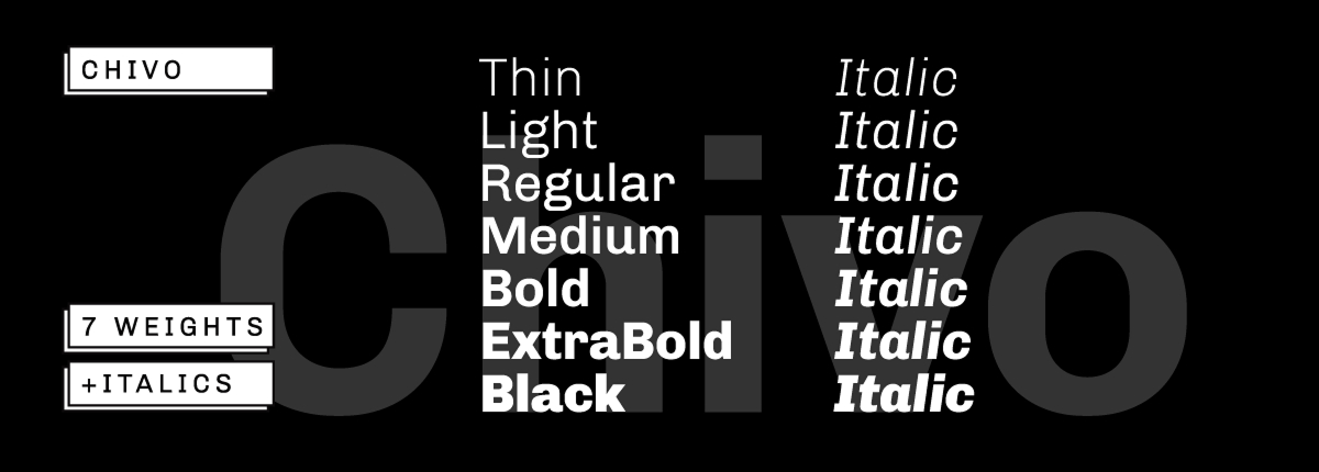
13. Chivo
• Why It’s Trending: Bold, highly readable, and functional across print or digital, Chivo is a solid choice for attention-grabbing headers.
• Best For: Bold ad campaigns or attention-worthy headlines.
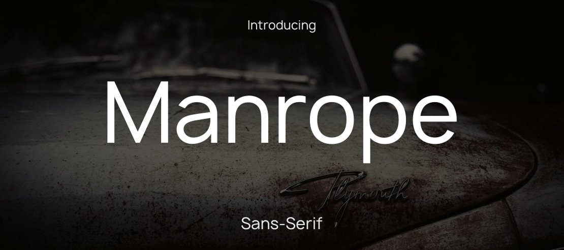
14. Manrope
• Why It’s Trending: Its minimal yet expressive structure works well for clean, user-friendly designs.
• Best For: Apps or digital interfaces prioritizing clean UX.
15. Clash Display
• Why It’s Trending: A maximalist font with asymmetry and unconventional forms that feel fresh and daring.
• Best For: Creative agencies or trend-focused brands.

How to Use Typography Effectively
Knowing which fonts work for your brand is only part of the equation. Here are practical tips to make typography work for your designs.
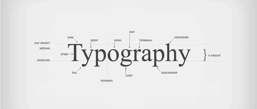
1. Match the Tone to the Brand
2. Keep It Readable
Don’t sacrifice clarity for aesthetics. Ensure high readability, especially on digital platforms where users quickly scan content.
3. Use Hierarchy and Pairing
Create contrast between headings and body text by pairing fonts. For instance, use a bold display font for titles and a clean sans-serif for paragraphs.
4. Test Across Mediums
A font might look perfect on a website but feel lacking in printed materials. Test your typography choices across all use cases.
5. Limit Font Choices
Stick to 2-3 fonts maximum. Too many fonts can confuse users and dilute your identity.
Wrapping Up
Typography isn’t just a design detail; it’s a branding powerhouse. The fonts you choose say more than words—they shape perceptions, spark emotions, and build trust. For 2025 branding, leaning into typography trends, experimenting with modern fonts, and staying intentional with your choices can set your brand apart wherever it shows up.
