Color is much more than just a visual element; it’s a powerful tool that can influence consumer behavior, evoke emotions, and shape perceptions. In the realm of branding and web design, understanding and utilizing color psychology can make a significant difference in how your audience interacts with your brand. For business owners, marketers, and startup founders, leveraging color psychology can enhance your brand’s impact and drive engagement.
Understanding Color Psychology
The Science Behind Colors
Color psychology is the study of how colors affect human behavior and emotions. It’s rooted in the idea that certain colors can trigger specific responses due to cultural associations, personal experiences, and even biological factors.
Key Concepts:
Emotional Responses: Colors can evoke emotions such as joy, excitement, calmness, or trust.
Cultural Differences: Different cultures may interpret colors differently. For example, white symbolizes purity in Western cultures but is associated with mourning in some Eastern cultures.
Biological Impact: Certain colors can have physiological effects, such as increasing heart rate or inducing relaxation.
Explore More: The Impact of Color on Emotion and Behavior
The Psychological Effects of Colors
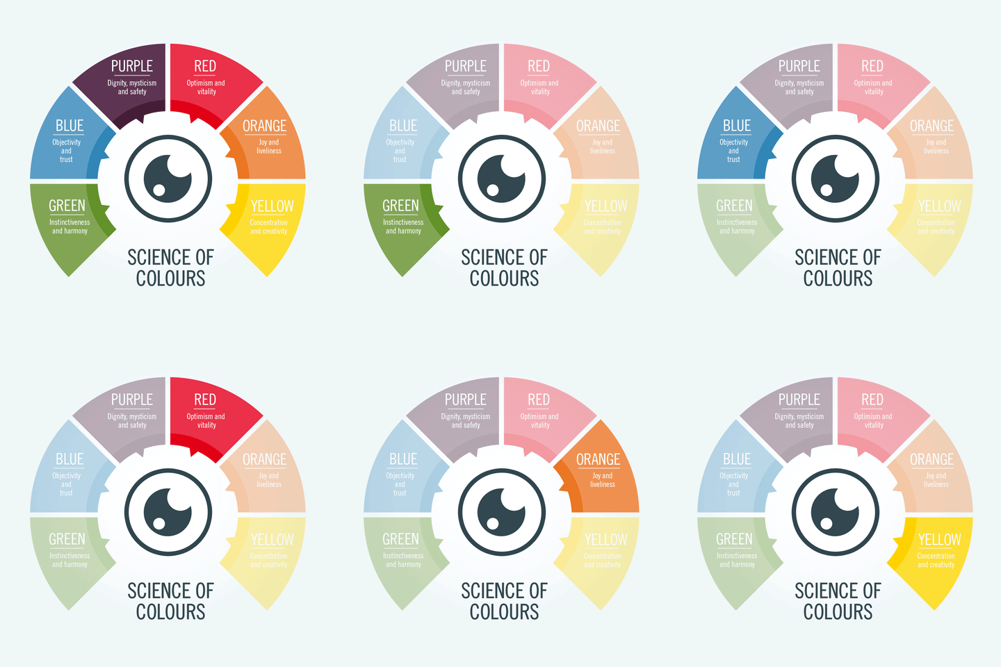
Each color carries its own set of psychological associations and can influence how your brand is perceived. Here’s a brief overview of some common colors and their psychological effects:
Benefits:
Red: Excitement, passion, urgency. Often used in clearance sales to create a sense of urgency.
Blue: Trust, calmness, professionalism. Popular among corporate brands and financial institutions.
Green: Growth, health, tranquility. Common in brands related to wellness, nature, and finance.
Yellow: Optimism, happiness, energy. Used to grab attention and create a cheerful vibe.
Purple: Luxury, creativity, wisdom. Often associated with upscale brands and creative industries.
Black: Sophistication, elegance, authority. Favored by luxury brands and fashion designers.
White: Simplicity, purity, cleanliness. Widely used in minimalist designs and healthcare.
Explore More: Color Meanings and Associations
Applying Color Psychology in Branding
Choosing the Right Color Palette
Selecting the right color palette for your brand goes beyond aesthetics. It’s about aligning colors with your brand’s values, message, and target audience. A thoughtful color palette can strengthen your brand identity and make it more memorable.
Steps to Choose a Color Palette:
Understand Your Brand: Reflect on your brand’s mission, values, and personality.
Know Your Audience: Consider the preferences and cultural backgrounds of your target audience.
Analyze Competitors: Look at the color schemes of competitors to differentiate your brand.
Test Different Palettes: Experiment with various combinations to see what resonates best.
Explore More: How to Choose a Color Palette
Case Studies of Successful Brand Colors
Coca-Cola
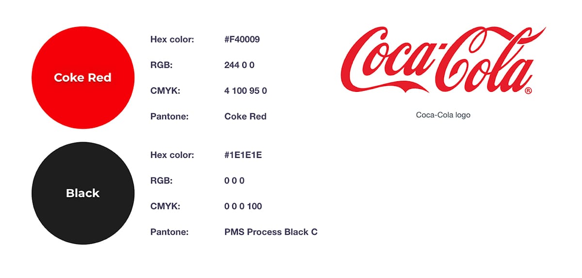
Coca-Cola’s iconic red color is synonymous with excitement and energy. The consistent use of red across all branding elements creates a strong, recognizable identity that evokes feelings of joy and celebration.
Explore Coca-Cola’s Branding: Coca-Cola
Starbucks
Starbucks uses green to symbolize growth, health, and freshness. This aligns perfectly with their brand message of providing high-quality, ethically sourced coffee and creating a welcoming environment.
Explore Starbucks’ Branding: Starbucks
Tiffany & Co.
Tiffany & Co. uses a distinctive shade of blue known as “Tiffany Blue” to convey luxury, elegance, and exclusivity. This unique color has become an integral part of the brand’s identity.
Explore Tiffany & Co.’s Branding: Tiffany & Co.
Implementing Color Psychology in Web Design
Enhancing User Experience (UX)
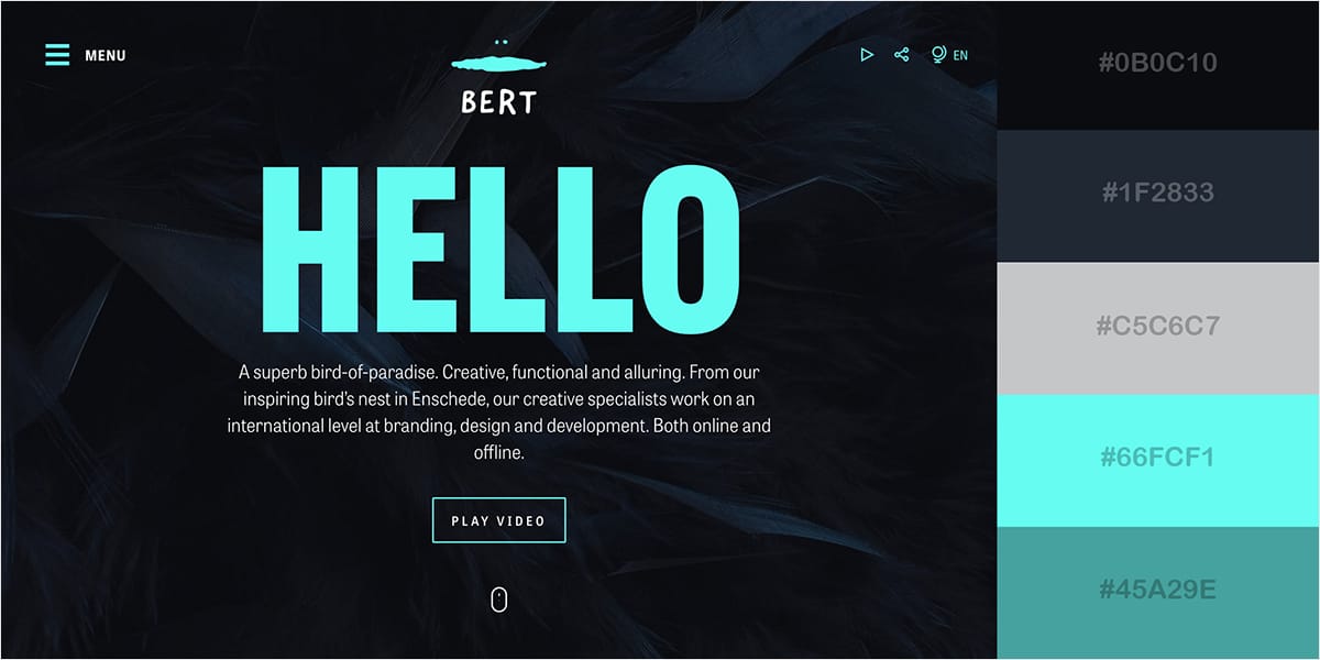
Colors play a crucial role in user experience by guiding behavior, creating focus, and evoking emotions. An effective use of color can lead to better engagement and higher conversions.
Tips for Using Color in UX:
Highlight CTAs: Use contrasting colors to make calls-to-action stand out.
Create Visual Hierarchy: Use different colors to establish a hierarchy and guide users through the content.
Ensure Readability: Choose colors that provide good contrast between text and background for readability.
Explore More: Color in UX Design
Designing for Accessibility
Accessibility is a critical aspect of web design. Ensuring that color choices are inclusive and accessible to all users, including those with color vision deficiencies, enhances usability and compliance with standards.
Accessibility Tips:
Contrast Ratios: Ensure sufficient contrast between text and background colors.
Color Blindness: Use tools to check how your site appears to users with different types of color blindness.
Multiple Cues: Don’t rely solely on color to convey information—use text labels and icons as well.
Explore More: Designing Accessible Websites
Real-Life Examples of Color Psychology in Web Design
Spotify
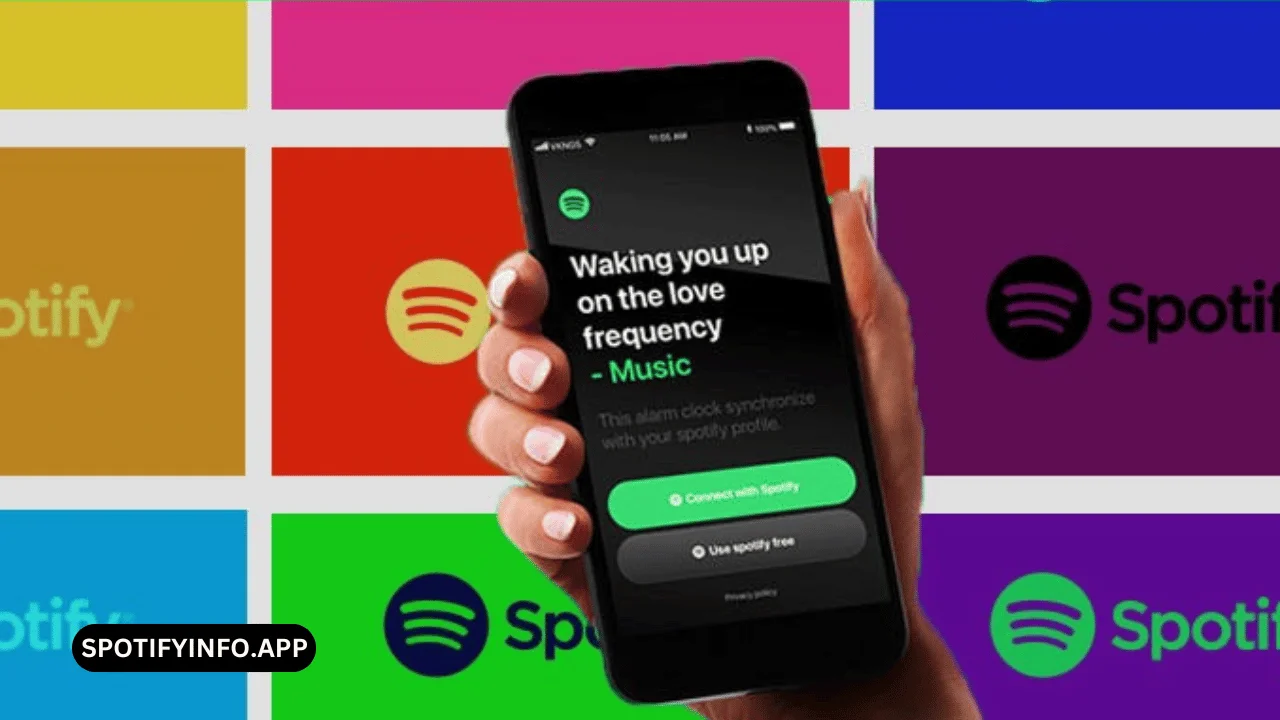
Spotify’s vibrant green is associated with growth, freshness, and energy. The consistent use of this color across their platform helps users instantly recognize the brand and feel energized while using the service.
Explore Spotify’s Design: Spotify
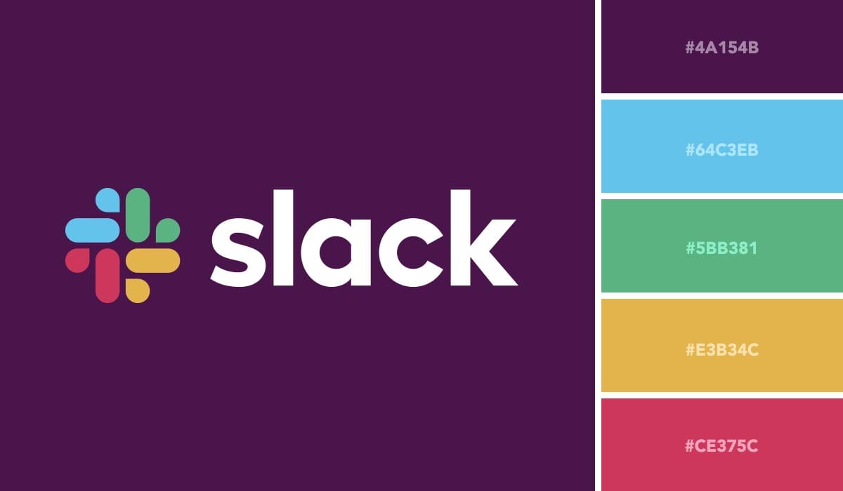
Slack
Slack uses a combination of calming blues and energetic purples to create a balance between productivity and creativity. This color scheme helps position Slack as both a professional tool and a fun platform for team collaboration.
Explore Slack’s Design: Slack
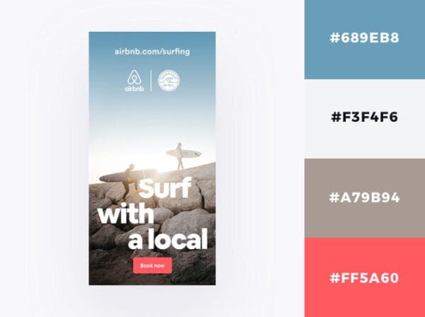
Airbnb
Airbnb’s use of soft blues and pinks evokes feelings of warmth, trust, and friendliness. This color choice aligns with their brand promise of creating a welcoming and safe community for travelers.
Explore Airbnb’s Design: Airbnb
Conclusion
The role of color psychology in branding and web design cannot be overstated. By understanding the psychological effects of colors and strategically incorporating them into your brand identity and digital presence, you can influence consumer behavior, enhance user experience, and create a memorable brand.
For business owners, marketers, and startup founders, leveraging color psychology is a powerful way to connect with your audience and drive engagement. Start experimenting with colors today, and watch how they transform your brand’s impact.
