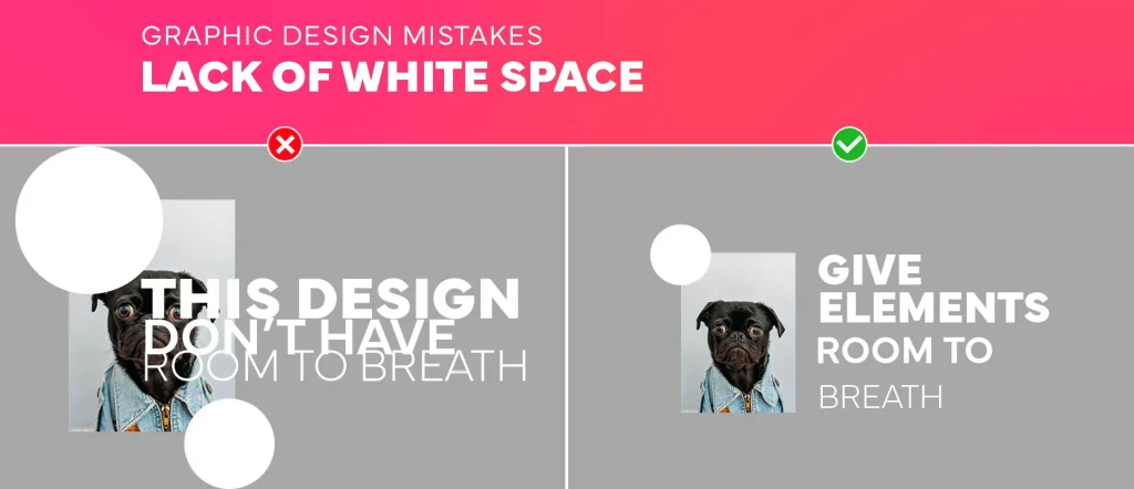
In the bustling world of web design, the term “whitespace” might seem misleading. But just like in art and architecture, it’s not about what’s there—it’s about what isn’t. White space is the silent hero of web design, ensuring content clarity and enhancing user experience. For web designers, UX/UI enthusiasts, and digital marketers, mastering this element can transform a cluttered interface into a masterpiece of simplicity and functionality. This blog will unpack the role of white space, illustrating how it crafts aesthetic appeal and boosts usability in the digital landscape.
Understanding White Space in Web Design
White space, or negative space, refers to any unmarked area on a page. It’s the breathing room between text, images, and other elements. Yet, despite its simplicity, white space is a powerful tool in the designer’s toolkit. It frames content, guides the user’s eye, and contributes to a clean, professional look. By understanding its role, designers can create layouts that are not only visually appealing but also user-friendly. Studies show that websites with ample white space are perceived as more luxurious and easier to read, making them more engaging for visitors.
The Psychology Behind White Space
White space does more than just make a website look pretty. It impacts how users perceive and interact with your site. Psychologically, it reduces cognitive load, allowing users to process information more efficiently. This simplicity fosters focus, helping users hone in on key messages without distraction. A well-spaced design can even evoke feelings of trust and professionalism, enhancing brand credibility. In essence, leveraging white space effectively can guide user behavior and improve their overall experience.

The Role of White Space in UX Design
User experience (UX) is central to web design, and white space plays a vital role in this. It enhances readability by breaking up text and making content more digestible. This ease of reading is crucial for keeping users engaged. Additionally, white space contributes to intuitive navigation, helping users find what they need without frustration. By strategically placing white space, designers can lead users through a site’s hierarchy, emphasizing important elements and calls to action. This not only improves UX but also increases conversion rates.

Enhancing Visual Hierarchy with White Space
Visual hierarchy is about arranging elements to show their importance. White space is key in achieving this. It differentiates between primary and secondary information, guiding users’ eyes naturally to the most important content. By varying the amount of space around elements, designers can subtly influence user perception. For example, more space around a call-to-action button can make it stand out, encouraging clicks. This technique ensures that users notice and engage with the content you want them to.

Creating Balance and Harmony
Balance in design refers to distributing elements evenly across a page. White space is essential in achieving this balance. It creates harmony by ensuring that no area is too dense or too sparse. This balance is not just about aesthetics; it affects usability too. A balanced design feels stable and organized, making it easier for users to interact with. By maintaining a consistent amount of white space throughout a site, designers create a cohesive experience that is both pleasing to the eye and functional.

Minimalism and White Space
Minimalism in web design is all about simplicity and clarity. White space is foundational to this style, stripping away unnecessary elements to focus on core content. This approach not only looks clean but also serves practical purposes. It speeds up load times and makes sites mobile-friendly, both critical factors in today’s digital age. Minimalist designs, with their abundant white space, also communicate confidence, letting the content speak for itself. This simplicity can make a brand appear more trustworthy and authoritative.
Improving Readability with White Space
Readability is crucial for user engagement, and white space is a major factor. It breaks up text into manageable chunks, preventing overwhelming walls of text. Wider line spacing, for instance, makes text easier to read, reducing eye strain. Additionally, margins and gutters (the spaces between columns) improve flow, guiding the reader naturally from one section to the next. By enhancing readability, white space keeps users on your site longer, increasing the likelihood of achieving your goals, whether that’s conveying information or driving sales.
Using White Space to Direct Attention
Just as a spotlight draws focus to a performer on stage, white space can direct attention to key elements on a web page. By isolating important content, white space ensures it stands out against the rest. This is particularly useful for guiding users to calls to action, such as “Buy Now” buttons or signup forms. Designers can use negative space to create focal points, drawing users’ eyes to where they want them to go. This technique enhances user engagement and can significantly boost conversions.

The Art of Spacing in Typography
Typography is more than just choosing a font; it’s about how text is arranged on a page. White space is integral to this arrangement. Proper line height (leading), letter spacing (tracking), and space between paragraphs (padding) all contribute to a pleasant reading experience. When text is well-spaced, it not only looks good but is also more accessible, accommodating users with different needs. By considering these aspects of typography, designers can ensure that their content is as inviting to read as it is informative.
White Space in Mobile Design
With mobile browsing overtaking desktop, designing for smaller screens is crucial. White space is especially important here, where clutter can quickly overwhelm. It ensures that touch targets are large enough and content is easily scannable, improving usability. Mobile designs that utilize ample white space feel less cramped and more intuitive, providing a seamless user experience. In mobile design, every pixel counts, and using white space effectively can make the difference between a site that’s frustrating and one that’s delightful to use.

Common Mistakes and How to Avoid Them
Despite its importance, white space is often underutilized or misused. Common mistakes include overcrowding, inconsistent spacing, and neglecting mobile considerations. To avoid these pitfalls, designers should prioritize a clean layout from the start. Using grid systems can help maintain consistency and balance. Additionally, testing designs on multiple devices ensures that white space enhances rather than hinders usability. By recognizing and addressing these common errors, designers can harness the full potential of white space to elevate their work.

Conclusion The Power of White Space in Web Design
White space is more than just an empty area; it’s a fundamental element of effective web design. It enhances user experience, guides attention, and improves readability. By understanding and utilizing white space, designers can create websites that are not only visually appealing but also functional and engaging. For web designers, UX/UI enthusiasts, and digital marketers, mastering the art of white space is essential for crafting standout digital experiences. Ready to transform your designs? Start experimenting with white space today, and see how it can elevate your work to new heights.

