In the ever-evolving realm of branding, staying ahead of visual trends is not just a luxury—it’s a necessity. Today’s brands must captivate and engage their audiences with compelling visuals that stand out in a crowded marketplace. As we navigate through 2024, several visual branding trends are making waves, setting the stage for innovative, eye-catching brand identities. Here are the top 10 visual branding trends you need to watch this year to ensure your brand remains relevant and memorable.
Bold Typography
Making a Statement with Type
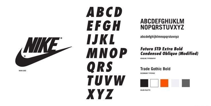
Typography is no longer just about readability—it’s about making bold statements. Brands are embracing oversized, bold fonts that capture attention and convey confidence. This trend emphasizes clarity and impact, ensuring that your message is not only seen but felt.
Consider Nike’s use of bold typography in its campaigns. The strong, assertive typefaces align perfectly with the brand’s empowering messaging.
Pro Tip: Choose typefaces that reflect your brand’s personality and make sure they are legible across all platforms.
Minimalism with a Twist
Less is More, but Better
Minimalism continues to dominate, but with a creative twist. This year, minimalistic designs incorporate unexpected elements and vibrant accents that break the monotony while maintaining simplicity. It’s about finding that perfect balance between clean design and unique aesthetics.
Take Apple, for example. Their minimalist approach is enhanced with subtle, innovative details that elevate their brand’s sophistication.
Pro Tip: Focus on uncluttered layouts with pops of color or unique design elements to keep your visuals fresh and engaging.
Custom Illustrations
Adding a Personal Touch
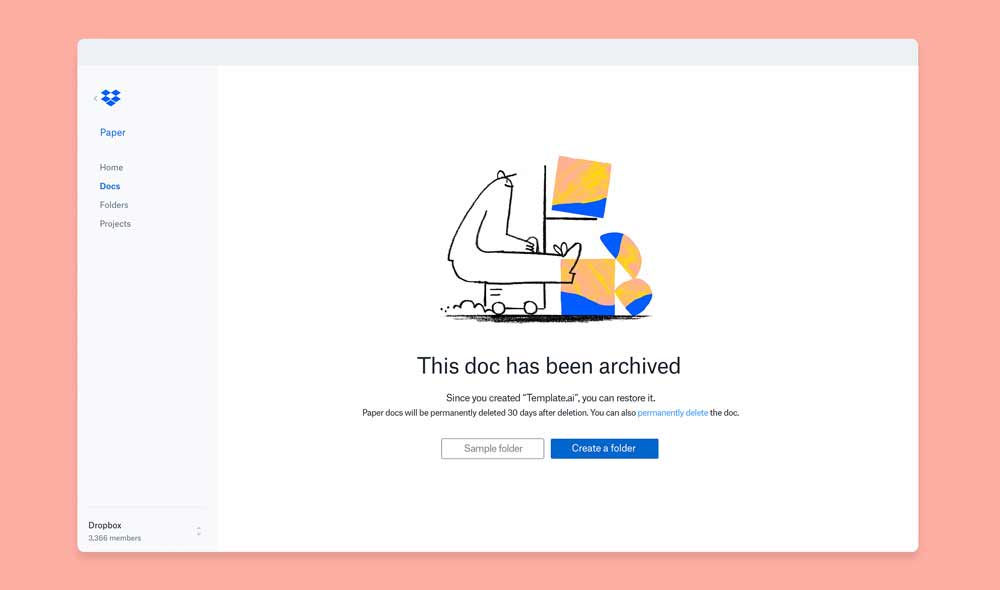
Custom illustrations bring a unique, personal touch to your brand. Unlike stock images, custom art can be tailored to reflect your brand’s voice and values, making your visuals truly one-of-a-kind.
Dropbox’s use of quirky, hand-drawn illustrations sets it apart from competitors and adds a friendly, approachable vibe to the brand.
Pro Tip: Work with an illustrator to create bespoke visuals that resonate with your audience and differentiate your brand.
Animated Logos
Bringing Your Brand to Life
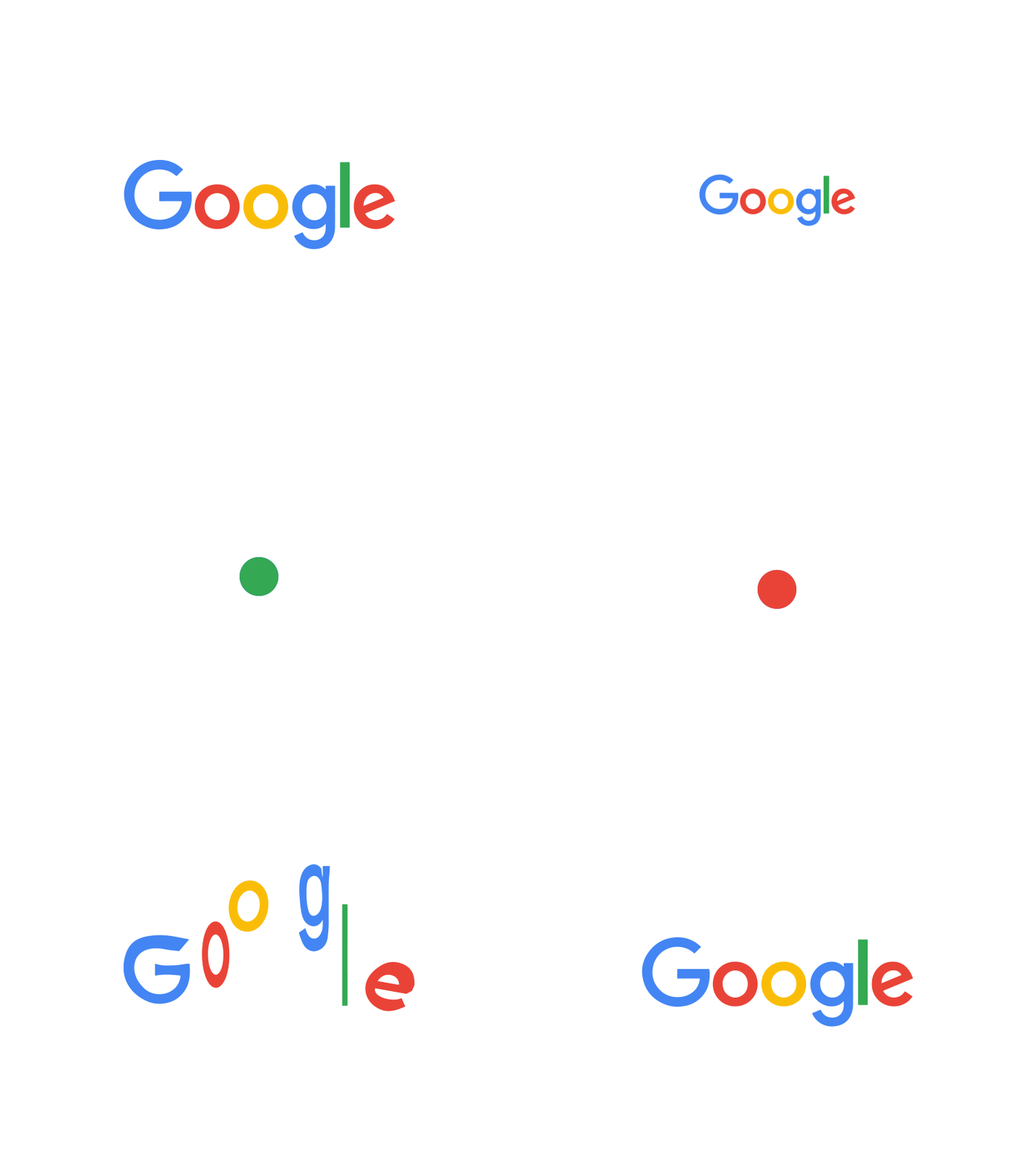
Static logos are stepping aside to make room for dynamic, animated logos. These moving visuals capture attention and add a layer of modernity and sophistication to your brand identity.
Google’s subtle yet impactful animated logo reflects its innovative spirit and keeps users engaged.
Pro Tip: Ensure your animated logo remains simple and doesn’t detract from your brand’s core message. Focus on smooth, seamless animations.
Gradients and Blends
Adding Depth and Dimension
Gradients are making a strong comeback, adding depth and dimension to flat designs. This trend uses smooth transitions between colors to create visually appealing effects that draw the eye.
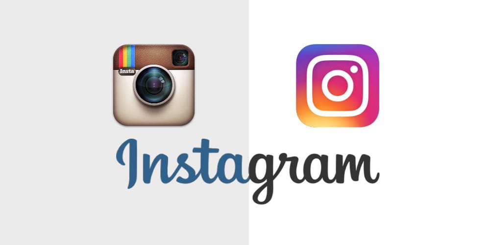
Instagram’s rebranding with vibrant gradients has set a benchmark, making the platform instantly recognizable and visually appealing.
Pro Tip: Use gradients thoughtfully to enhance your design without overwhelming it. Pair them with minimalist elements for a balanced look.
Authentic Photography
Keeping It Real
Authenticity in visuals is more important than ever. Brands are moving away from overly polished, staged photos and embracing real, candid imagery. This trend builds trust and relatability with your audience.
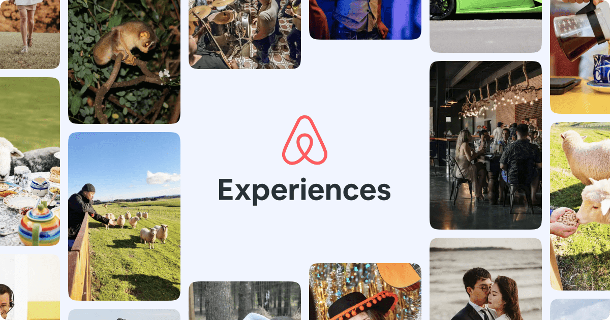
Airbnb’s use of authentic, user-generated photos showcases real experiences, enhancing the brand’s credibility and connection with users.
Pro Tip: Use high-quality, genuine photography that tells your brand’s story and resonates with your audience’s experiences.
Vintage and Retro Aesthetics
Nostalgia Meets Modernity
Vintage and retro aesthetics are making a nostalgic comeback, blending old-school charm with modern design principles. This trend evokes a sense of nostalgia while still feeling fresh and relevant.
The reimagined branding of companies like Coca-Cola often taps into vintage aesthetics to evoke a timeless quality.
Pro Tip: Combine vintage elements with contemporary design to create a unique, memorable brand identity.

Asymmetrical Layouts
Breaking the Grid
Asymmetrical layouts challenge traditional grid systems, creating dynamic and intriguing visual compositions. This trend encourages creativity and adds a sense of movement and energy to your designs.
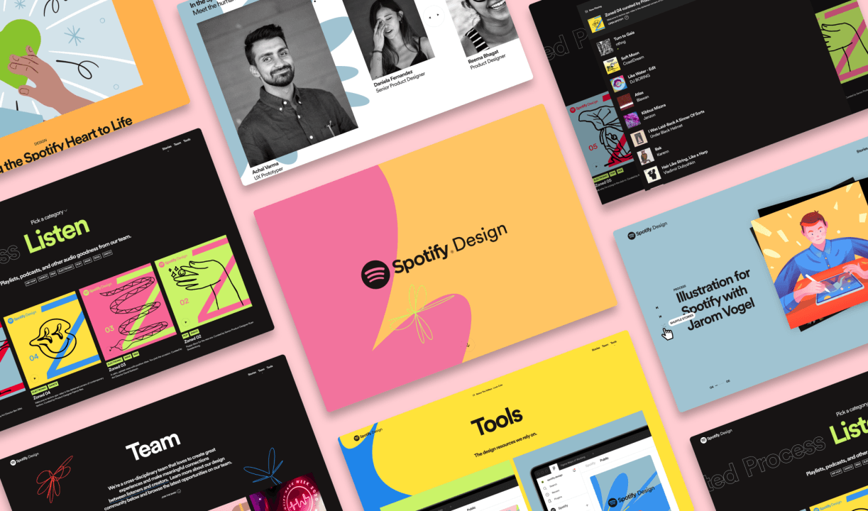
Spotify’s use of asymmetrical layouts in their marketing materials keeps the viewer’s attention and creates a sense of excitement.
Pro Tip: Use asymmetry to guide the viewer’s eye and create focal points within your design.
Dark Mode Design
Sleek and Modern
Dark mode isn’t just for screens; it’s influencing overall design aesthetics. Dark-themed designs are sleek, modern, and reduce eye strain, making them increasingly popular.
Brands like Netflix utilize dark mode to create an immersive viewing experience that aligns with their sleek brand identity.
Pro Tip: Incorporate dark mode options in your digital design to enhance user experience and add a modern touch to your visuals.
Interactive Elements
Engaging Through Interaction
Interactive elements are transforming static designs into engaging experiences. From hover effects to clickable animations, these interactive features invite users to interact with your brand.
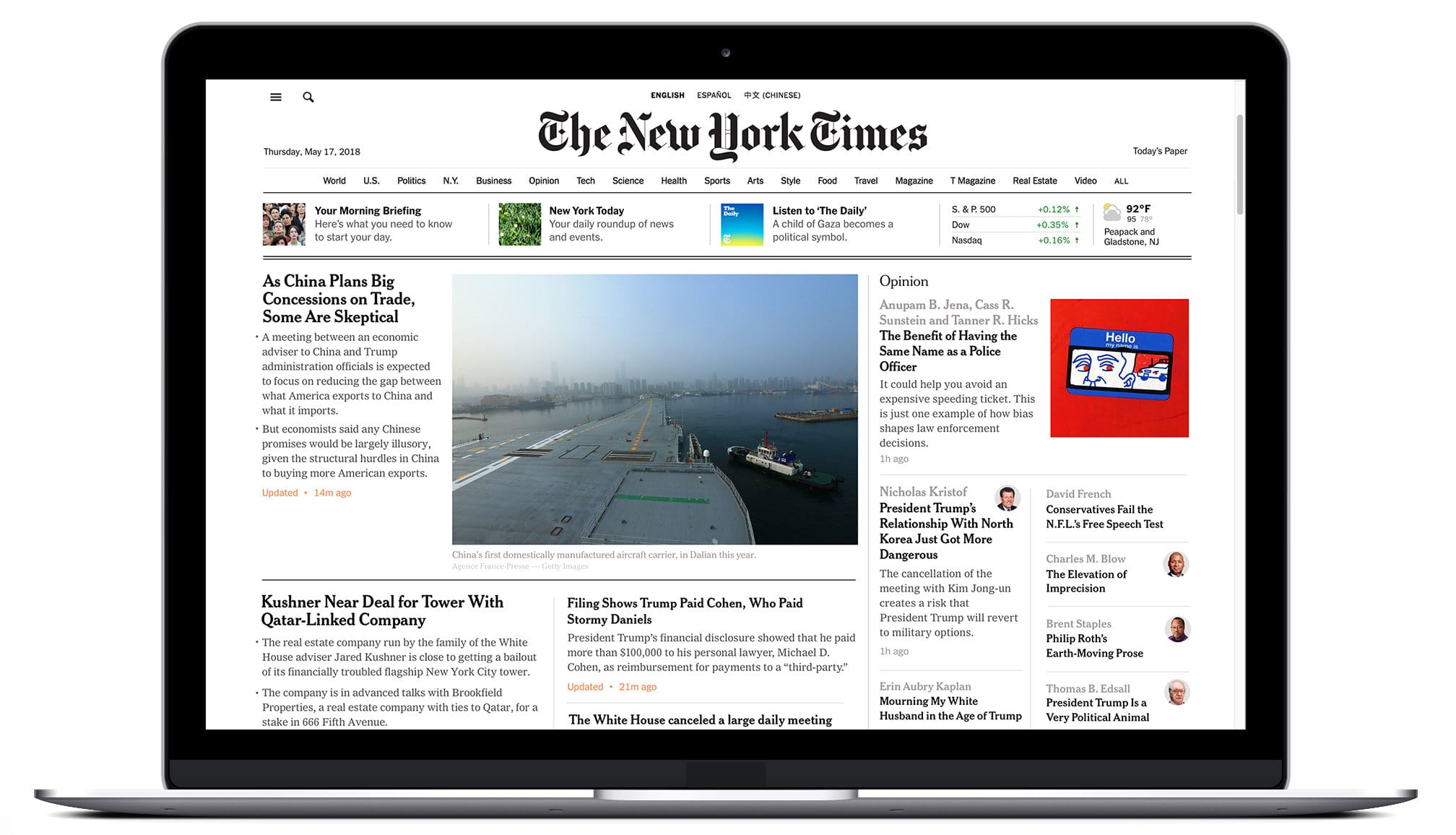
The New York Times’ interactive articles exemplify how engagement through interactive design can enhance storytelling and user involvement.
Pro Tip: Use interactive elements to make your website and digital platforms more engaging and user-friendly.
Conclusion
Staying ahead of visual branding trends is essential for creating a brand that not only stands out but also stays relevant in a fast-paced world. By incorporating these top 10 trends, you can ensure your brand’s visuals are modern, engaging, and memorable.
