Alarmas AAA
PROJECT NAME
Alarmas AAA
components
Branding | Presentation
Date
February 2022
duration
2 Weeks
tools
Client
ALARMAS AAA
For 35 years, this pioneering company has become the go-to provider of personal and industrial security solutions in the Dominican Republic.
From fire suppression systems to building automation, they offer it all with representation from several North American companies guaranteed by their team of specialized technicians - each boasting factory training to ensure customer satisfaction.
With an extensive portfolio showcasing many requests delivered through decades of experience, you can trust that your request is well-taken care of!


CHALLENGE
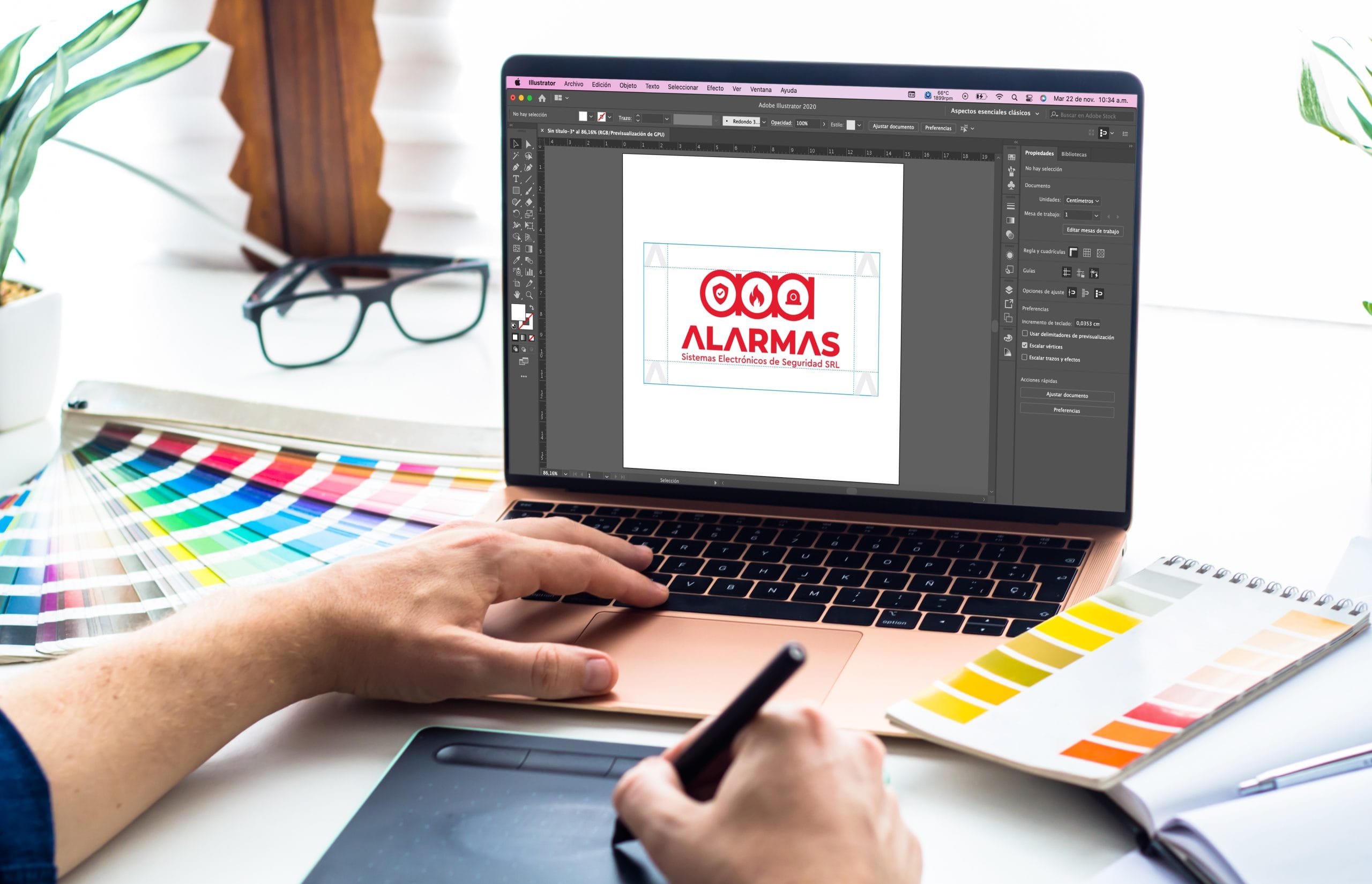
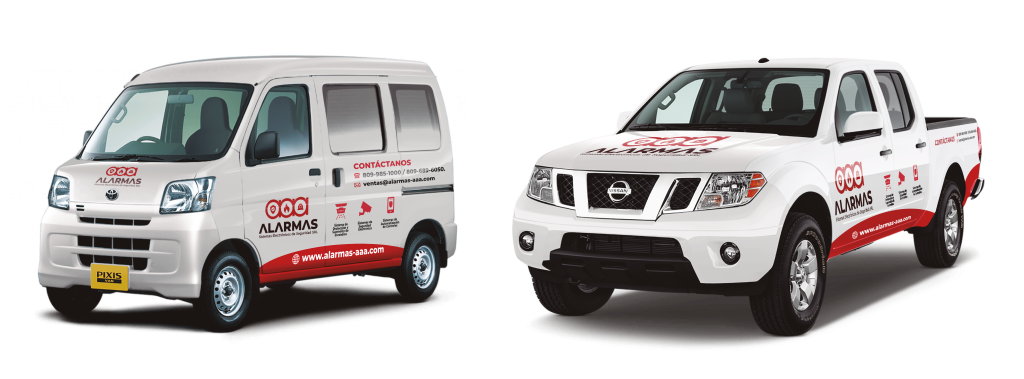
After being a trusted name in the industry for over three decades, it was time to revitalize its timeless branding. They updated their look from office decor and transport vehicles to advertisements across all platforms, ensuring continued success with an evolved image.
We accepted the challenge to modernize a brand with a rich legacy, retaining its core values and consumer recognition while enhancing its usability and relevance in today’s competitive landscape.
logo design
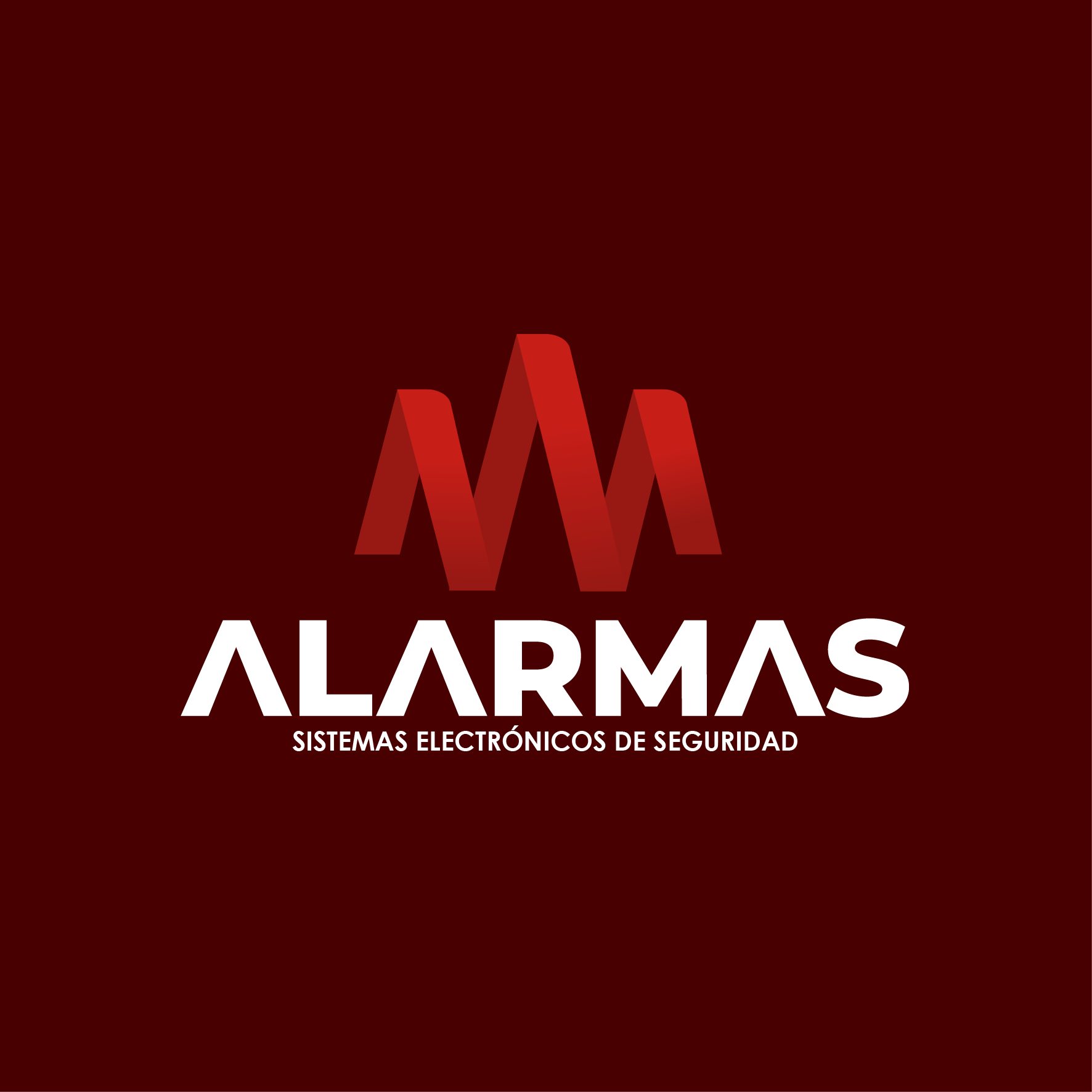
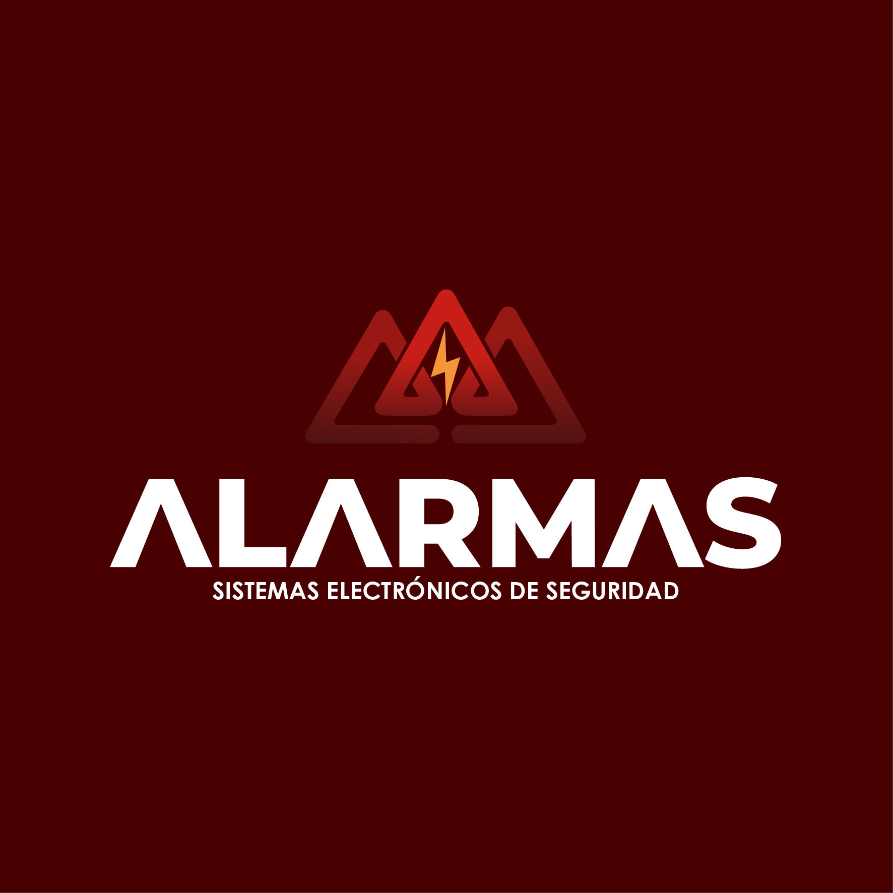
AAA’s logo presents a powerful visual representation of its value proposition: an expectant and efficient design that accurately reflects all the client’s needs. Four creative proposals have been developed to showcase this ideal, elevating AAA’s brand identity with style.
PROPOSAL #1
PROPOSAL #2
PROPOSAL #3
PROPOSAL #4
Branding
Logo Selection
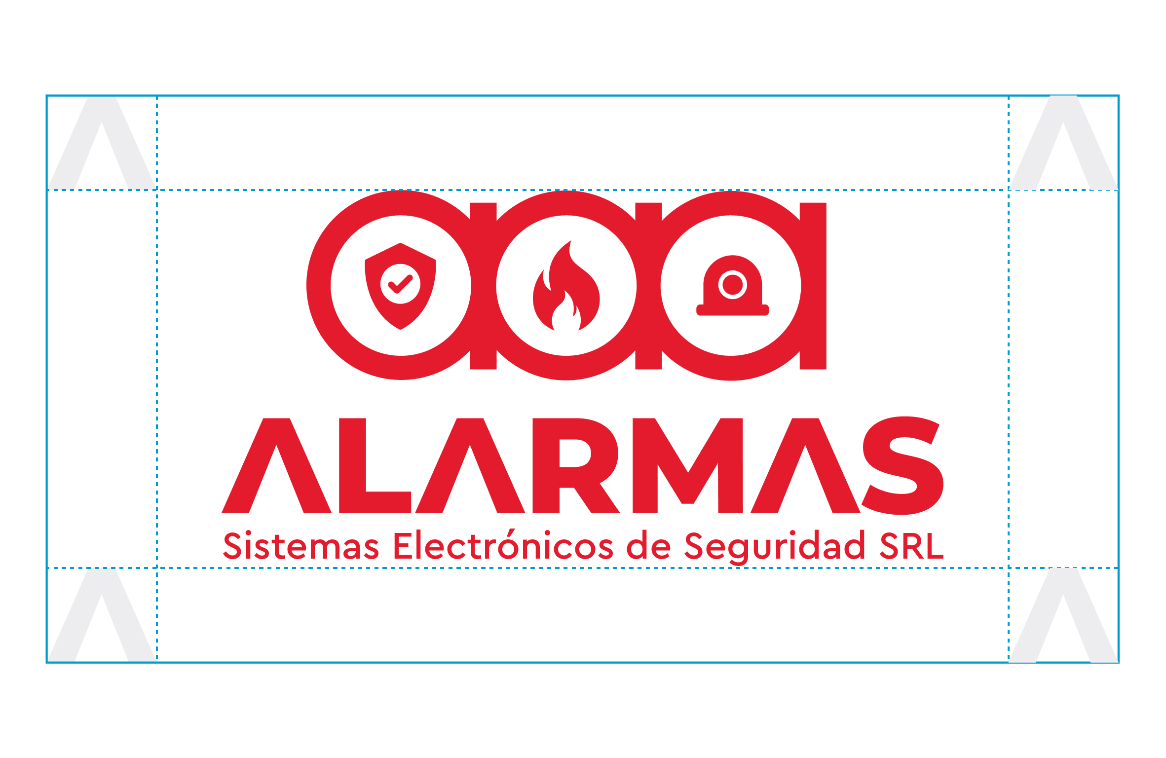
After carefully reviewing the client’s feedback, we selected proposal three as our final decision. Its flexible nature and straightforward design were a perfect fit for our needs!
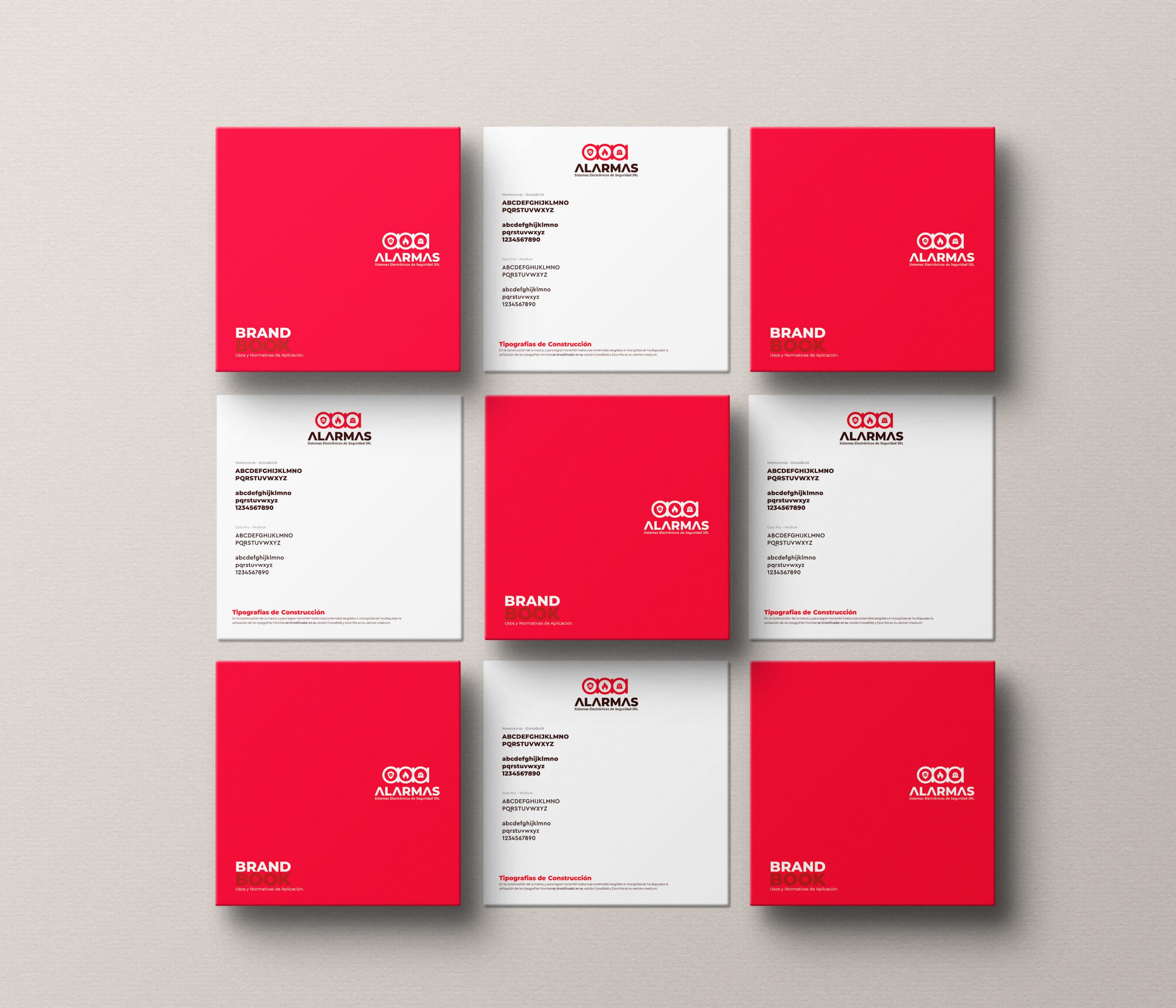
We’ve structured a safety margin with a specific height to guarantee an impeccable implementation of typography across various media. This vital security measure helps ensure optimal accuracy and reliability in both print and digital spaces.
Typography Selection
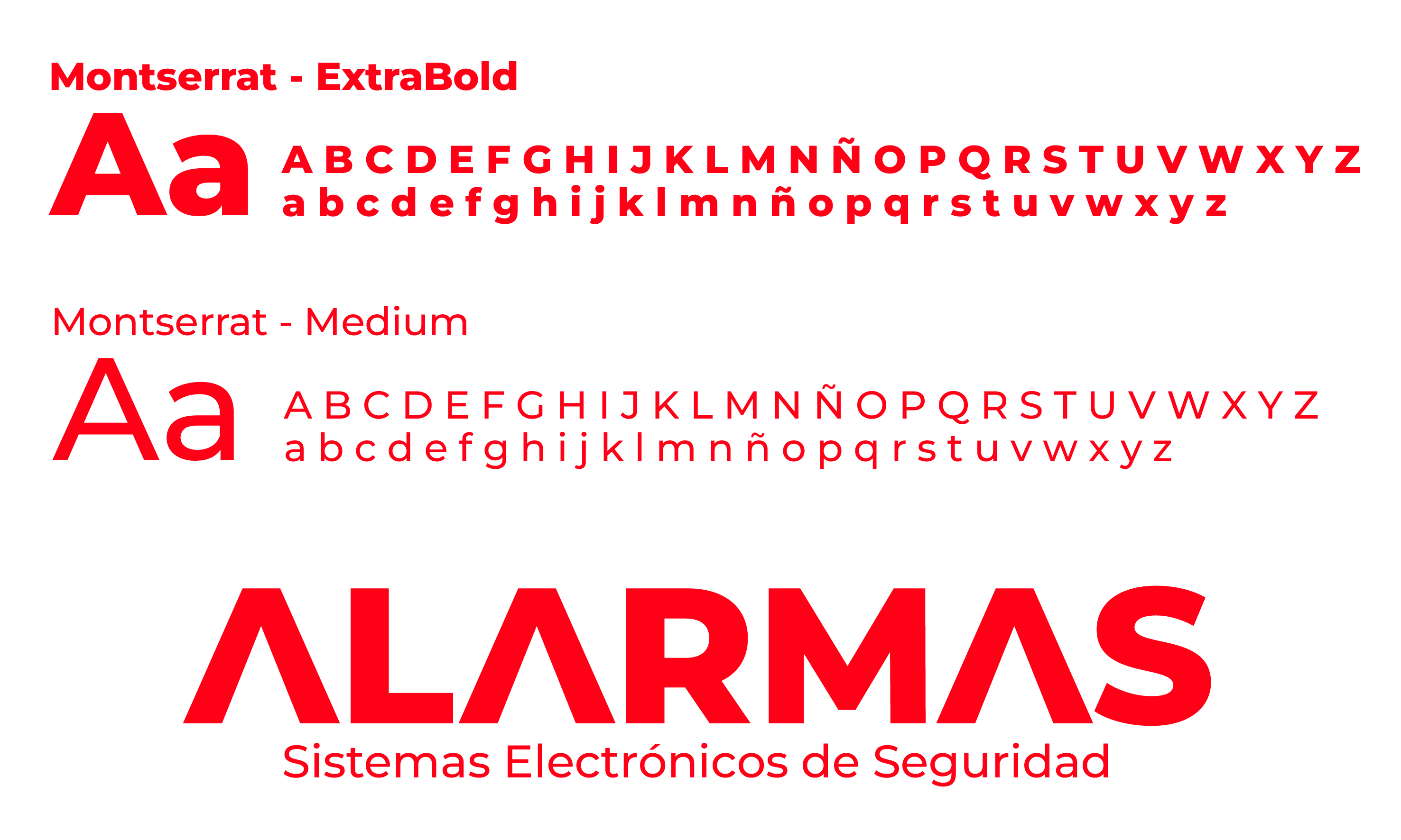
When selecting the perfect typography for our brand, we wanted something encapsulating its personality and values in one font. We decided to go with Montserrat – a contemporary yet legible choice popular among websites, flyers, and graphic pieces alike. Its techy edge makes it ideal for innovative startups or platforms looking to make their mark!

Color Selection
Red is a powerful choice of corporate color, symbolizing action and alerting customers to potential danger. By selecting this hue as their official shade, companies communicate strength in even the direst circumstances – encouraging trust built on reliability!
RE-BRANDING
presentation
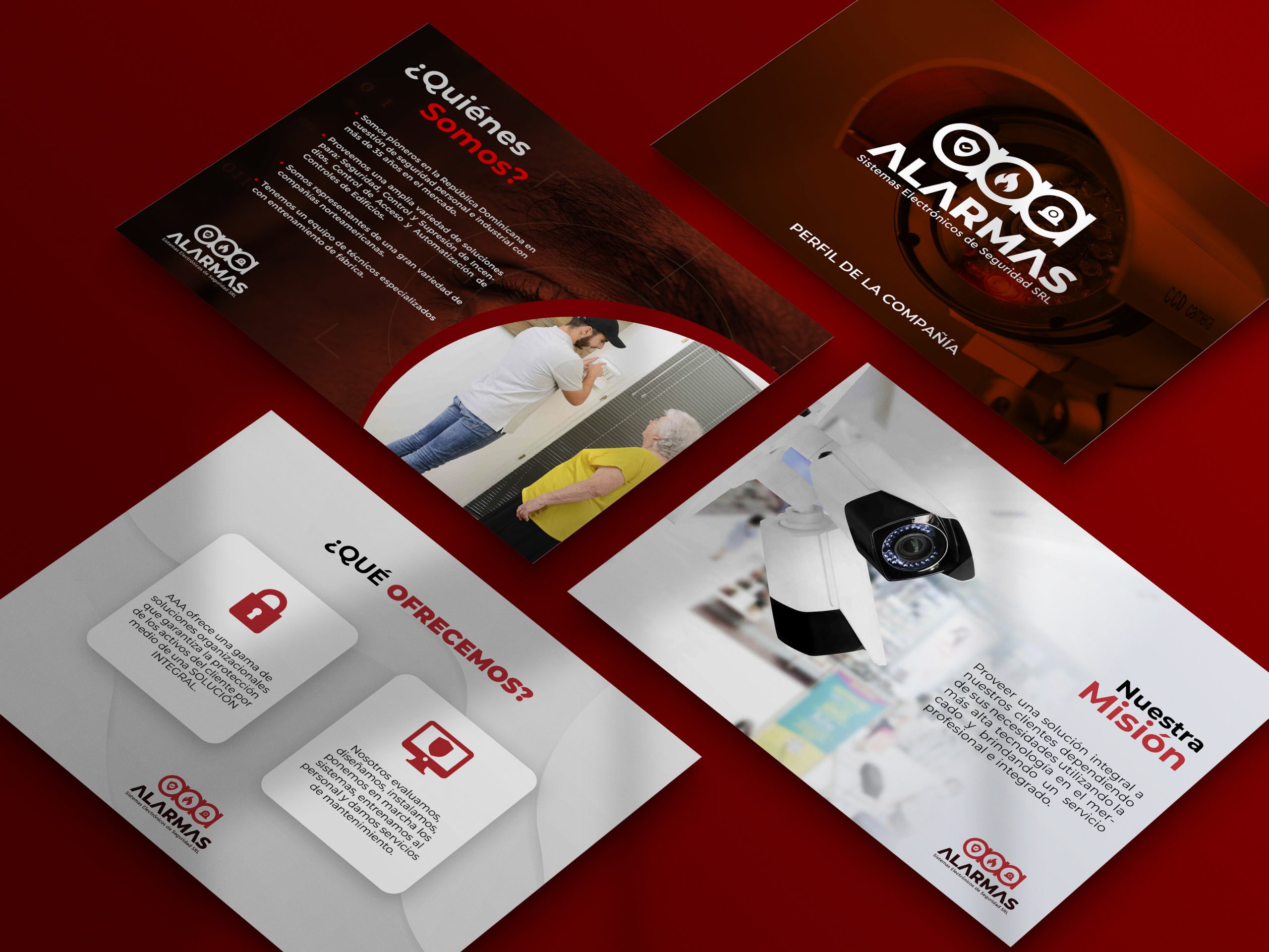
Intending to introduce their new corporate image, we created a captivating digital presentation illustrating all that makes up this business.
Through this dynamic showcase, viewers could explore its diverse pillars and products/services as they enter an exciting new era.
Conclusion
When we were tasked with re-branding of the well-established security systems company, Alarmas AAA, we knew it was imperative to design something that could represent their history and set them up for continued success. We are proud of our efforts in building a solid foundation that will guarantee Alarms’ progress far into the future.
project
"
Let’s roll up our sleeves and make it happen.
We’ll turn your vision into designs that work and wow.
