Colors are powerful
They can evoke emotions, convey messages, and ultimately create a lasting impression on customers. Choosing the right colors for your brand is essential to ensure that you create the desired effect and send the intended message. This blog post will explore some of the basics of color selection for branding to help you select a color palette for UI/UX projects and any branding designs.


Whether you’re a designer, artist, or just someone looking to create something visually appealing, understanding how color is used in the design is essential. Instead of trying different shades of blue with no particular purpose, you can focus on three or four colors with specific meanings that work together. This will make it easier to choose colors when creating visuals such as logos or designing websites because you'll already know what works best with the overall color scheme in mind.


When creating your color palette, there are several things to consider. It would be best to consider what message you want your colors to communicate about the product or company, including trustworthiness, innovation, sophistication, etc. It also helps to consider what other elements will be present in the design; for instance, making sure that the text is legible against whatever background you choose. Additionally, ensure you only use a few colors since too many can make it difficult to distinguish them all and cause confusion within the design layout.
The last step in crafting your perfect color palette involves experimenting until you find something that works best for your project’s vision and purpose. It may require some trial and error, but eventually, you'll find something that looks great!
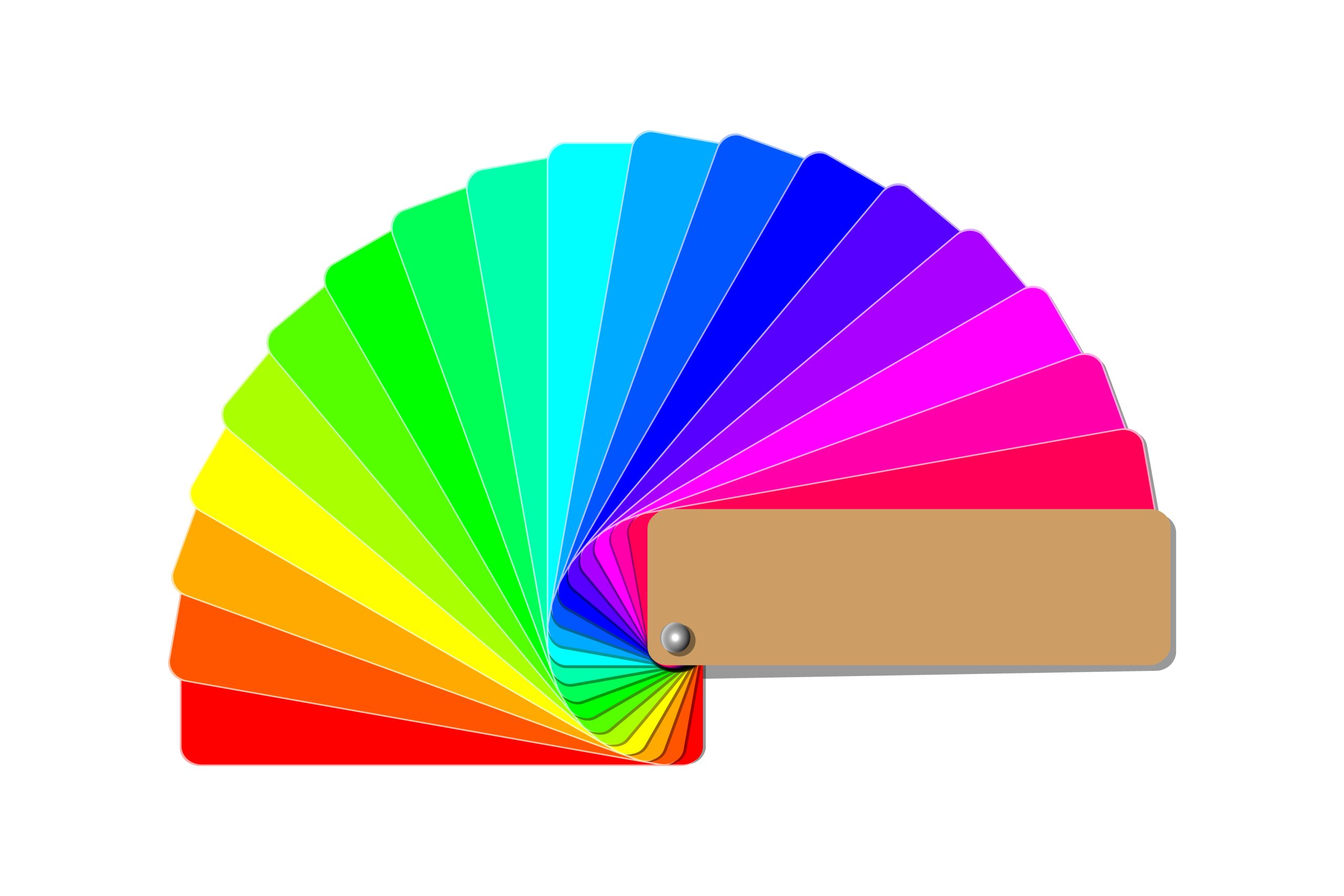
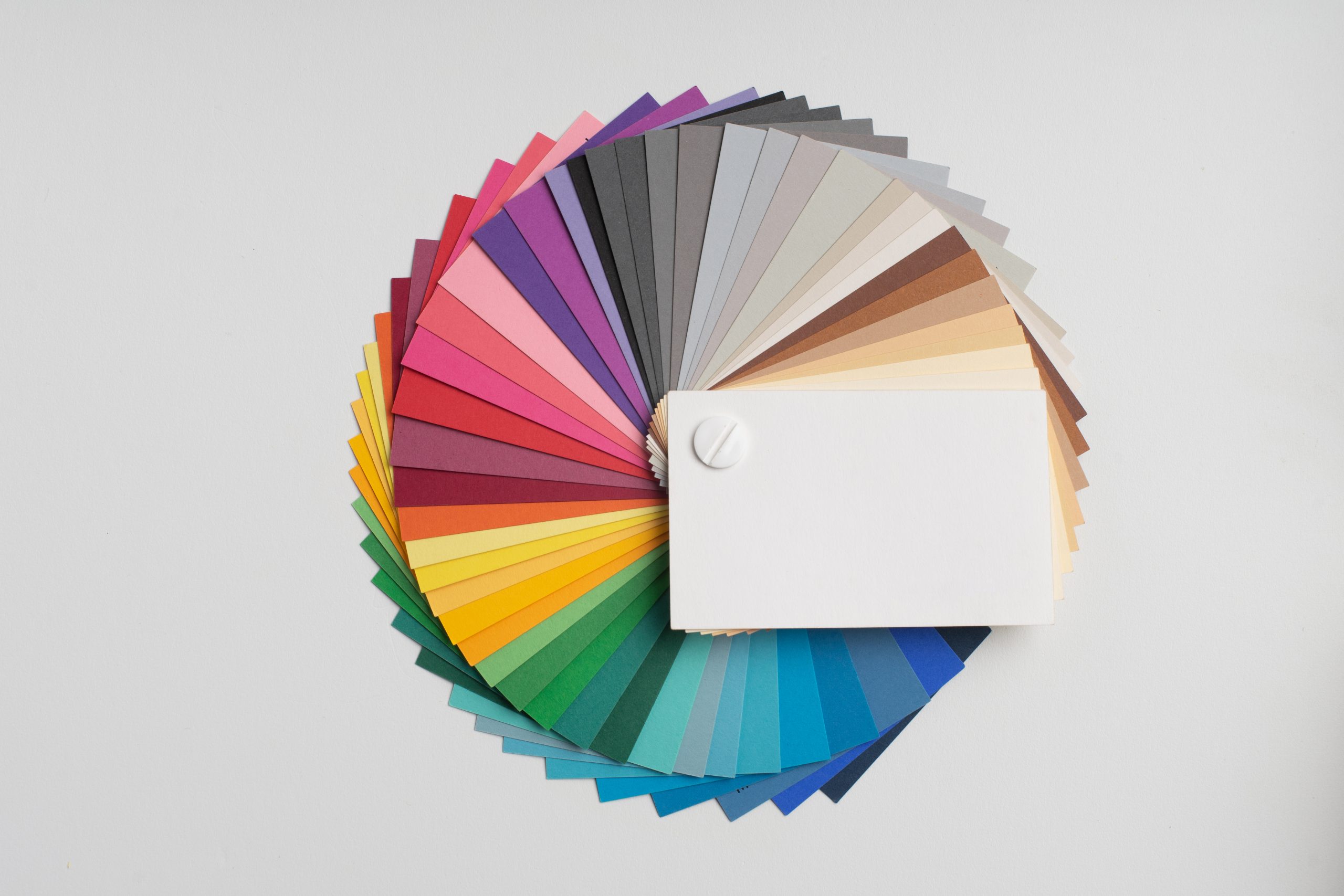
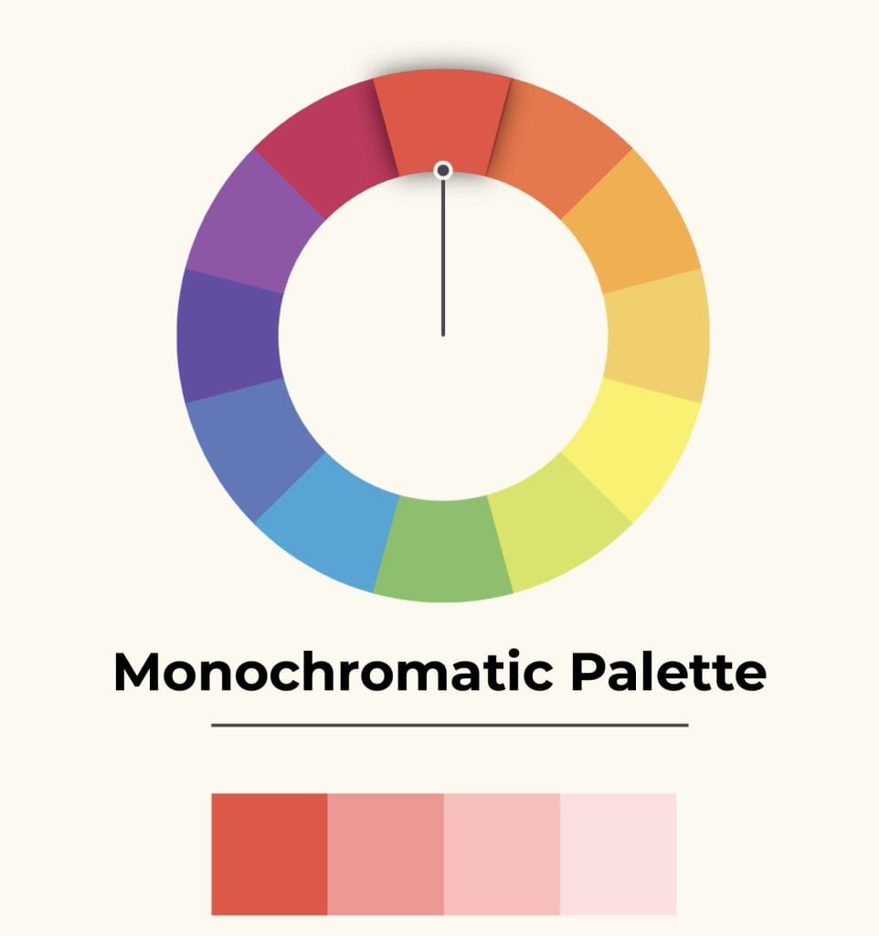
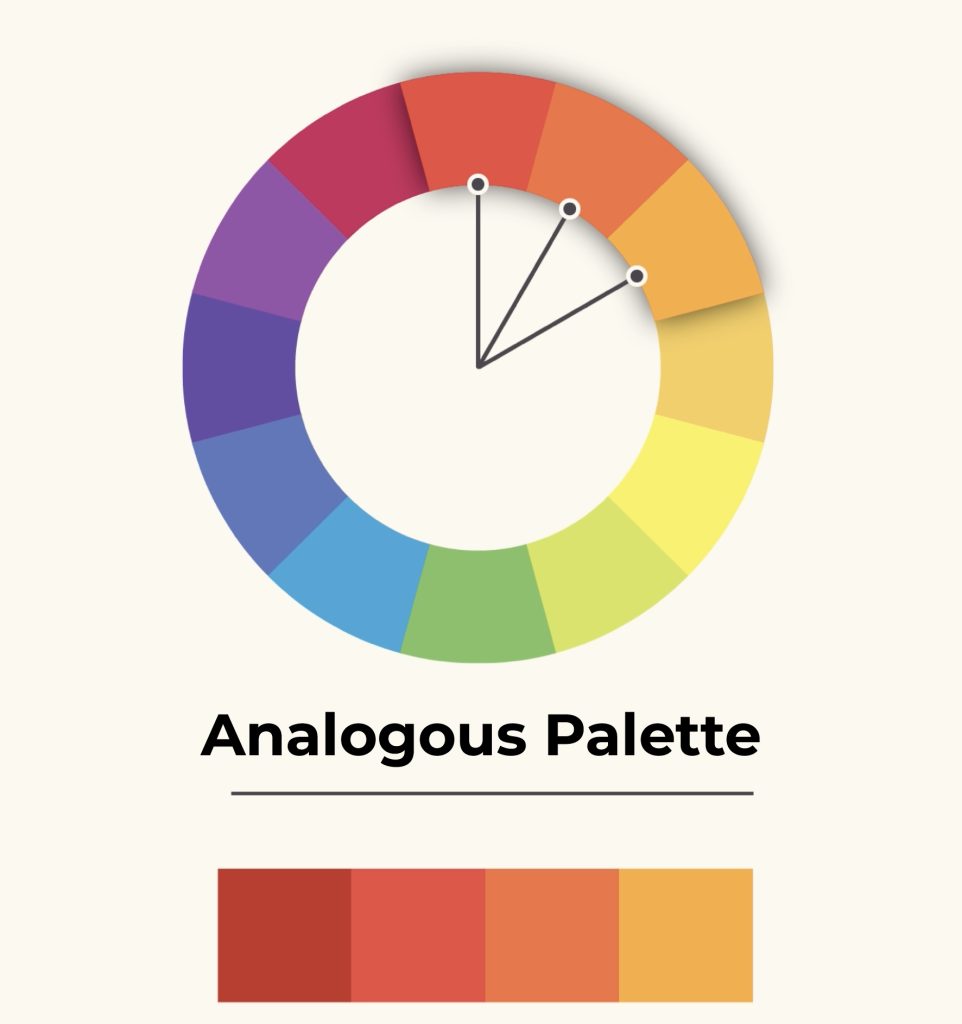
Color Palette Types
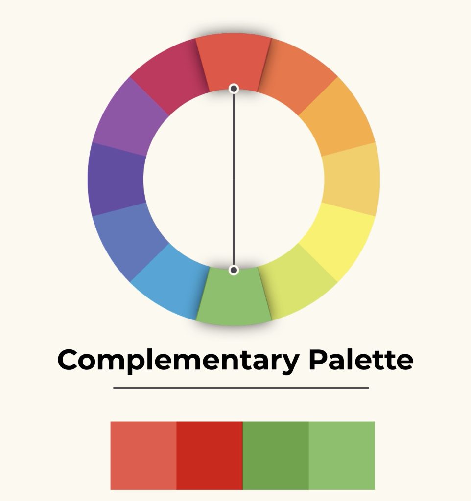
When deciding on the best color palette for your brand, it’s essential to understand the available palettes. The three main types of palettes are monochromatic, analogous, and complementary. A monochromatic palette consists of various shades and tints of one hue; an analogous palette consists of one hue plus two adjacent hues; and a complementary palette consists of two hues at opposite ends of the color wheel. These are just some examples, as many more options are available when creating a color palette for your brand.
Understanding Color Theory
Color theory studies how colors interact with each other and how the human eye perceives them. It is a fundamental aspect of design that helps to create visually exciting, balanced, and harmonious designs.
A color wheel is a helpful tool for understanding color and its relationships. It consists of 12 distinct hues.
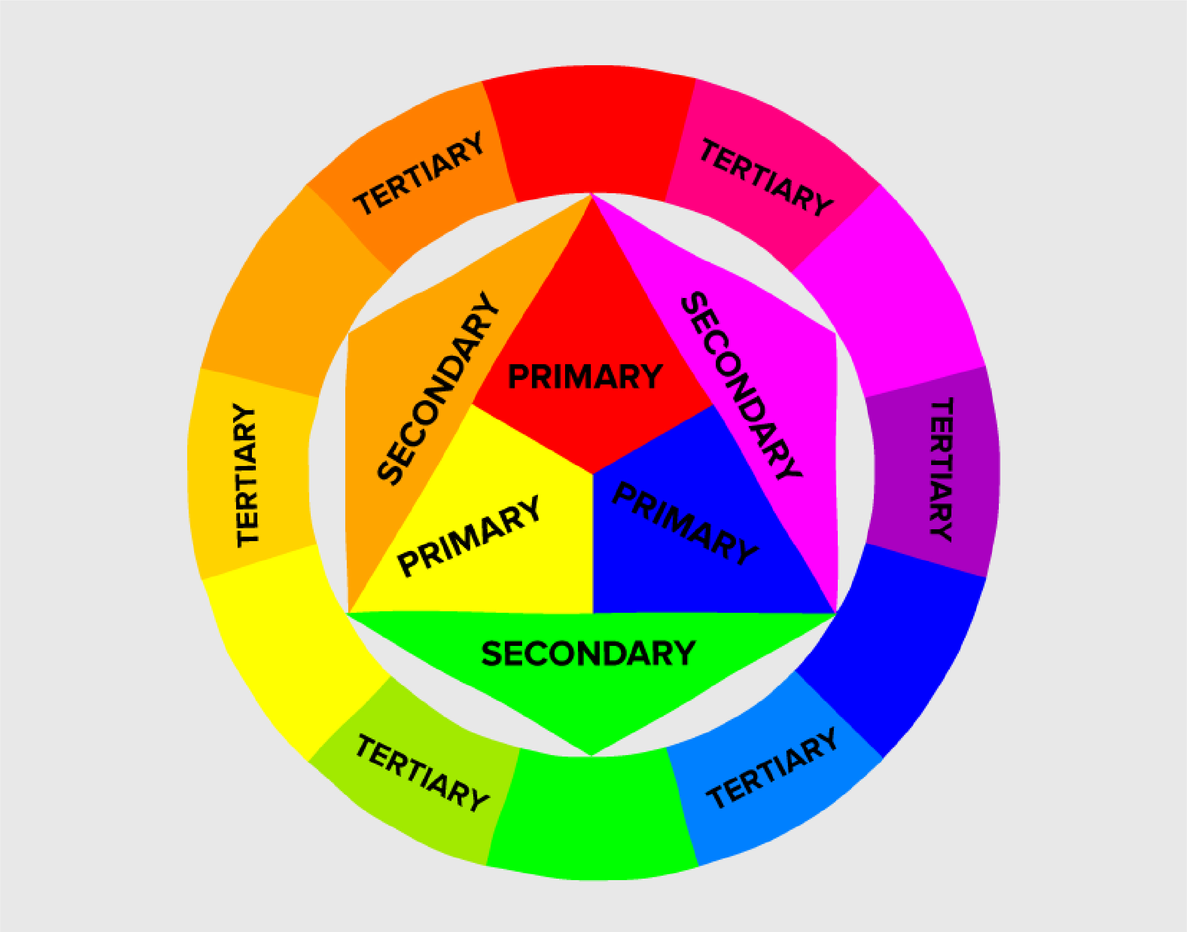
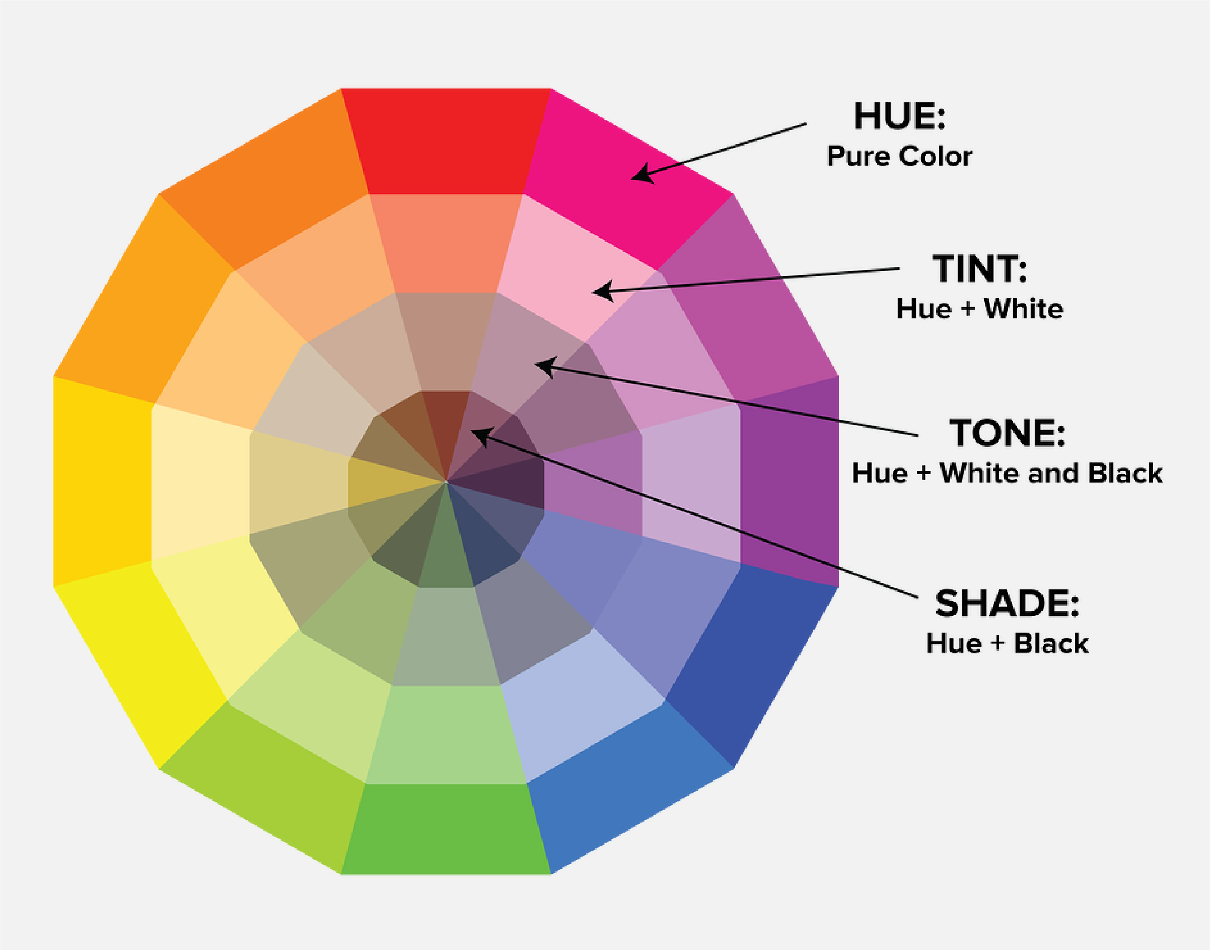
Once you understand the basics of color theory and the color wheel, you can start to apply it to create an effective and visually appealing color palette. A typical color palette consists of three levels: primary, secondary, and tertiary colors. Primary colors include red, yellow, and blue.
Color Meaning
Colors have potent meanings associated with them that can influence how people perceive your brand:
Green
Green is often associated with growth, nature, and renewal. It is a calming color that can create feelings of harmony and balance. It is also seen as a color of prosperity and abundance, representing safety, stability, and security. Green can also symbolize life, energy, and freshness. In addition to being considered a calming color.
Blue
Blue is often associated with trustworthiness, professionalism, and loyalty. It conveys a sense of calmness, security, and dependability. Blue is often seen as a color of authority and power because it has the ability to evoke feelings of strength, reliability, and seriousness. It can also be used to express intelligence, knowledge, and wisdom.
Yellow
Yellow is often associated with joy, happiness, and optimism. It is a bright, cheerful color that can lighten up any space. Additionally, yellow is often used to represent sunshine, the summer season, and freshness. It can also symbolize hope and positivity, which can help boost morale.
Red
Red is a powerful color that can evoke strong emotions. It signifies danger and can be used to draw attention, but it can also symbolize passion, energy, and love. Red can be used to indicate power and authority; it is associated with strength, courage, and determination. It is often seen as a warning color.
Purple
Purple is a highly symbolic color with a range of meanings. It is often associated with power, wealth, creativity, and sophistication. Historically, it has been used to represent royalty, mystery, magic, and spirituality. It is seen as a calming and meditative color that can help create balance and harmony in one’s life.
Orange
From the warm range, orange is a color with clear positive connotations. Symbol of enthusiasm and exaltation, it has among its qualities a stimulating and energetic power but without reaching the extremes of red, therefore also being suitable for shy, sad or lymphatic people, as it tends to lift their spirits.
White
White is a highly symbolic color that can evoke a range of emotions. It is often associated with purity, cleanliness, and innocence, symbolizing new beginnings and freshness. White also has positive connotations of hope, faith, and optimism. In western societies, white is traditionally associated with weddings and celebrations.
Black
Black is a color that can evoke strong emotions and has multiple meanings. It is often associated with power, sophistication, stability, and strength. Black symbolizes authority and control; it can be used to express seriousness, respect, and formality. Additionally, black is often seen as a protective color that can provide a sense of safety and security.
Conclusion
Choosing the correct colors for your brand is essential to ensuring that customers form positive associations when they see it or engage with its products or services online or offline. When selecting a color scheme, there are various factors to consider, such as cultural differences, user preferences, and industry standards. It’s also worth considering professional design advice from an experienced designer specializing in creating compelling visuals that can provide invaluable insight into which colors best complement each other. If used correctly, color greatly enhances how customers interact with your product/service and how they perceive your brand overall.