Bidó Montero C.C.
PROJECT NAME
Bidó Montero C.C.
Components
Brand Book | Logo Design | Research
Date
Aug 2023 - Oct 2023
tools
Project:
BIDÓ MONTERO C.C.
Bidó Montero Construction Company is a company that, despite offering a wide range of services including construction, sales, remodeling, maintenance, and property rentals, faced a challenge: establishing a unique identity in an already saturated market. Understanding the critical role that a distinctive and efficient visual identity plays in setting a company apart, Bidó Montero Construction turned to our creative agency to shape their brand image.
In a highly competitive industry like construction, a compelling visual identity can be the key differentiator. Being a new entrant, it was imperative for Bidó Montero Construction to establish a strong market presence swiftly.

CHALLENGE
As a creative agency, it was a significant challenge for us to design a visual identity for Bidó Montero Construction that could effectively encapsulate their innovative approach, commitment to customer satisfaction, and expertise in the local property market. We understood that we had to create an identity that not only provides immediate recognition but also instills trust and communicates their values.
The task required a deep understanding of the brand, the industry, and the local market dynamics. It was a demanding endeavor, but one that pushed us to harness our creative skills to help Bidó Montero Construction stand out in the saturated construction industry.
RESEARCH & INSIGHTS
WEB ANALYSIS
Market & Competitive Analysis
Before beginning to sketch ideas, we needed to conduct thorough research. This step was vital to ensure that the identity we created resonated with the market, stood out from the competition, and appealed to both current and future clients.
We delved into studying the construction industry, analyzing the competitive landscape, and understanding the needs and preferences of potential clients. We needed to comprehend how Bidó Montero Construction could differentiate itself and what would make it attractive to its target audience. This research phase was not just about gathering data; it was about gaining insights that would guide us in crafting an identity that truly reflected Bidó Montero Construction's innovative approach, commitment to customer satisfaction, and deep expertise in the local property market.

LOGO DESIGN
BRANDING
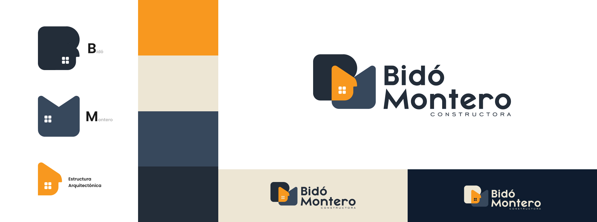
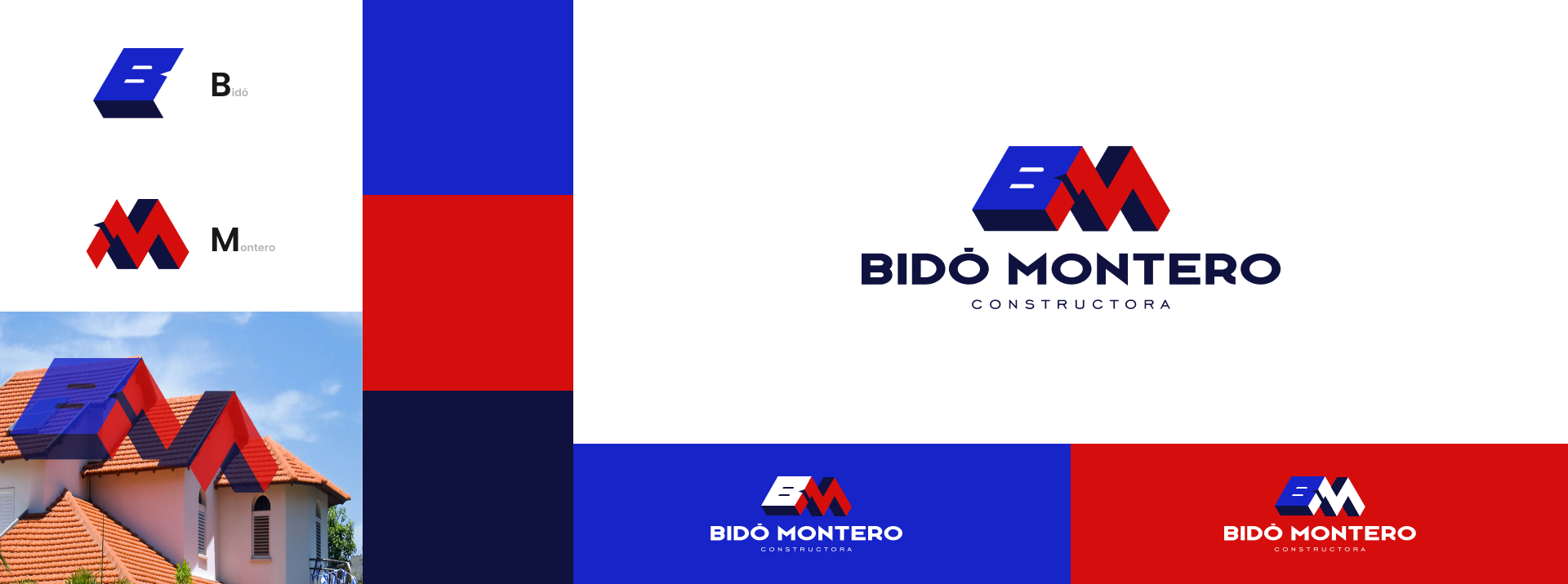
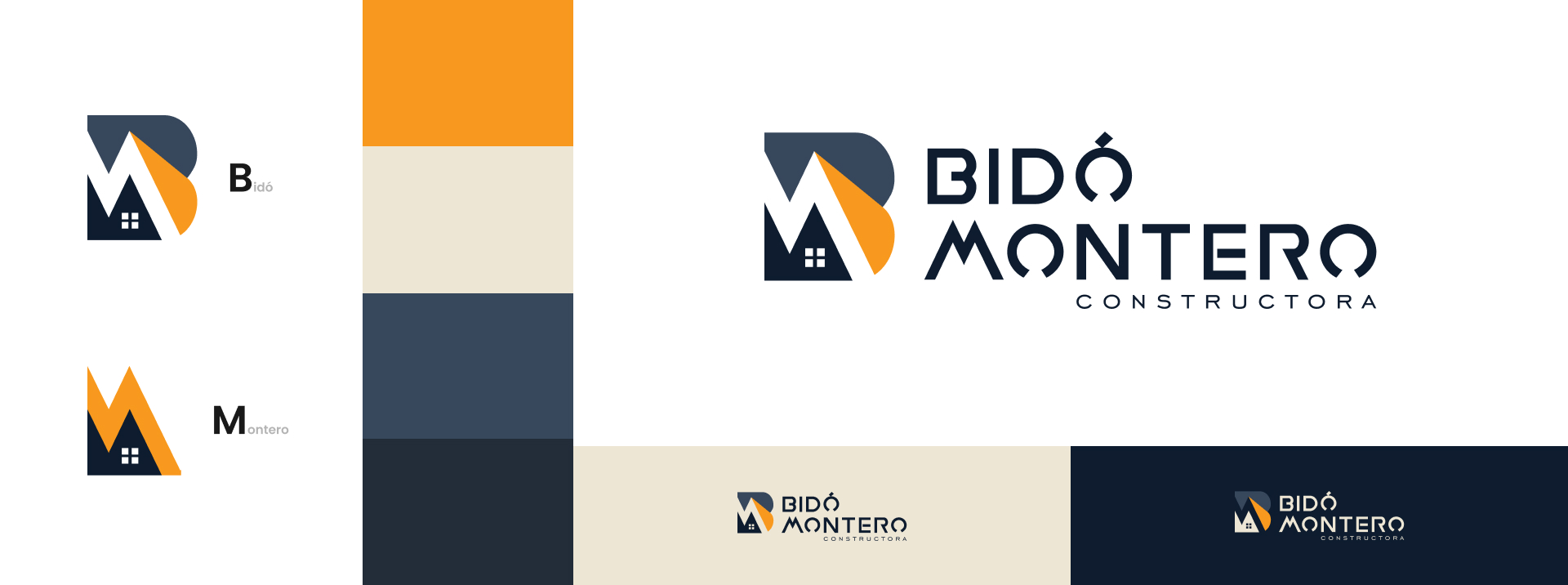
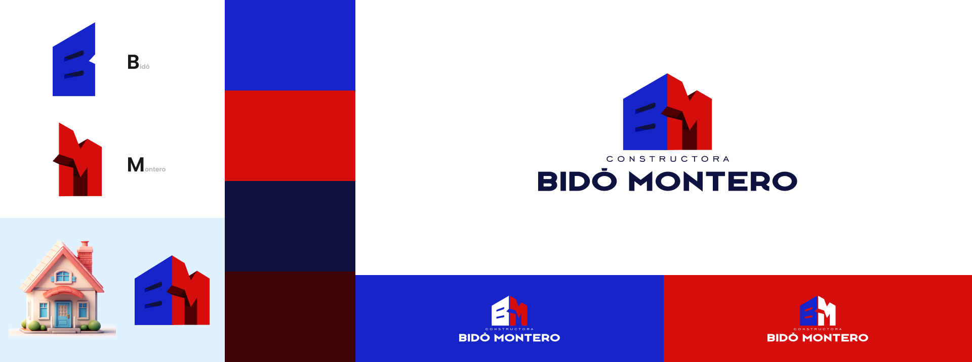
Based on the results of our research, we began sketching out design proposals for the Bidó Montero logo. This process allowed us to incorporate key elements identified in the research stage. As a result, we have generated the following logo proposals for Bidó Montero:
Logo Selection
After presenting the various logo proposals along with color variations, the client showed a preference for one particular design. Interestingly, they suggested incorporating the color scheme from one of their adjacent businesses. This strategic decision was made to maintain a sense of connection and consistency across their multiple enterprises. The chosen logo not only reflects the uniqueness of Bidó Montero but also subtly hints at its association with the client's other successful ventures.
Typography Selection
After presenting the various logo proposals along with color variations, the client showed a preference for one particular design. Interestingly, they suggested incorporating the color scheme from one of their adjacent businesses. This strategic decision was made to maintain a sense of connection and consistency across their multiple enterprises. The chosen logo not only reflects the uniqueness of Bidó Montero but also subtly hints at its association with the client's other successful ventures.
Color Selection
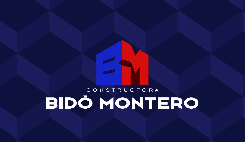
The choice of red and blue for Bidó Montero's logo aligns well with its identity as a construction company. Red signifies strength and determination, embodying the robustness of their constructions, while blue symbolizes trust and reliability, reflecting their commitment to delivering quality projects on time.

Texture
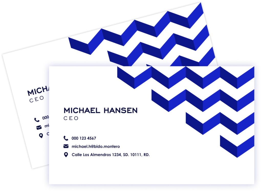
The design of a unique texture for Bido Montero holds significant importance in creating a consistent brand image. This texture, designed based on their geometric logo, not only adds depth and visual interest but also reinforces the brand's identity. By using this texture across various mediums, Bido Montero ensures a uniform and cohesive brand experience. The geometrically-inspired texture is a subtle yet powerful way to continually remind audiences of the solidity, precision, and symmetry that Bido Montero as a construction company stands for.
BRAND BOOK
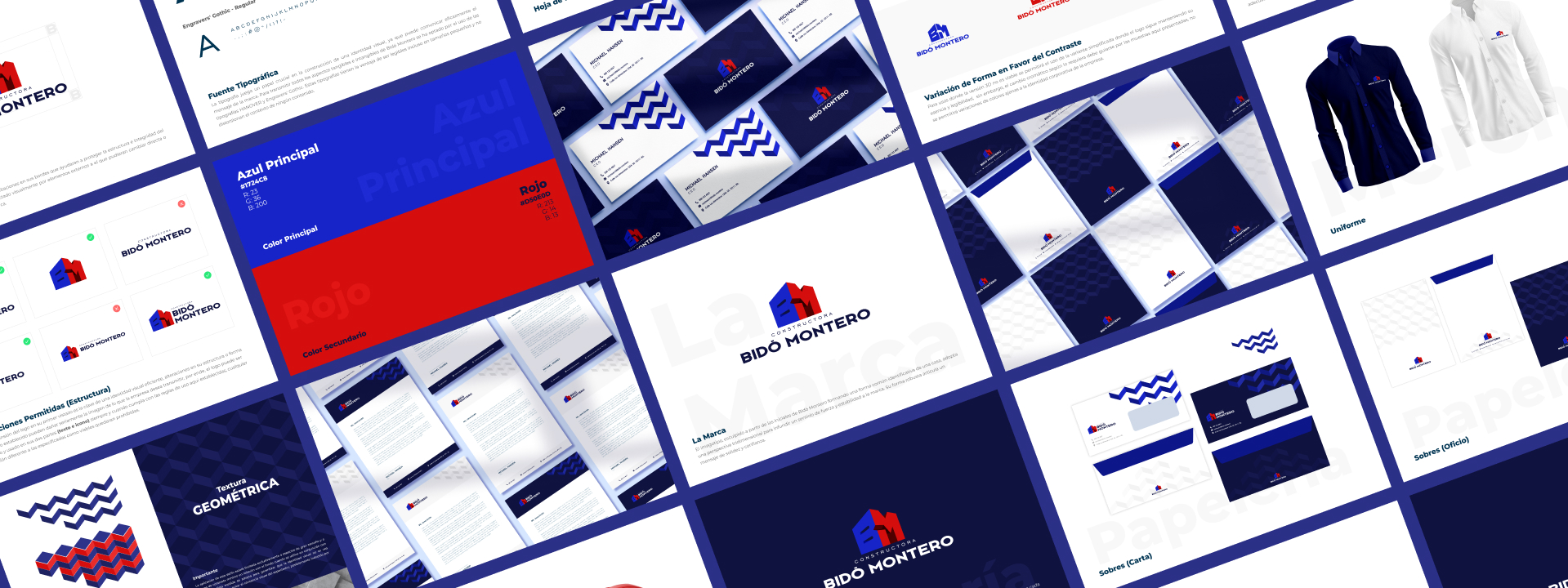
Designing a brand book for Bidó Montero is crucial as it ensures coherence and consistency in all communication and marketing efforts. It serves as a guide, outlining the company's visual and verbal identity, thus preserving its unique brand essence across various platforms.
Stationary
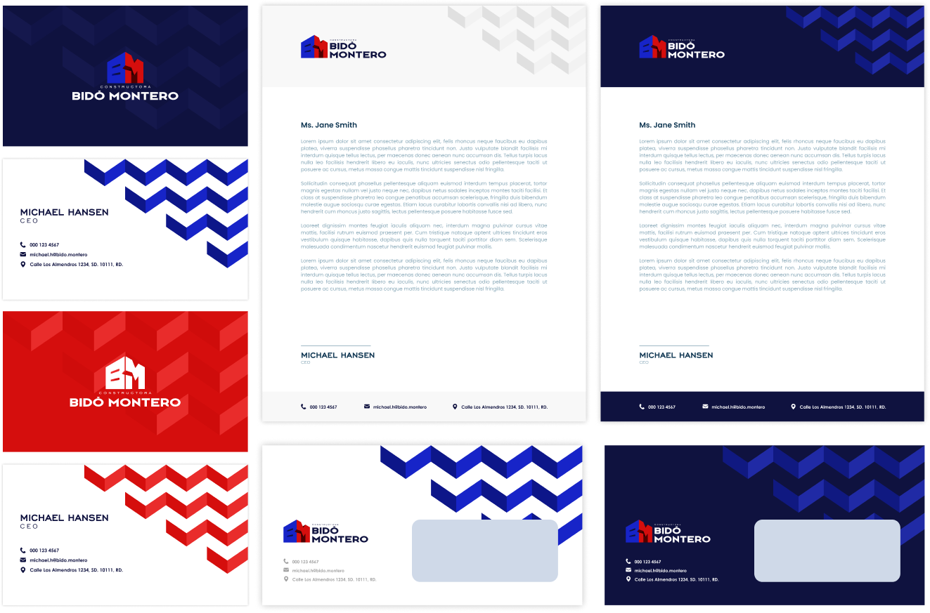
Every piece, from business cards to letterheads, is an opportunity to convey the company's values and standards.
The use of their unique, geometrically-inspired texture across all stationery items is a strategic move that further strengthens their brand consistency. This texture not only adds a visual appeal but also subtly communicates the company's focus on precision and quality. By doing so, Bido Montero ensures that even the smallest elements of their brand are aligned with their overall branding strategy, making their stationery an essential part of their brand communication.
Merch
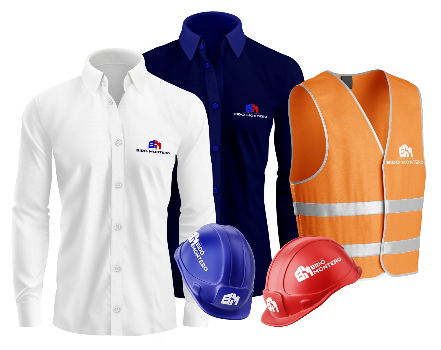
The design of Bidó Montero's merch is a key element in broadening the company's reach and enhancing brand recognition. The incorporation of their distinct, geometry-based texture on all merch items is a subtle yet effective way to mirror the company's commitment to precision and quality. This not only creates visually appealing products but also cements the brand's identity in the minds of customers.
With every use of these merch items, the brand's presence is subtly reinforced, making them powerful tools for ongoing brand promotion.

PROJECT RESULTS
As we draw the curtains on this project, it's with a sense of accomplishment and pride that we declare it an unrivaled success. Our client, Bidó Montero, has expressed profound satisfaction with the results, their enthusiasm mirroring our own. The brand, now characterized by its unique geometry-based texture and distinctive identity, stands poised to make its mark in the market. It's not just a brand that's ready for launch; it's a powerful symbol of precision and quality, set to reshape customer experiences.
BIDÓ MONTERO C.C.
Let’s roll up our sleeves and make it happen.
We’ll turn your vision into designs that work and wow.
