Paradise Tours
PROJECT NAME
Paradise Tours
Components
Logo Design | Brand Book
Date
Jul 2023 - Sep 2023
tools
Project:
Paradise Tours
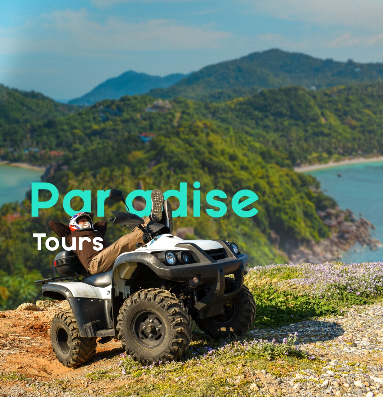
Paradise Tours is a renowned travel agency offering stunning excursions to the pristine beaches of Samana, in the Dominican Republic. Their unique offerings include adventurous ATV tours across the island, giving tourists an opportunity to explore and discover the hidden gems of this tropical paradise. However, despite their exciting activities and beautiful destinations, they face a significant challenge.
The agency lacks a defined visual identity, which has made it difficult for them to establish a strong brand presence in a competitive market. Recognizing this issue, they have reached out to our creative agency for assistance. We are tasked with the exciting project of developing their branding, which will not only encapsulate the spirit of their tours but also carve out a distinctive image that sets Paradise Tours apart from the rest.
CHALLENGE
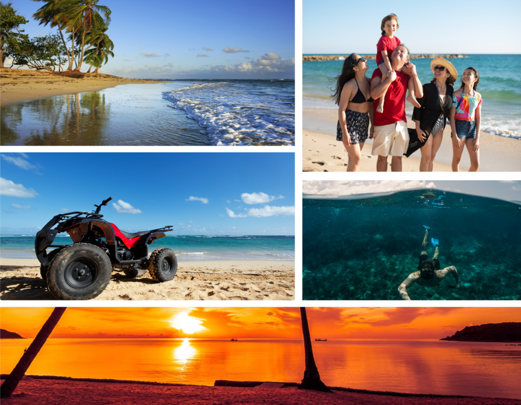
As a creative agency, our challenge was to create a captivating visual identity for Paradise Tours that encapsulated adventure and vacation vibes while also reflecting the tropical allure of the Caribbean beaches. The design needed to immediately evoke the essence of a travel agency, highlighting inclusive experiences, from lounging on sun-kissed beaches to thrilling ATV excursions. Balancing this with their reputation as a serious and committed company added another layer to our task.
Our goal was to seamlessly blend these elements, crafting an identity that truly represents the unique offerings and ethos of Paradise Tours.
LOGO DESIGN
BRANDING
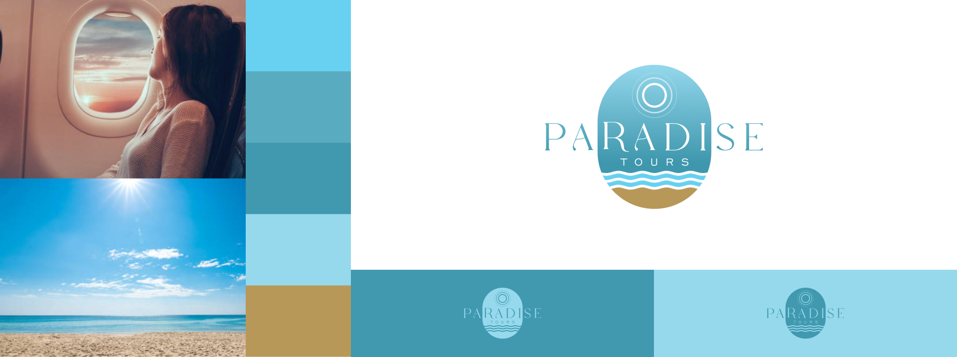
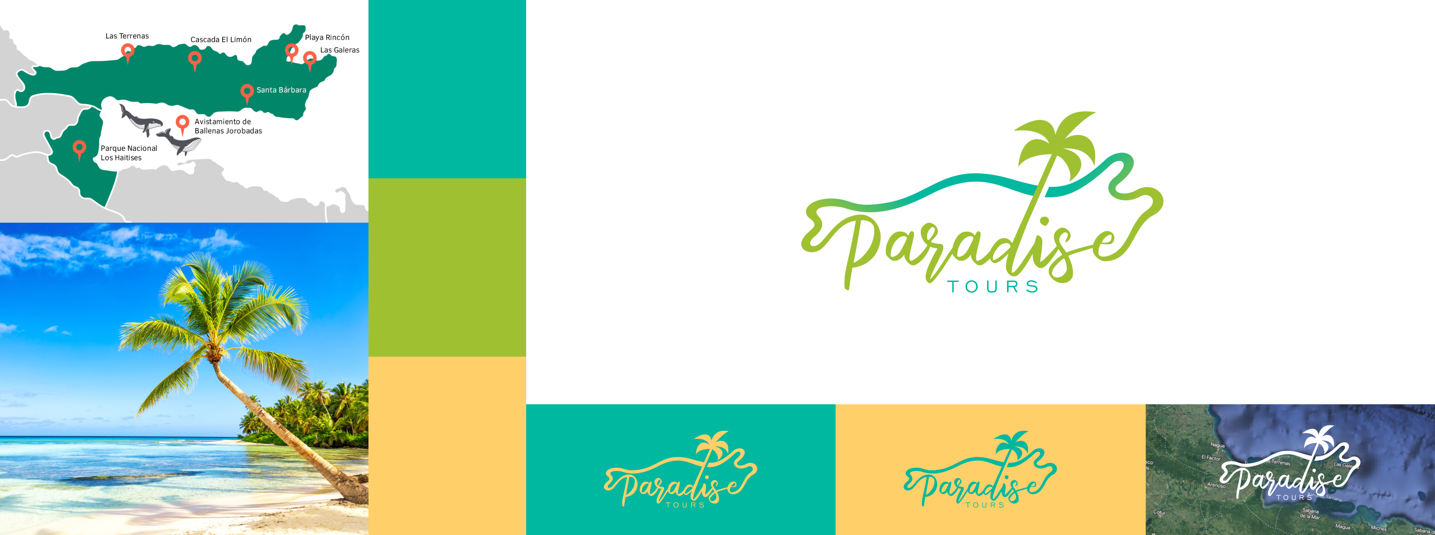
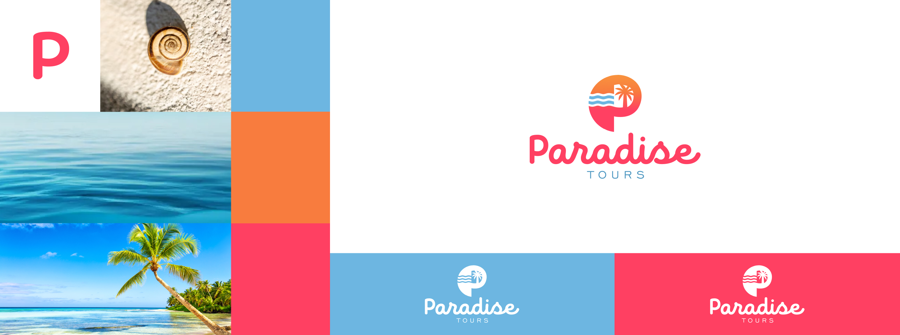
Drawing from the client's clear vision, we undertook the task of bringing their concept to life, facing the challenge of finding the perfect interpretation that captures the essence of Paradise Tours' experiences and creates a fresh, new, and functional image. Close collaboration and the ongoing search for the ideal combination resulted in a logo that not only reflects the client's initial vision but also promises unforgettable experiences.
Logo Selection
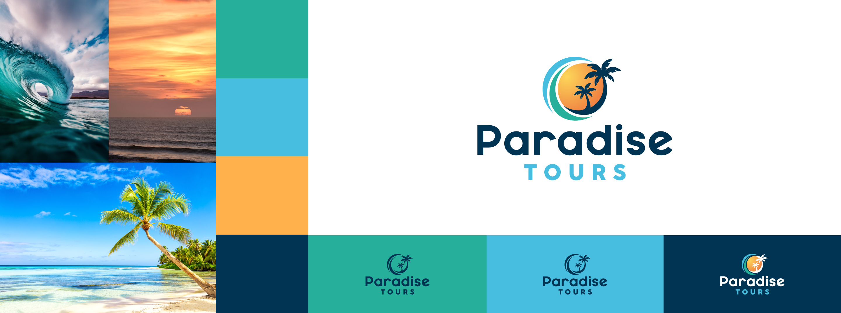
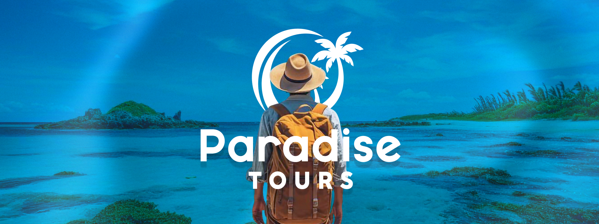
The client has decided on a logo proposal that beautifully encapsulates the brand's identity. This new visual symbol incorporates key elements that define Samana, a region of the Dominican Republic. The design features the area's characteristic curved palm trees, stunning sunsets, rolling waves, and the vibrant green of the paths traversed by ATVs. This logo perfectly represents the brand's essence, embodying both the natural beauty of Samana and the adventure it promises.
Typography Selection
Typography plays a crucial role in building a visual identity, as it can effectively communicate the brand's message. To convey all the tangible and intangible aspects of a brand, the use of the MAYEKA and CocoSharp typefaces has been selected, both belonging to a similar morphological family. This typography has the advantage of being legible even in small sizes, and it does not distort the context of any content.
Color Selection
The colors orange, blue, and green are ideal for Paradise Tours. Orange signifies adventure and warmth, blue represents the tranquility of sea and sky, while green symbolizes nature's richness. Together, they perfectly encapsulate the beach travel experiences offered by the brand.

Texture
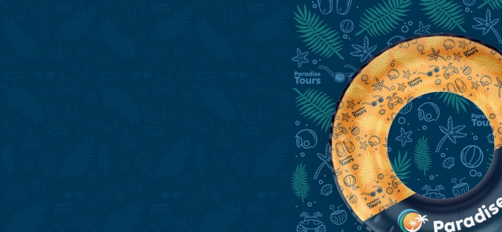
The design of a texture for Paradise Tours is a significant aspect of its brand identity. A texture that encapsulates elements typical of a beach day, such as the grainy feel of sand, the ripple of waves, or the pattern of palm leaves, can powerfully communicate what the brand stands for - relaxing and rejuvenating beach vacations. This visual tool aids in evoking the right emotions and setting the mood for potential customers, making the brand more relatable and attractive.
Having a unique texture as part of the brand's aesthetic can differentiate Paradise Tours from competitors, enhance its memorability, and provide a consistent visual language across different platforms, thus strengthening the overall brand recognition and connection with the audience.
Tagline
In choosing the slogan, the most important elements that reflect the brand were taken into account and turned into a catchy commercial phrase that encourages the reader to associate feelings with the brand. The phrase had to emphasize a relaxed and joyful lifestyle where the aim is to disconnect. Moreover, the combination of words creates an easy-to-remember rhyme to imprint part of the brand on those who read or hear it.

BRAND BOOK
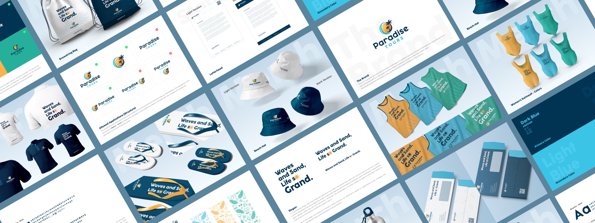
The creation of a Brand Book for Paradise Tours provides a holistic view of the brand, encompassing its mission, vision, values, color palette, typography, imagery, and voice. It serves as a guide, establishing clear and consistent rules on how the brand should be portrayed across various platforms. By doing so, it helps maintain brand consistency, enhances recognition, and ensures that all communications align with the brand's ethos.
Stationary
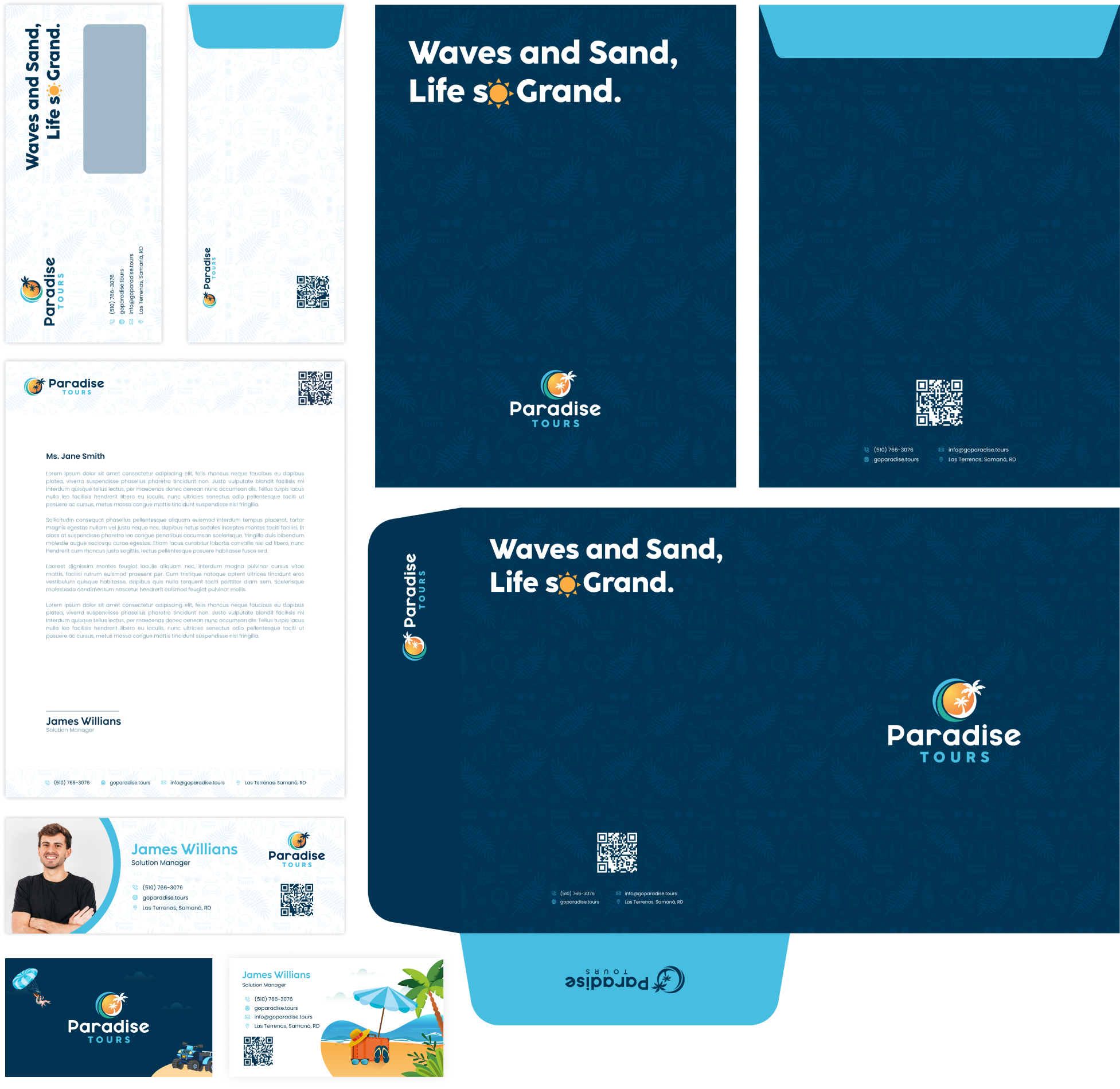
The Brand Book of Paradise Tours comprehensively covers the brand's stationery, ensuring uniformity across all its touchpoints. From envelopes and letterhead to business cards and promotional materials, each element follows a consistent aesthetic and design language that reflects the essence of the brand. The use of vibrant colors and beach-inspired graphics consistently conveys the brand's message about unforgettable beach vacations.
This approach ensures that customers receive a clear and consistent message in every interaction, strengthening the identity of Paradise Tours and ensuring instant recognition.
Merch
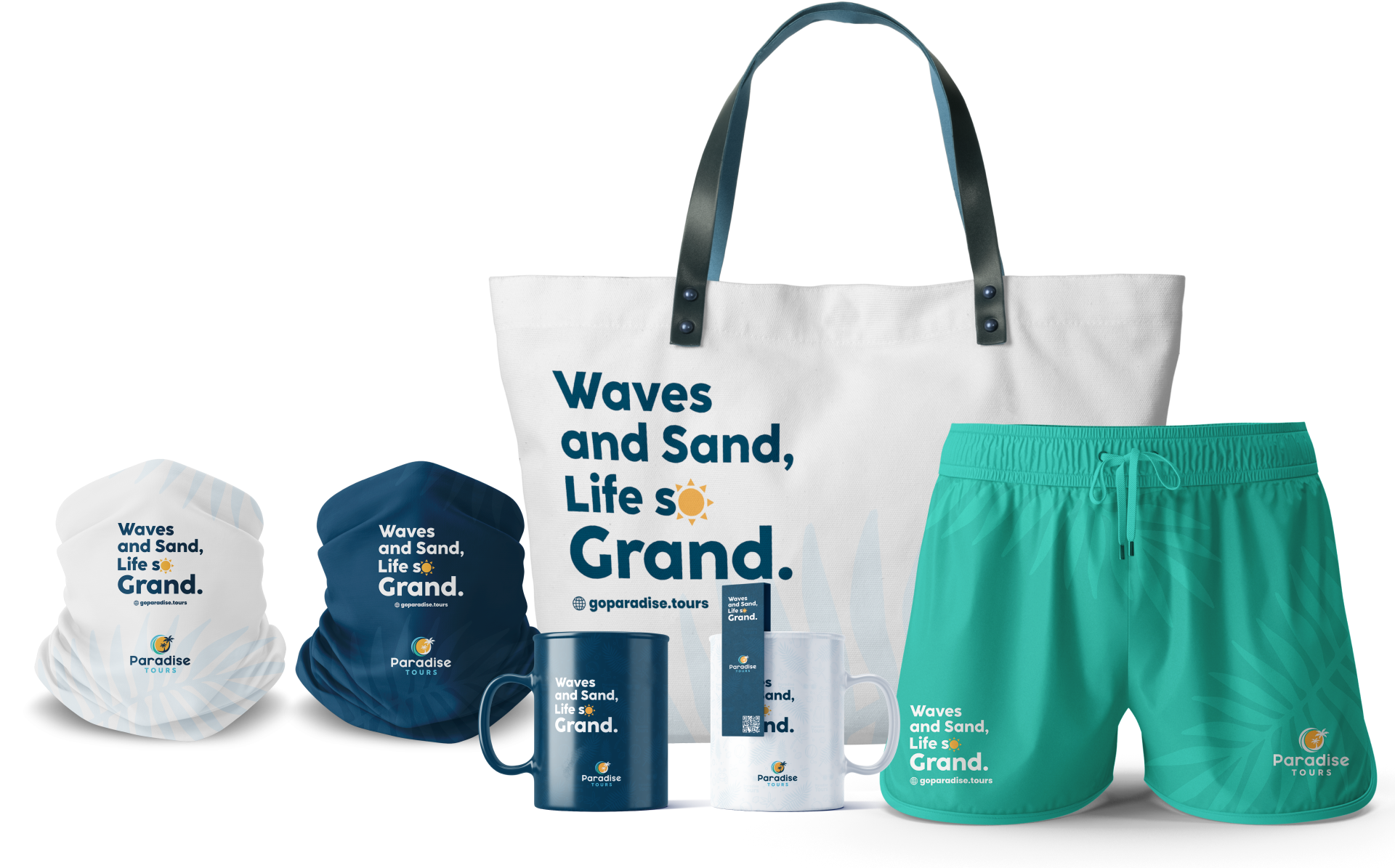
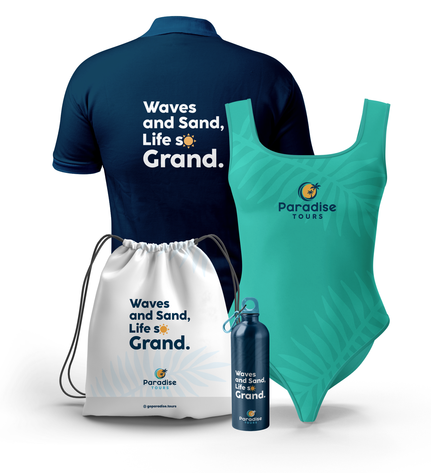
Each piece of merchandise, whether it be t-shirts, caps, or mugs, becomes a tangible representation of the brand's promise to provide unforgettable beach vacations. By using a bright color palette and beach-inspired designs, each piece of merchandise reinforces the brand's identity and its core message.
This cohesive approach ensures that, regardless of the product, customers are always in touch with the unique experience that Paradise Tours offers, thereby strengthening the brand's identity and its connection with customers.
PROJECT RESULTS
The final outcome of the project was a resounding success. The visual identity crafted for Paradise Tours fits seamlessly with what the brand needed, reflecting its core values and essence. The client was more than satisfied with the work, with the results exceeding their expectations. More importantly, the brand achieved its primary goal of capturing the audience's attention, who immediately associate it with the joy and tranquility that holidays in a paradisiacal island like the Dominican Republic convey. This project has not only strengthened the brand's identity but also positioned it in the hearts and minds of its audience, perfectly embodying the blissful and serene experience Paradise Tours offers.
PARADISE TOURS
Let’s roll up our sleeves and make it happen.
We’ll turn your vision into designs that work and wow.
