In today’s fast-paced digital world, less truly is more. Minimalist web design has become a powerful strategy for creating sleek, modern websites that drive results. By focusing on simplicity and clarity, minimalist design can captivate your audience, enhance user experience, and boost conversions. For business owners, marketers, and startup founders, understanding the benefits of minimalist design and how to implement it effectively is crucial.
The Benefits of Minimalist Design
Enhanced User Experience
A minimalist design ensures that your website is clean, uncluttered, and easy to navigate. By removing unnecessary elements, you allow visitors to focus on what truly matters—your content.
Key Elements:
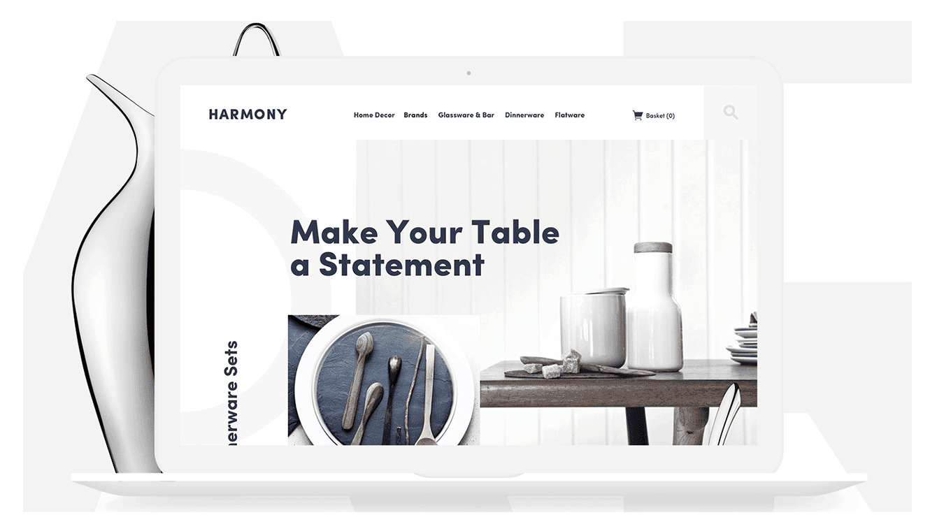
White Space: Generous use of white space creates a clean and organized look.
Bold Typography: Use bold fonts to highlight important information.
Contrast: High contrast between text and background enhances readability.
Explore More: Visual Hierarchy Principles
Increased Conversions
By reducing clutter and distractions, minimalist design can increase conversions. Users are more likely to complete desired actions, such as signing up for newsletters, making purchases, or contacting your business.
Conversion Boosters:
Clear CTAs: Prominent and straightforward calls-to-action encourage users to engage.
Focused Content: Highlight essential information and remove distractions.
Trust Signals: Clean design can build trust and credibility with your audience.
Explore More: Minimalism and Conversion Rates

Timeless Aesthetic Appeal
Minimalist designs tend to age well. Unlike trendy designs that may quickly become outdated, minimalist websites maintain their elegance and relevance over time.
Aesthetic Benefits:
Timeless Look: Clean and simple designs remain appealing for longer.
Brand Consistency: A minimalist approach can align with your brand’s identity.
Versatility: Works well across various industries and target audiences.
Explore More: Timeless Web Design
Implementing Minimalist Design Effectively
Focus on Essential Elements
Identify the core elements that are essential to your website’s functionality and user experience. Prioritize these elements and eliminate anything that does not add value.
Essential Elements:
Navigation Menu: Keep it simple with only the most important links.
Content: Focus on high-quality, relevant content that serves your audience.
Visuals: Use high-quality images and graphics sparingly to support your message.
Explore More: Essentials of Minimalist Design
Leverage White Space
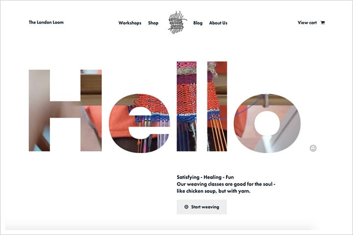
White space, or negative space, is a cornerstone of minimalist design. It helps create a balanced and harmonious layout by giving elements room to breathe.
Tips for Using White Space:
Margins and Padding: Use generous margins and padding around text and images.
Whitespace Around CTAs: Surround calls-to-action with ample white space to draw attention.
Less is More: Resist the urge to fill every empty space—embrace minimalism.
Explore More: The Power of White Space
Simplify Navigation
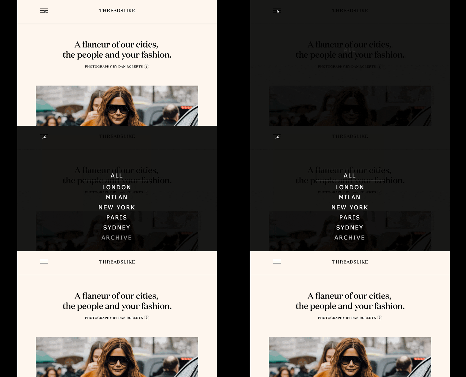
A minimalist website should have an intuitive and straightforward navigation structure. This helps users find what they’re looking for quickly and easily.
Navigation Tips:
Limit Menu Items: Keep the main navigation menu concise with 5-7 items.
Sticky Navigation: Consider using sticky navigation for easy access.
Breadcrumbs: Use breadcrumbs to help users understand their location on the site.
Explore More: Simplifying Website Navigation
Choose a Limited Color Palette
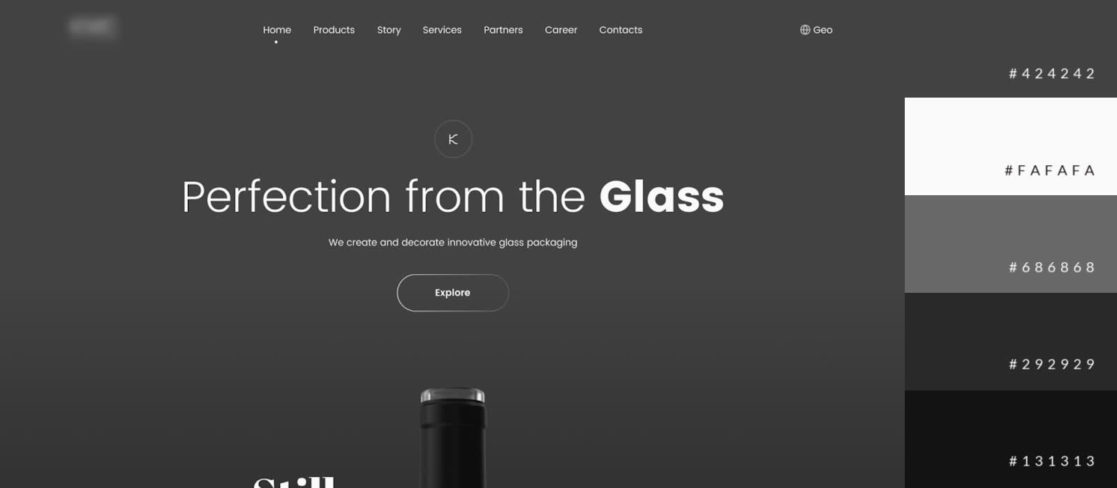
A limited color palette reinforces the minimalist aesthetic and prevents visual overload. Use a few complementary colors to create a cohesive and visually pleasing design.
Color Palette Tips:
Neutral Colors: Start with a neutral base and add accent colors for emphasis.
Consistency: Use the same color scheme throughout your site for consistency.
Accessibility: Ensure that color choices meet accessibility standards.
Explore More: Choosing a Color Palette
Optimize Typography
Typography plays a crucial role in minimalist design. Choose clean, readable fonts and use them consistently across your website.
Typography Tips:
Limit Fonts: Use no more than two or three fonts to maintain consistency.
Readable Sizes: Ensure font sizes are readable on all devices.
Hierarchy: Use different font weights and sizes to establish a clear hierarchy.
Explore More: Typography in Minimalist Design
Enhance Visuals with High-Quality Imagery
While minimalist design often features fewer images, the ones you choose should be high-quality and relevant. Use visuals strategically to support your content and enhance the overall design.
Visual Tips:
Professional Photography: Invest in professional photography for a polished look.
Consistent Style: Maintain a consistent style for all images and graphics.
Relevance: Ensure that every visual element adds value and supports your message.
Explore More: Using Images in Minimalist Design
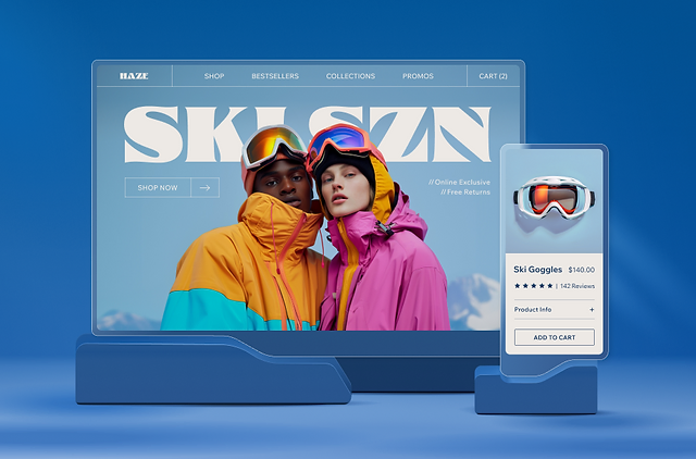
Implementing Minimalist Design Effectively
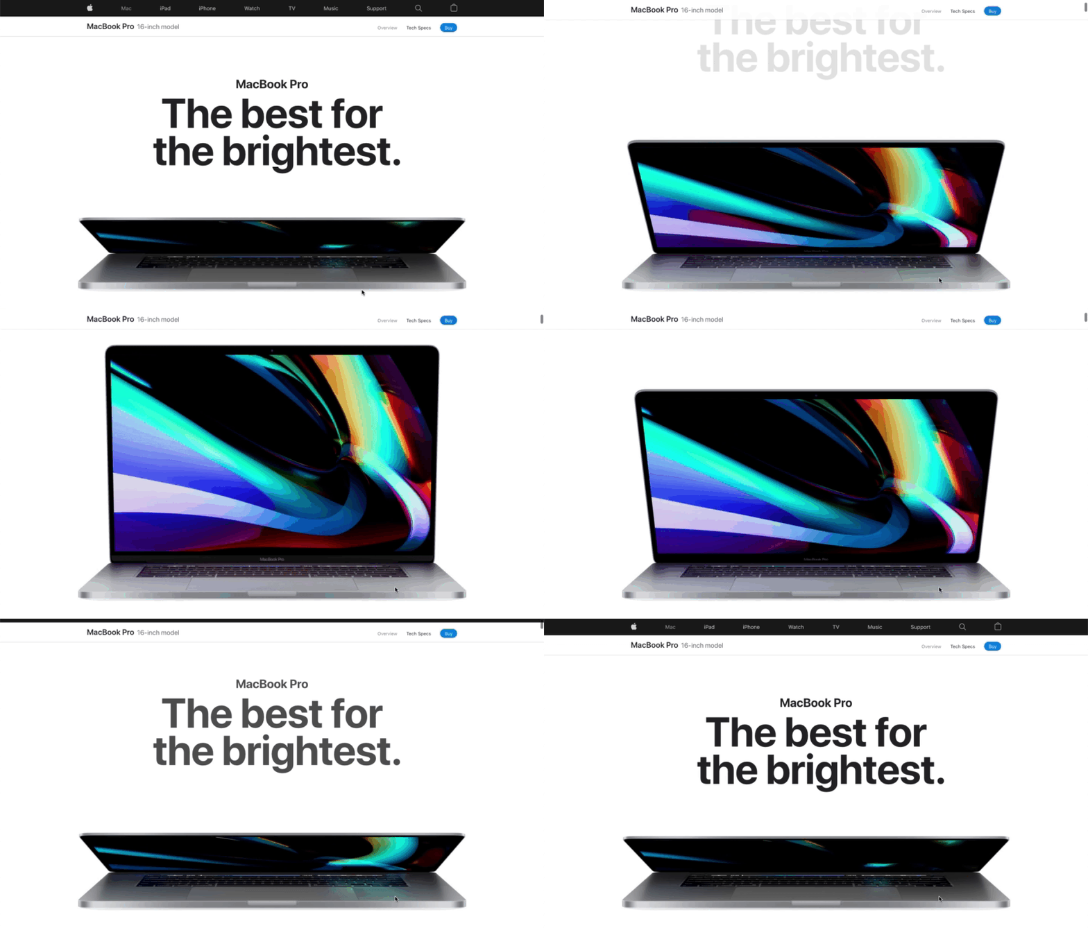
Apple
Apple’s website is a prime example of minimalist design. With its clean lines, ample white space, and focus on product visuals, Apple creates an engaging and effective user experience.
Explore Apple’s Minimalist Design: Apple
Everlane

Conclusion
Unlocking the potential of minimalist web design can transform your website into a sleek, modern platform that drives results. By focusing on essential elements, leveraging white space, simplifying navigation, choosing a limited color palette, optimizing typography, and enhancing visuals, you can create a website that captivates your audience and boosts conversions.
For business owners, marketers, and startup founders, embracing minimalist design is not just about aesthetics—it’s about creating a user-friendly experience that delivers value and stands the test of time. Ready to elevate your website? Start implementing these minimalist design strategies today and watch your online presence flourish.

